Week 4 — Some Visualization

IAT 461 / 882 · Data Science for Human-Centered Systems · Summer 2026 · Alireza Karduni

Design Principles

Instructor: Dr. Alireza Karduni · TA: Mehdi Jahani

Slides based on material by Prof. Emily Wall

Tamara Munzner

Rules of Thumb

8 guidelines that make or break visualizations

  • No unjustified 3D
  • No unjustified 2D
  • Eyes beat memory
  • Resolution over immersion
  • Overview first, zoom and filter, details on demand
  • Responsiveness is required
  • Get it right in black and white
  • Function first, form next

No Unjustified 3D

The easiest way to make your instructor grumpy about a design

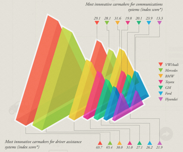
Bad 3D Examples

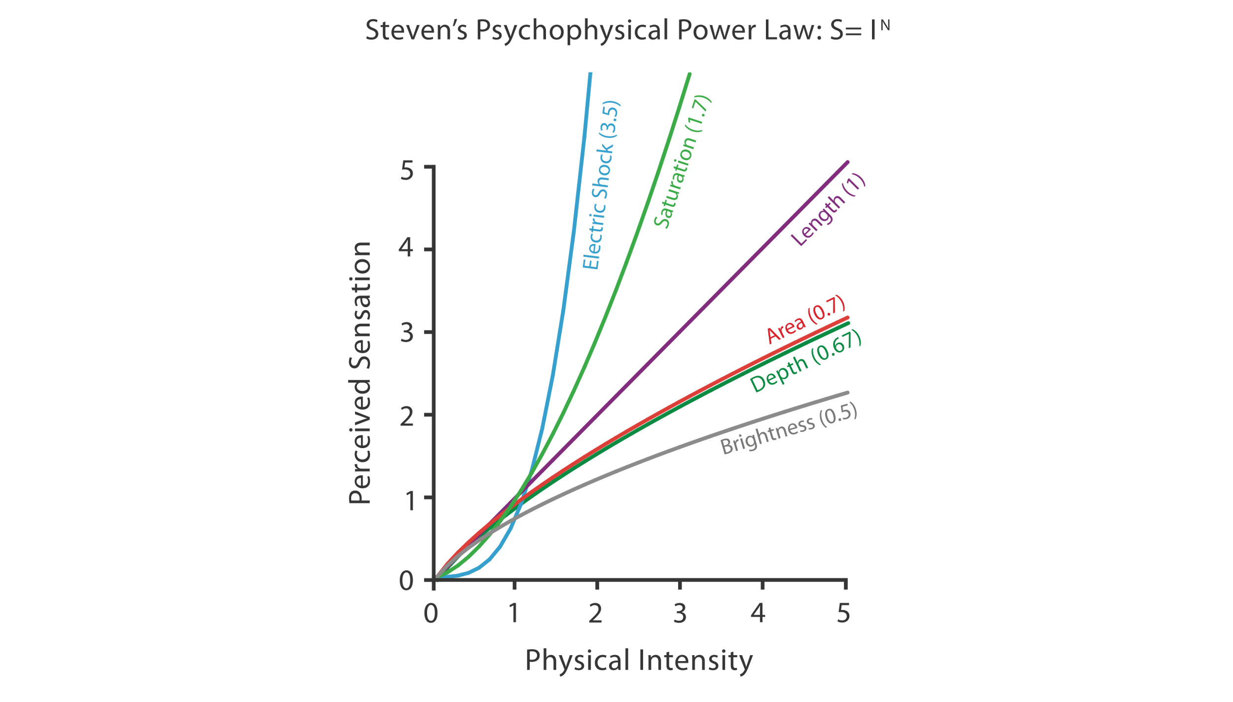
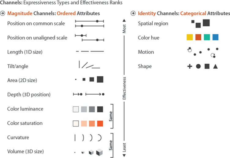
Magnitude is Effective in Planar Spatial Position (Not 3D!)
We See in 2.05D
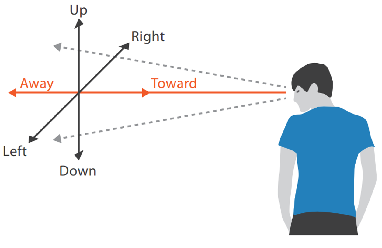
Depth Cues

Occlusion Hides Information
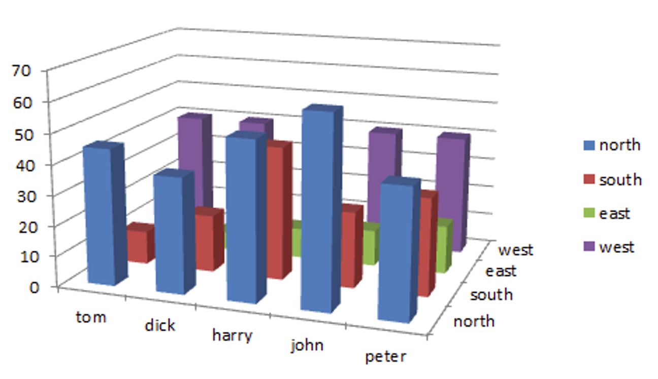
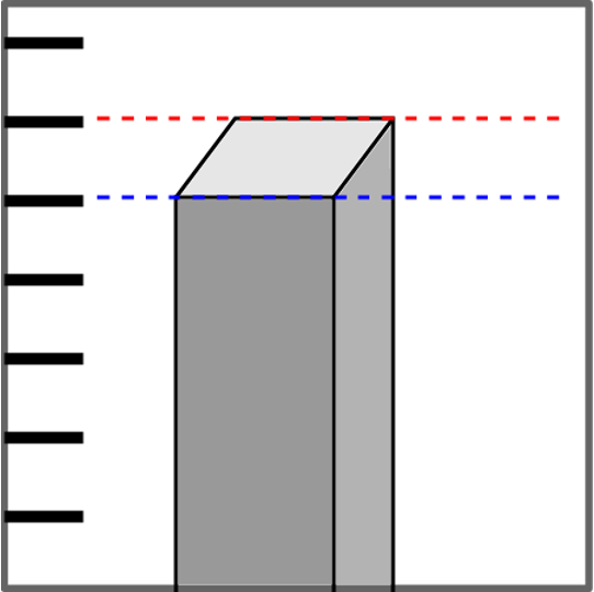
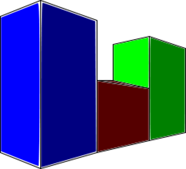
3D v. 2D Bars
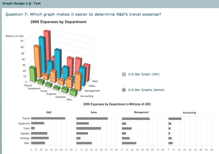
Why Not 3D?
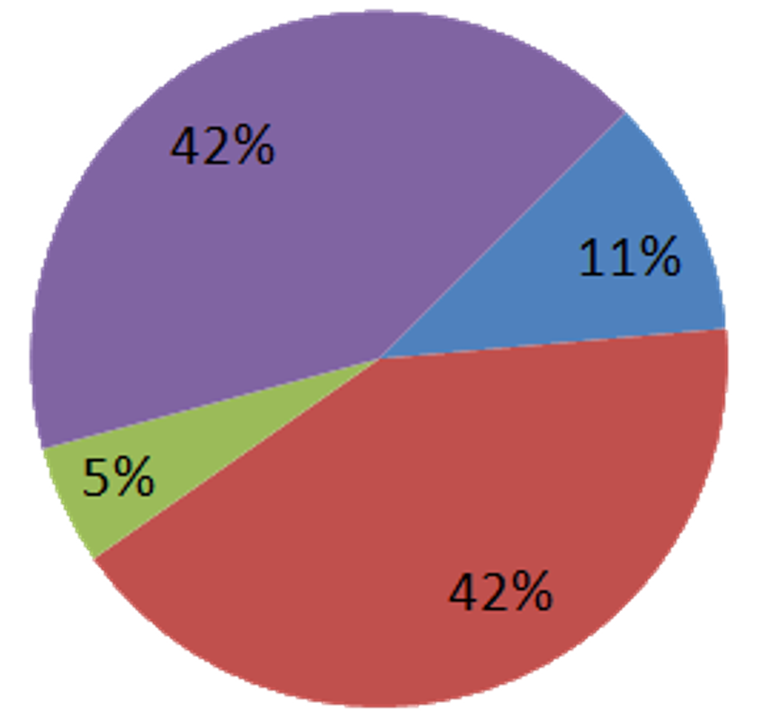
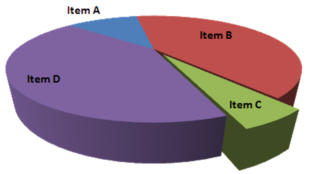
3D Pie Chart
3D Time Series
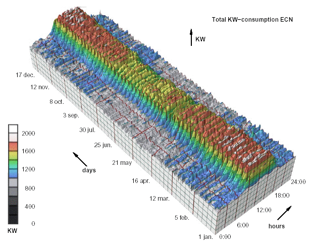
Van Wijk 1999

Alternatives? Transform.
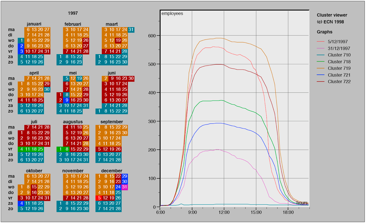
Van Wijk 1999

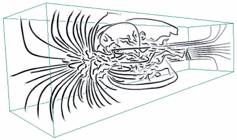
When is 3D Justified?

  • Benefits outweigh costs
  • True 3D spatial data
  • When task is shape perception
  • Needs very careful justification for abstract data

Li 2007
No Unjustified 2D

Sometimes a simple list is enough

Like… Why Though?

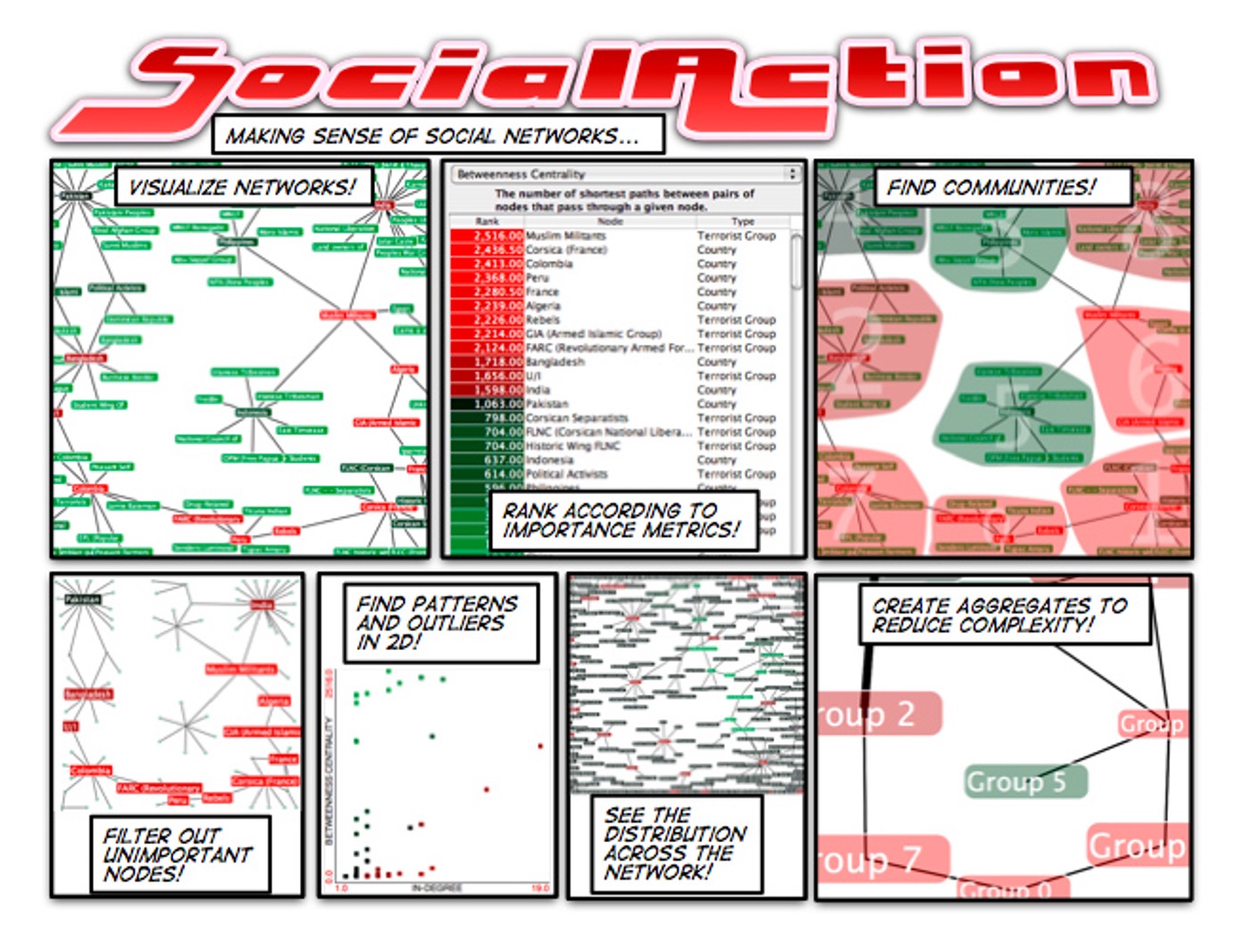
Does a Network Require 2D Layout?

  • Is reading a central task?
  • Network → lower info density, harder label lookup (compared to a list)
  • Benefits > costs when topological structure & context are important

Perer 2008
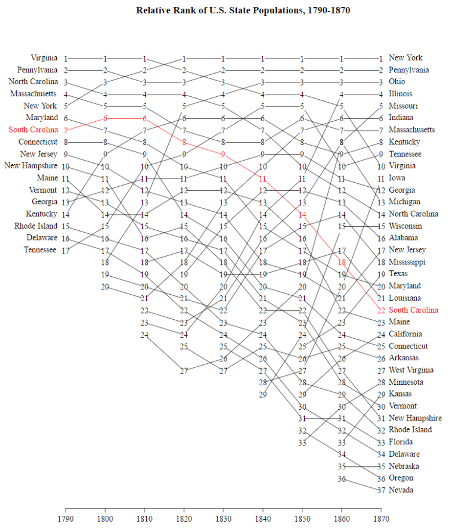
Sometimes 2D is Helpful

Change over time

Slope graph / bump chart
Eyes Beat Memory
Keep them on the screen

Eyes Beat Memory

External Cognition

  • Information needed to think is externalized — written down, encoded outside your head
  • Offloads cognition to perception
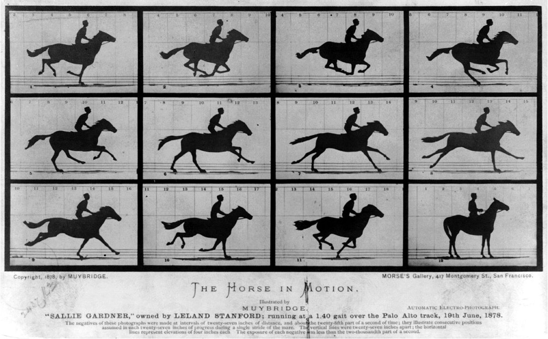
  • Easier to visually compare things side-by-side than to compare a visual to a memory
  • Small multiples > animation (often)

Small Multiples

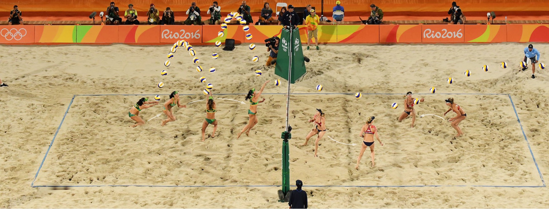
Image Composite

Image Composite

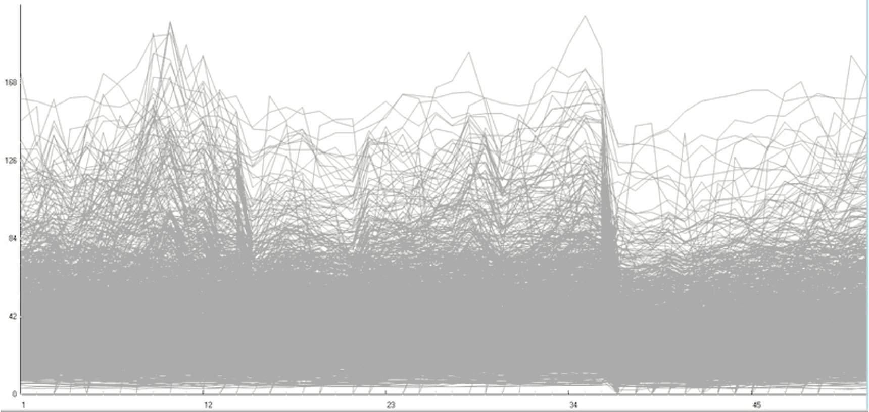
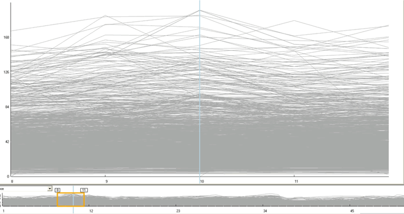
Overview First, Zoom & Filter, Details on Demand

Ben Shneiderman’s Information Seeking Mantra

Overview First

Zoom and Filter

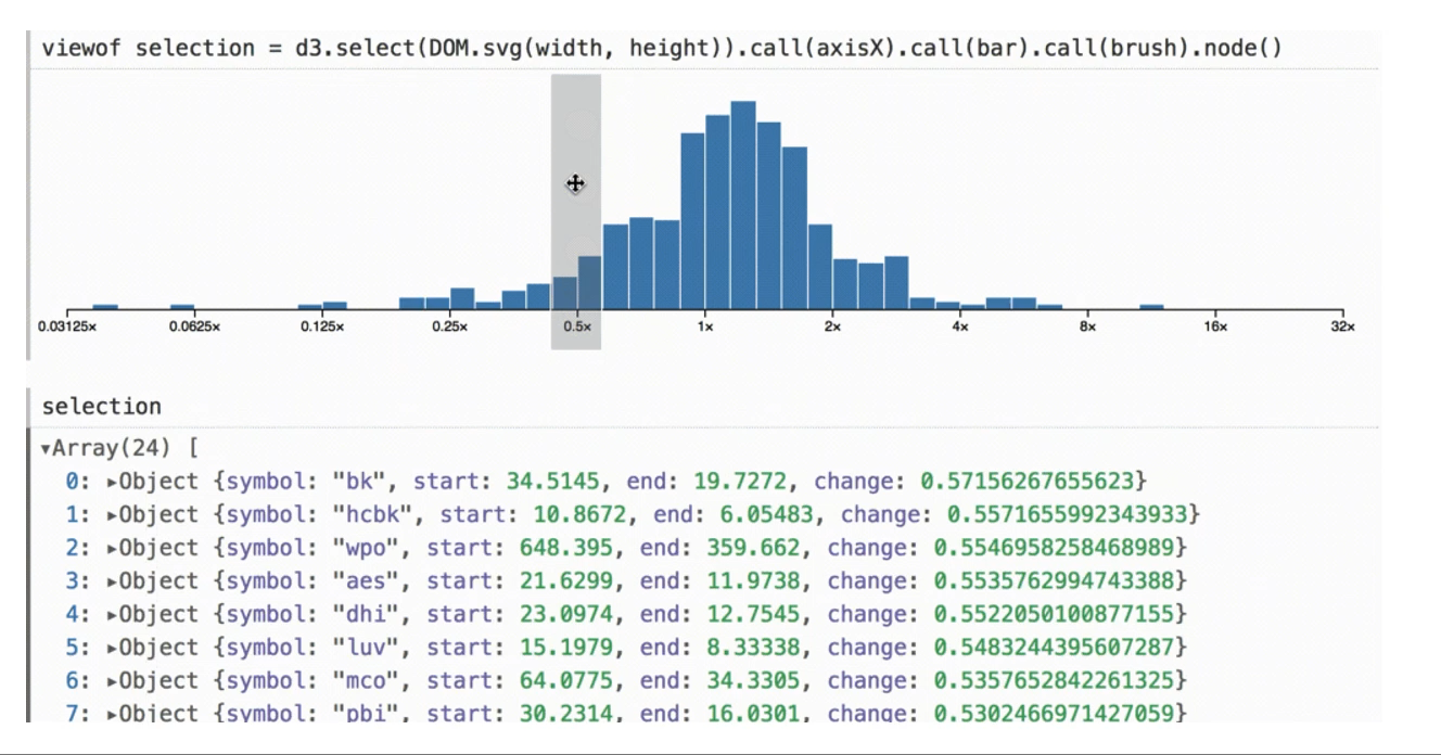
Details on Demand
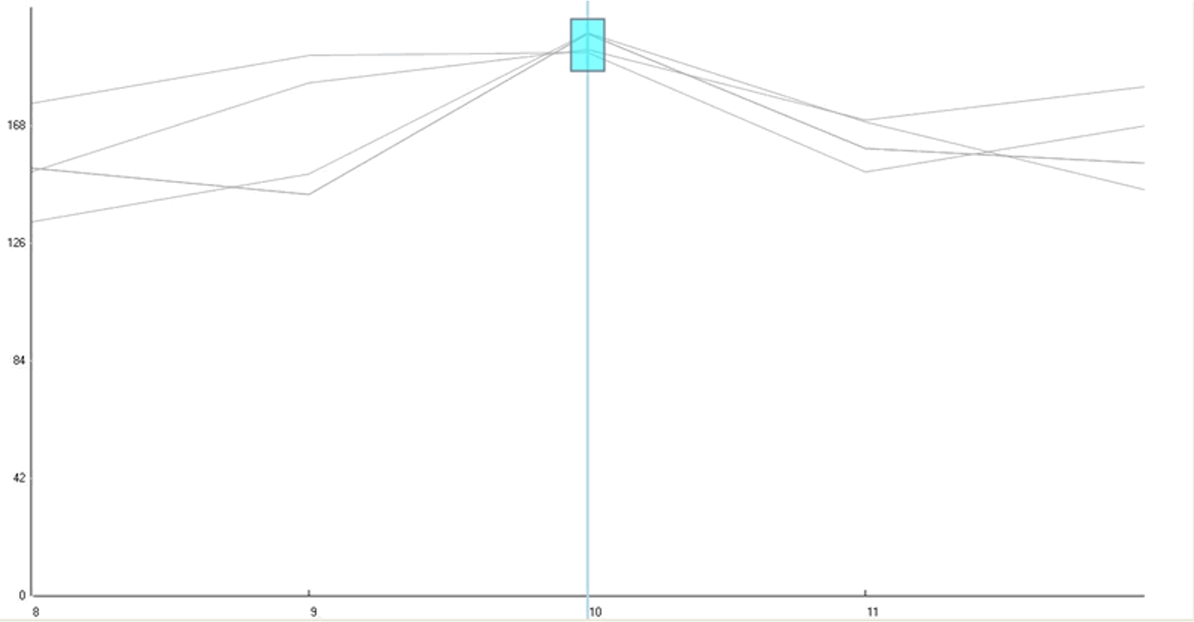
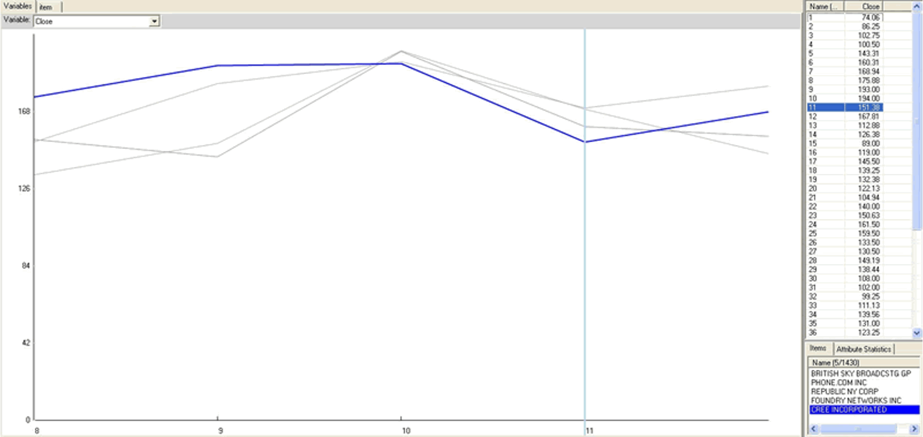
Interactive Example
Responsiveness is Required

For modern accessible visualizations

Visual Feedback

  • 0.1 sec — perceptual processing
    • Sub-second response for mouseover highlighting
  • 1 sec — immediate response
    • Fast response after mouse click, button press
  • 10 sec — brief tasks
    • Bounded response after dialog box — mental model of heavyweight operation (file load)

Considering Scalability

  • Highlight section without complete redraw of the view (graphics front-buffer)
  • Show hourglass for multi-second operations (check for cancel / undo)
  • Show progress bar for long operations (process in background thread)
  • Rendering speed when item count is large (guaranteed frame rate)

Dynamic Querying

Dynamic Querying

Function First, Form Next

For effective communication

Form vs. Function

Dangerous to start with aesthetics.

Very difficult to add function retroactively.

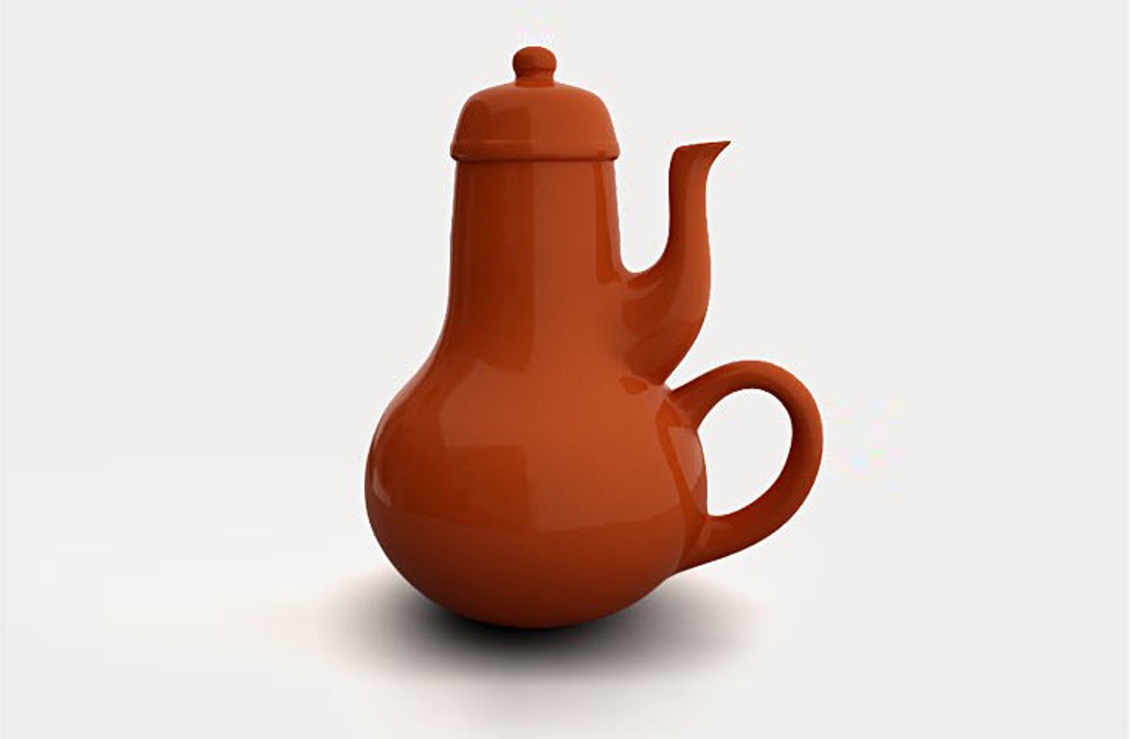
Masochist’s Teapot

Masochist’s Teapot by Jacques Carelman

Basic Graphic Design Ideas

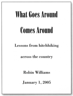
  • Proximity — group related items; avoid equal whitespace between unrelated items
  • Alignment — avoid automatic centering
  • Repetition — unify by pushing existing consistencies
  • Contrast — if not identical, make very different

The Non-Designer’s Design Book 2015
Best Practices: Labeling

  • Meaningful & useful titles, labels, and legends
  • Axes and panes / sub-windows should have labels
  • Axes should have good min / max boundary tick marks
  • Everything that’s plotted should have a legend
  • Use reasonable numerical format

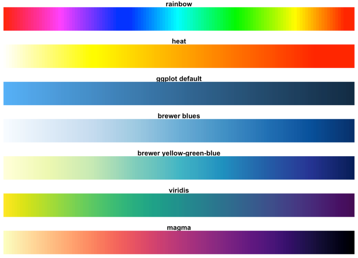
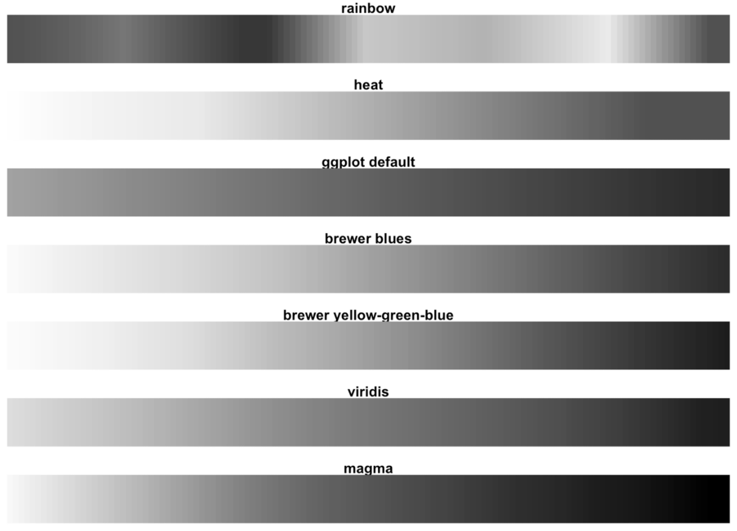
Get it Right in Black and White

In case of empty color cartridges

Color to Grayscale

Grayscale Test

Viridis Colormap
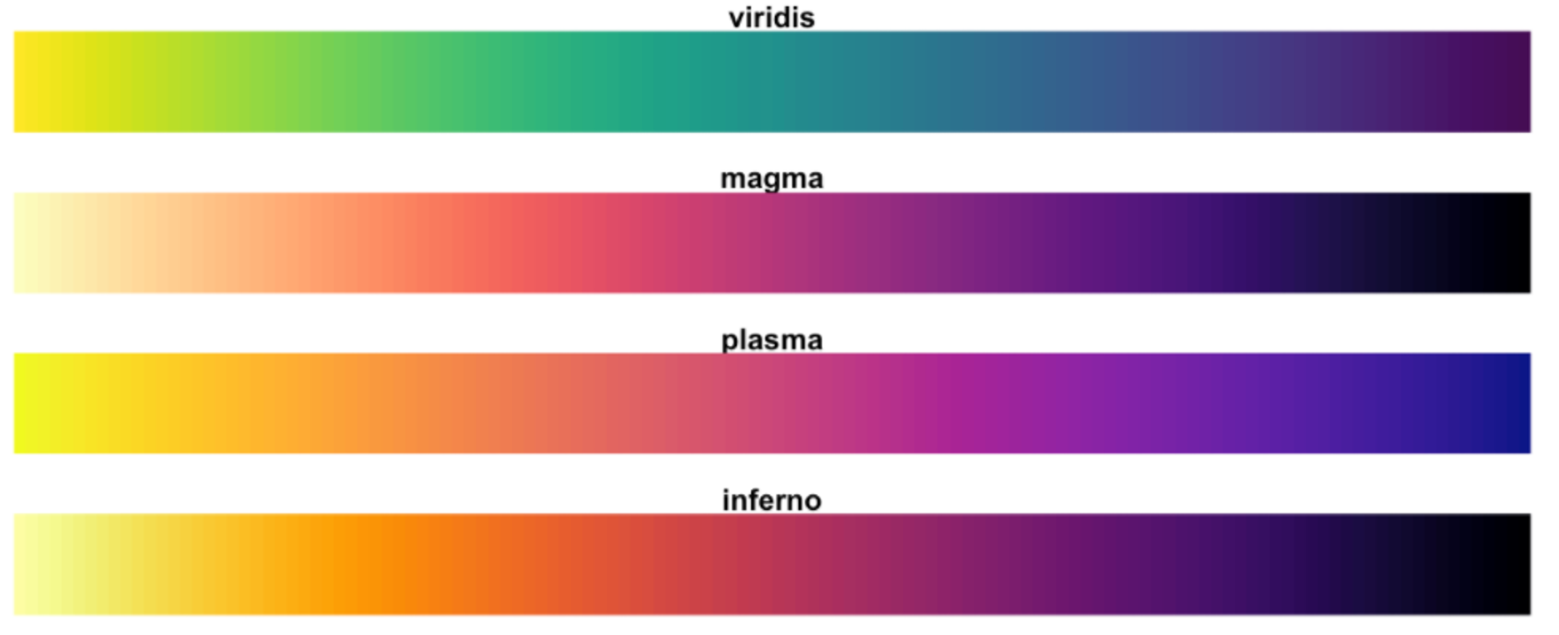
Viridis in Grayscale

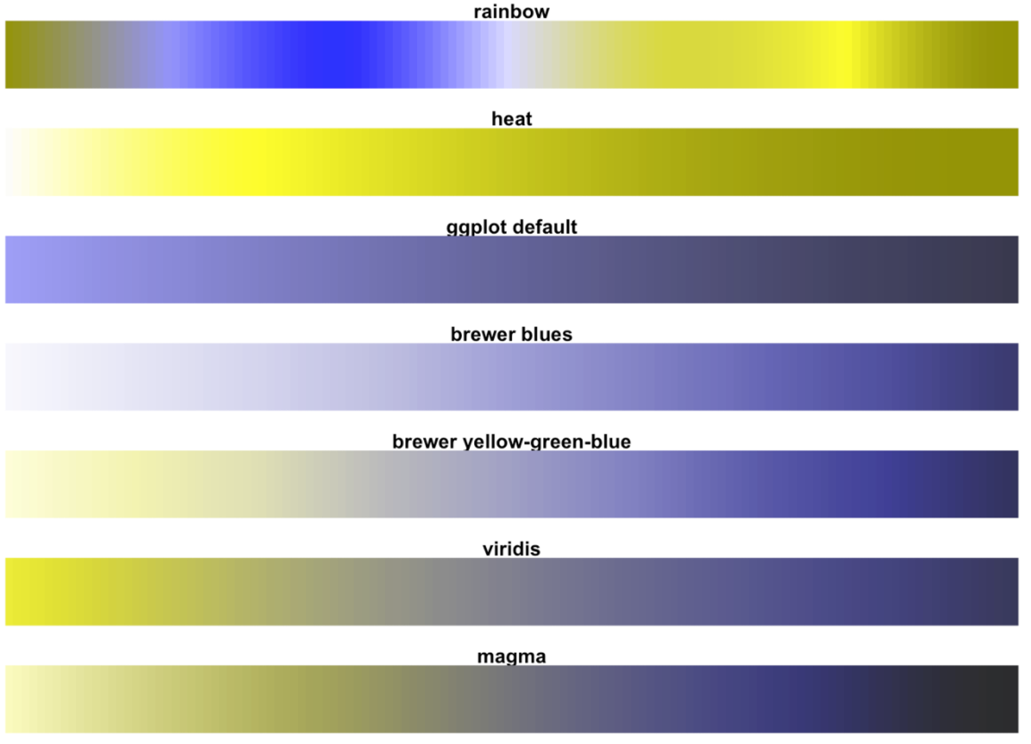
Color Accessibility
Colorblindness Simulation
Perceptually Uniform Colormaps
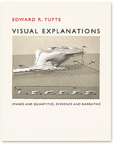
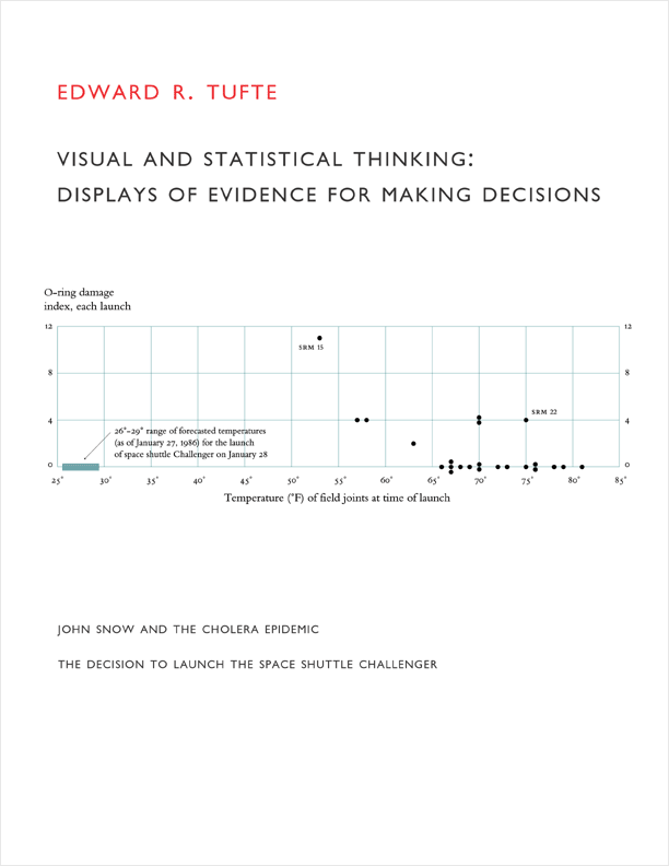
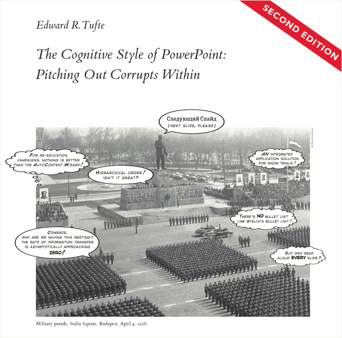
Edward Tufte
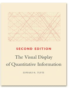
Edward Tufte

Graphical Excellence

“Graphical excellence is that which gives to the viewer the greatest number of ideas in the shortest time with the least ink in the smallest space.”

— Edward Tufte

Two Rules

  1. Tell the truth (graphical integrity)
  2. Do it effectively with clarity, precision (design aesthetics)

Tufte’s Design Principles

  • Graphical integrity
  • Maximize data-ink ratio
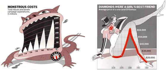
  • Avoid chart junk
  • Macro / micro readings
  • Small multiples
  • Minimize / unite grids, labeling, legends
  • Appropriate applications of color

Data-Ink Ratio

\[\text{Data-ink ratio} = \frac{\text{Data ink}}{\text{Total ink used in graphic}}\]

The proportion of the graphic’s ink devoted to non-redundant display of information.

Tufte’s Design Principles

  • Graphical integrity
  • Maximize data-ink ratio
  • Avoid chart junk
  • Macro / micro readings
  • Small multiples
  • Minimize / unite grids, labeling, legends
  • Appropriate applications of color

Chartjunk

Tufte’s Design Principles

  • Graphical integrity
  • Maximize data-ink ratio
  • Avoid chart junk
  • Macro / micro readings
  • Small multiples
  • Minimize / unite grids, labeling, legends
  • Appropriate applications of color

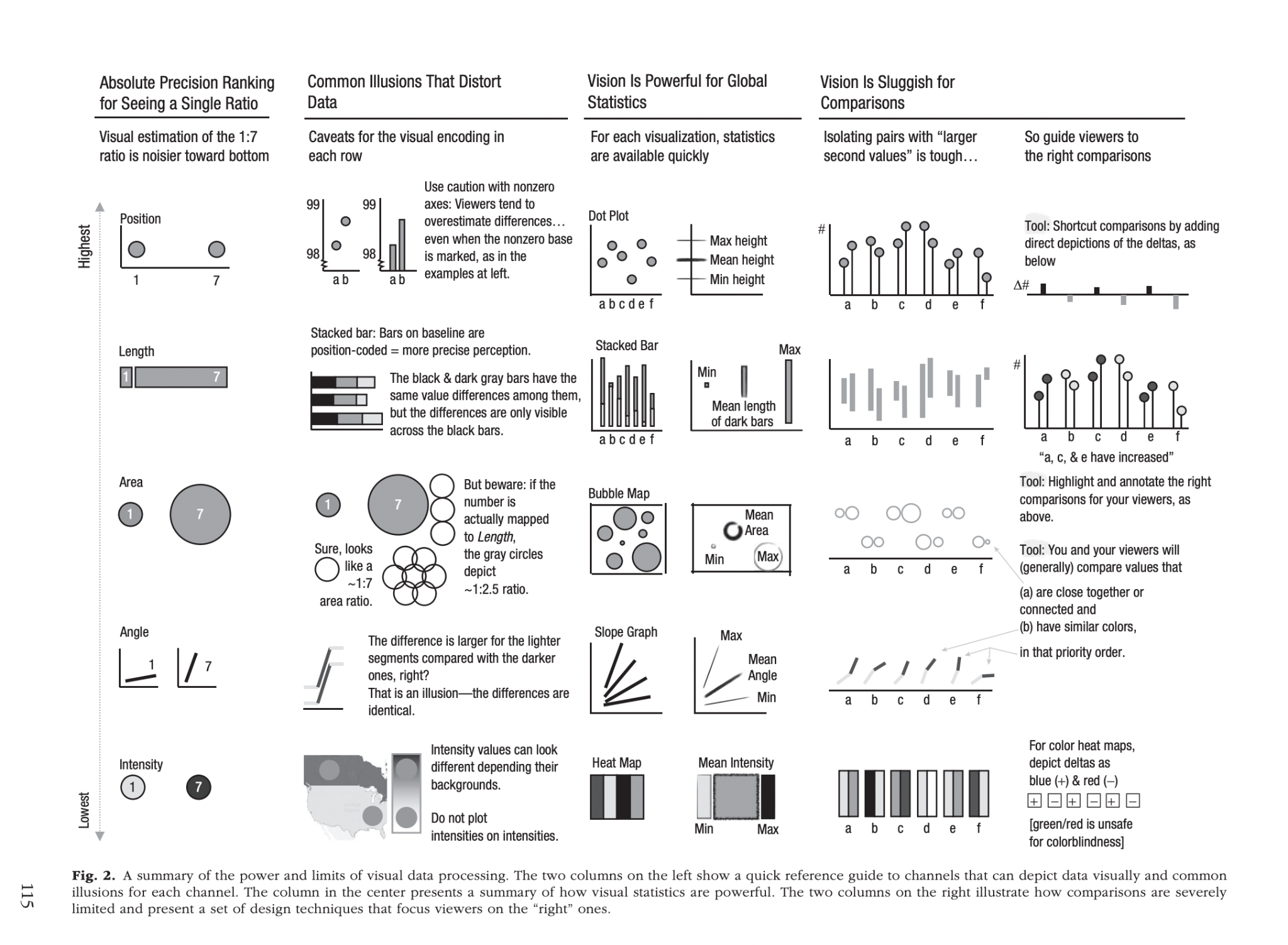
Things to remember!

  1. Some visual encodings are harder / noisier
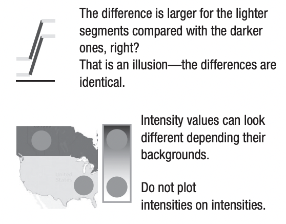
  2. Some illusions distort data
  3. Global statistics are fast
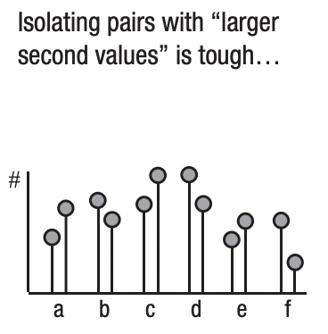
  4. Comparisons are slow
  5. Guide viewers to the right comparisons

01 — Visual Encoding Precision

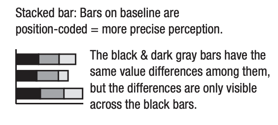
People are more precise reading these.
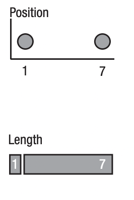
People are less precise reading these.
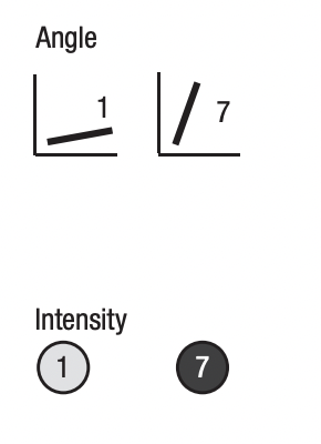
One piece is WAY MORE popular.
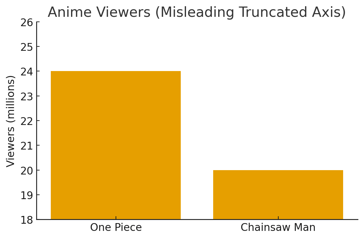
Oh but that’s not that different?
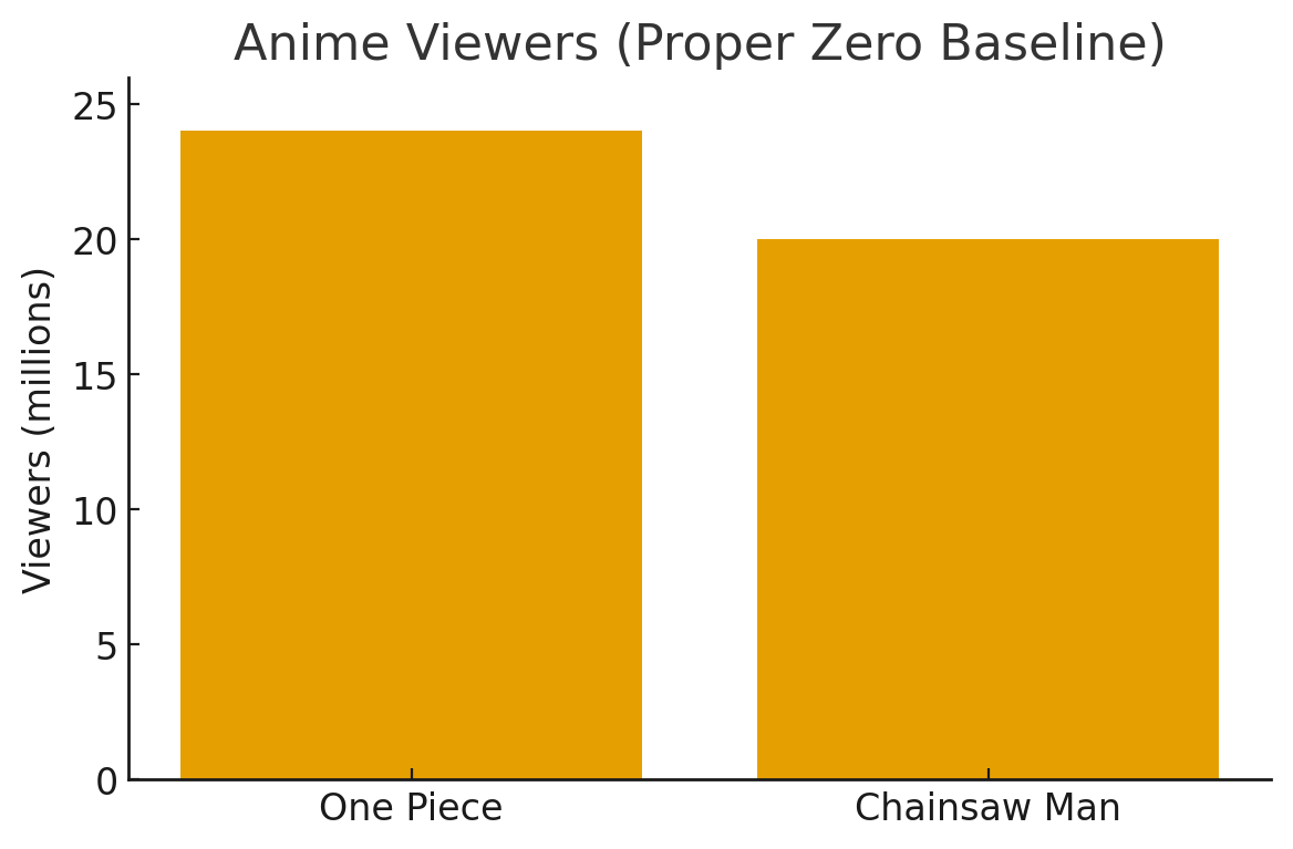
02 — Some Illusions Distort Data
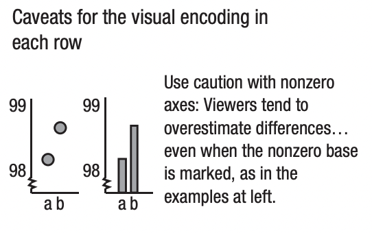
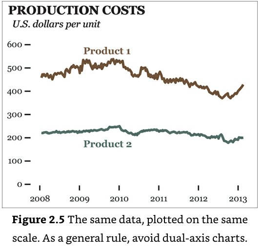
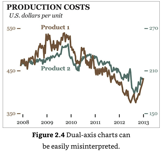
Dual Axis is bad.
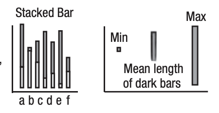
What’s the average?
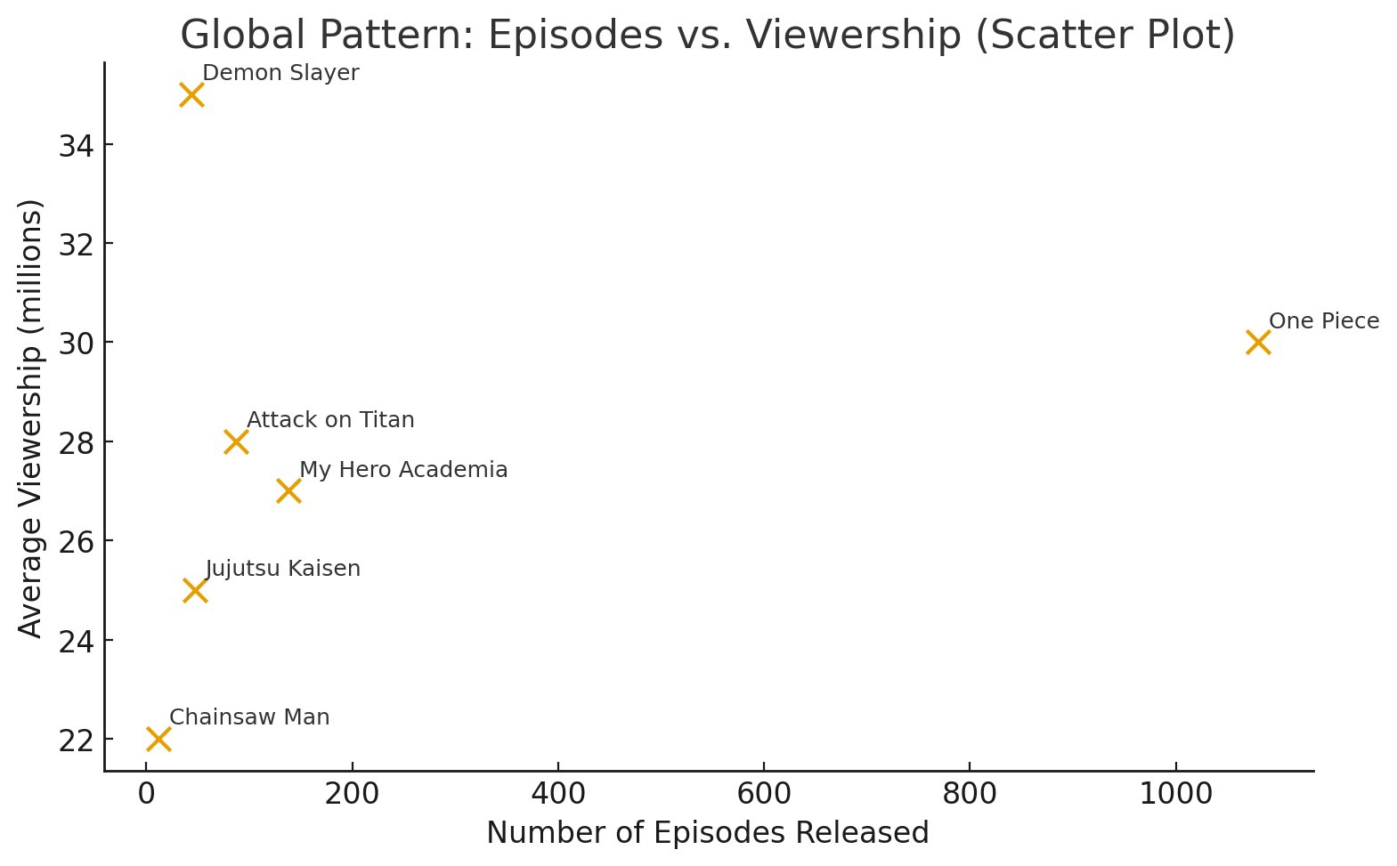
03 — Global Statistics Are Fast
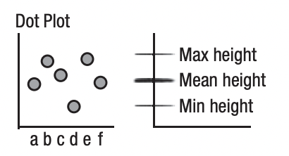
Find the anime with viewers lower in 2025 than 2024
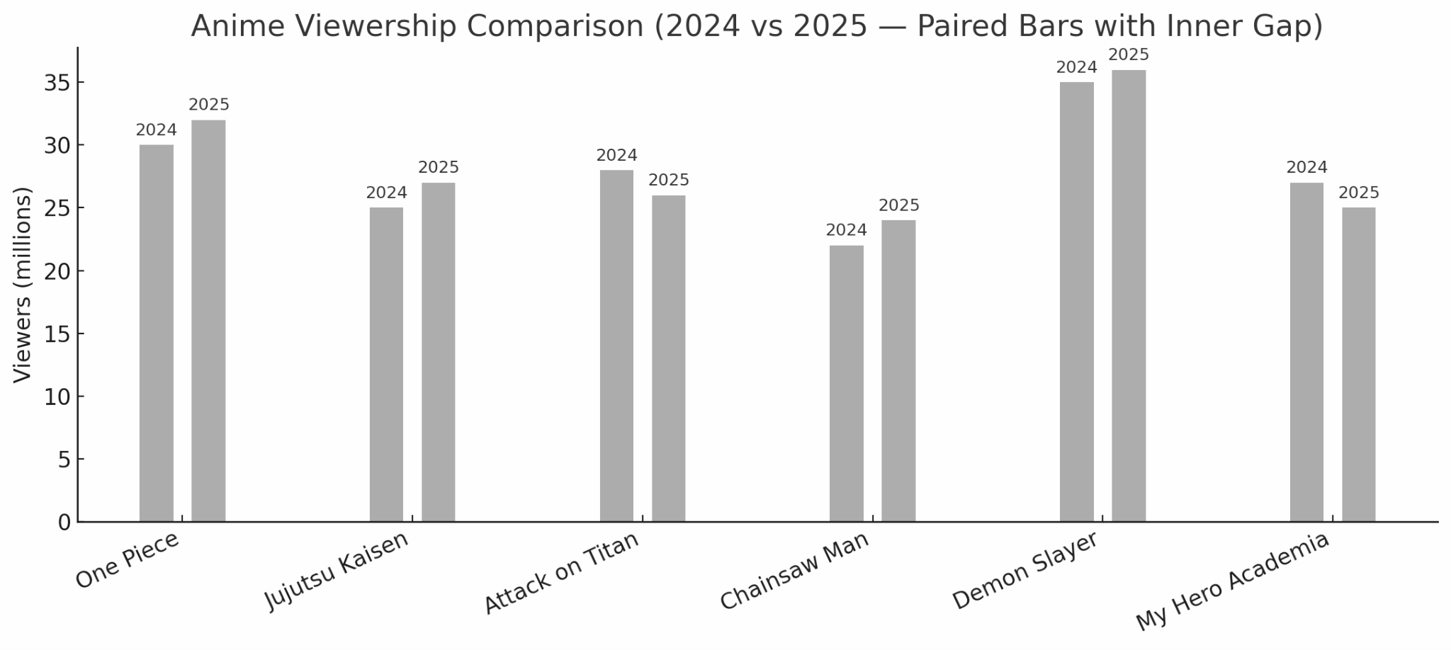
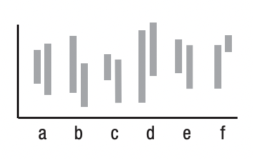
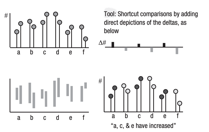
04 — Comparisons Are Slow
Guide the eyes!
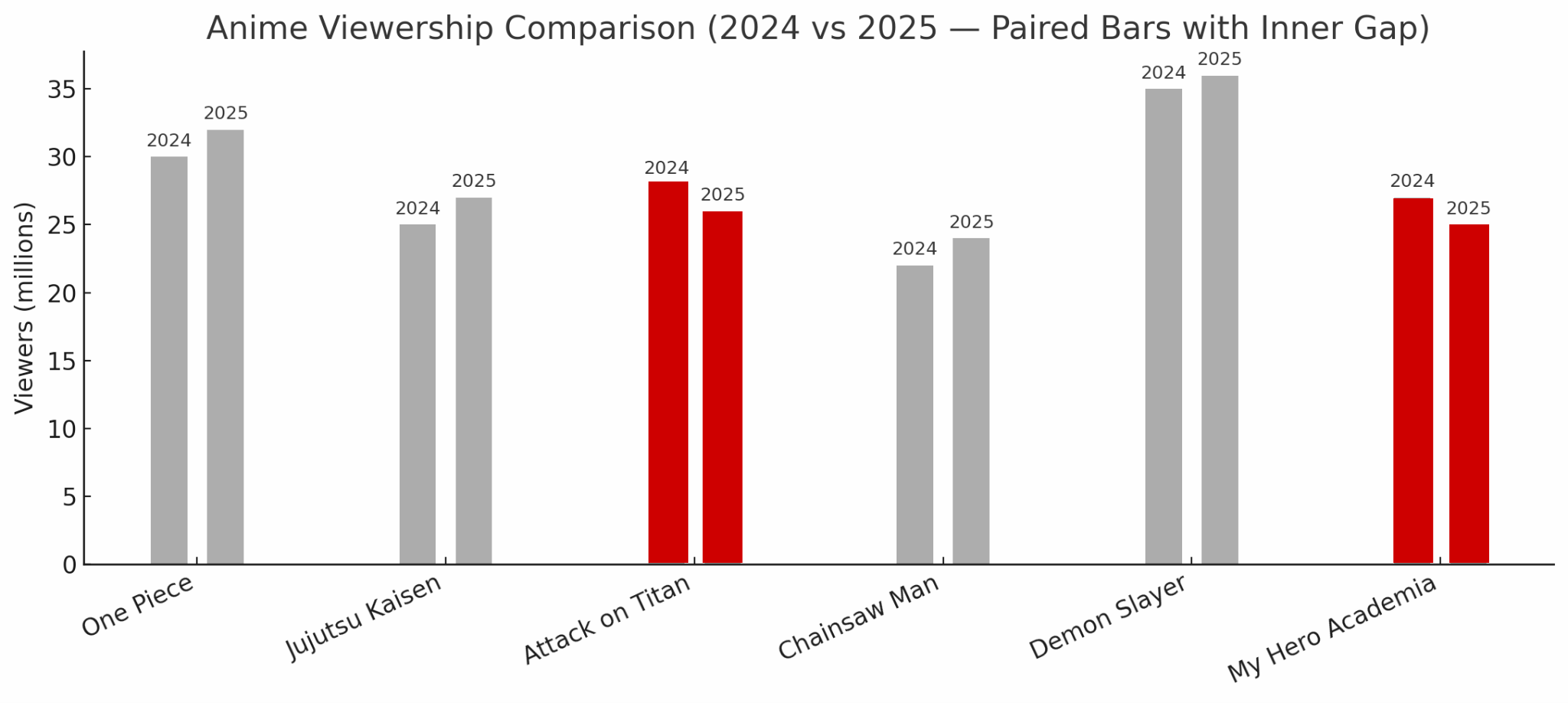
Attack on Titan and My Hero Academia Have Reduced Viewerships

05 — Guide Viewers to the Right Comparisons
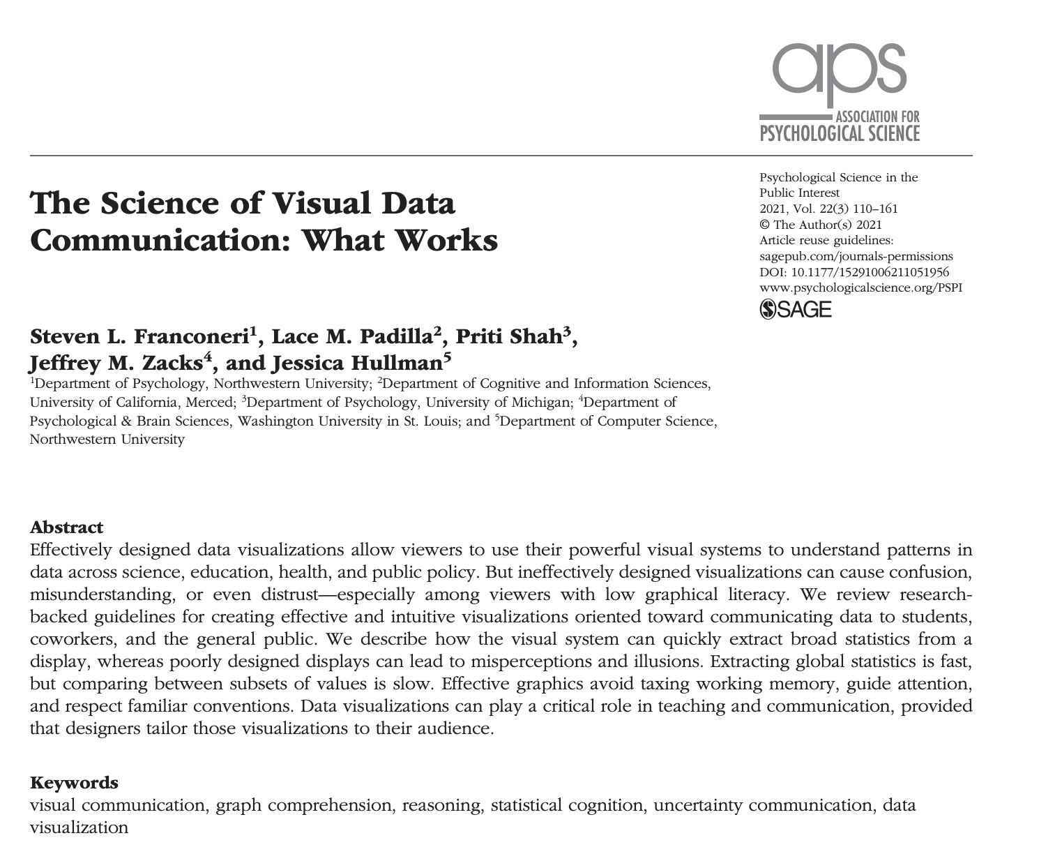
Read this paper :)
1 — Simplify · 2 — Structure · 3 — Story

Let’s Transform This Chart

Example 1

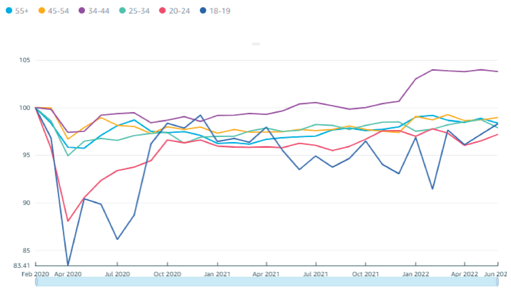
Let’s transform this chart
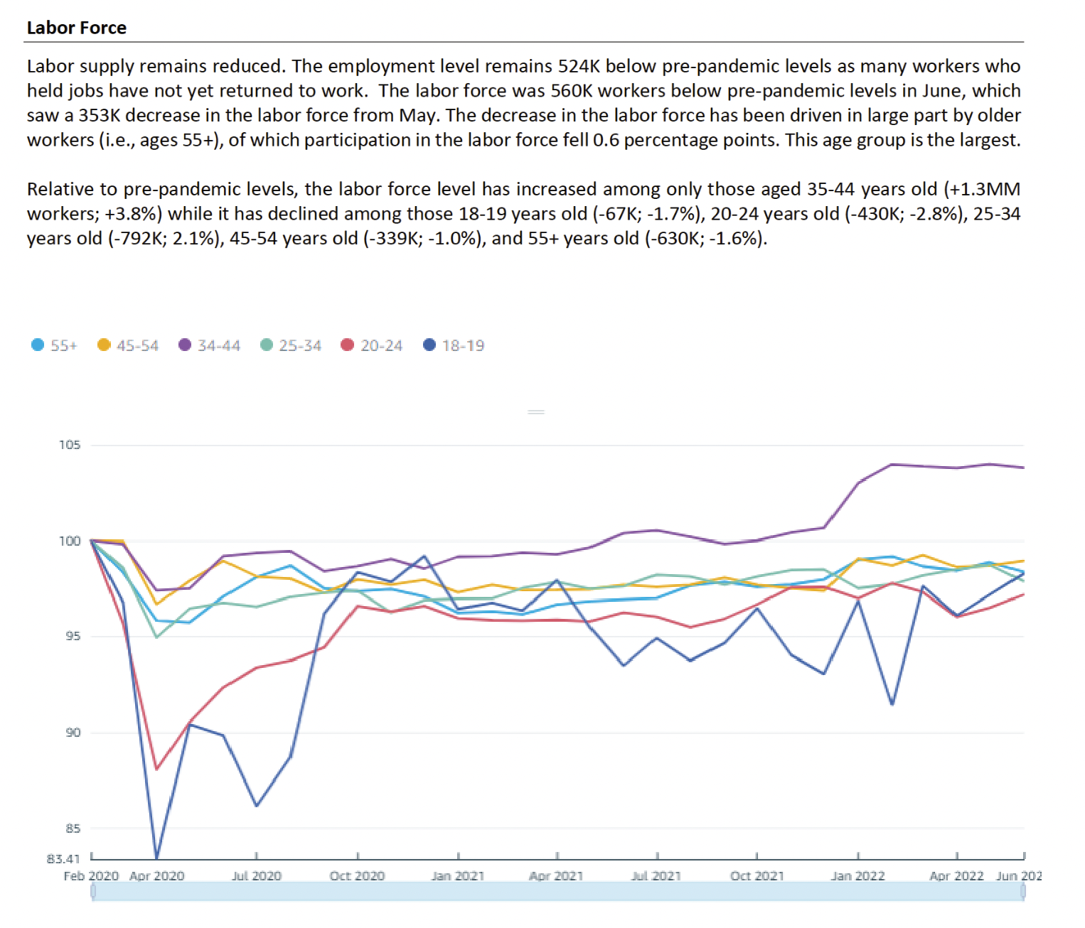
Transform Legends

Our eyes have to move back and forth between the legend and the chart to find the appropriate line.
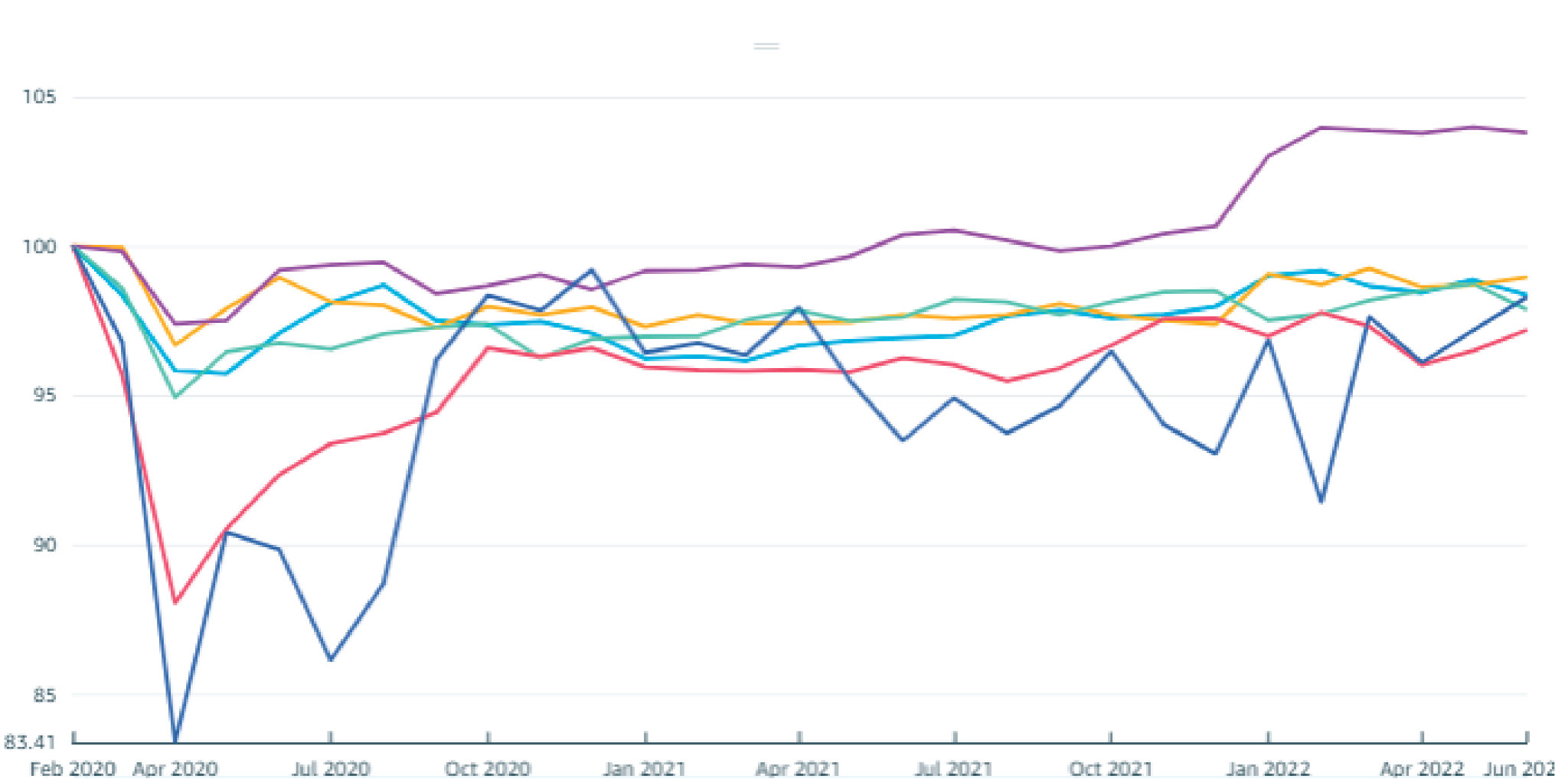
Transform Legends

So we can potentially remove the legend from the top.
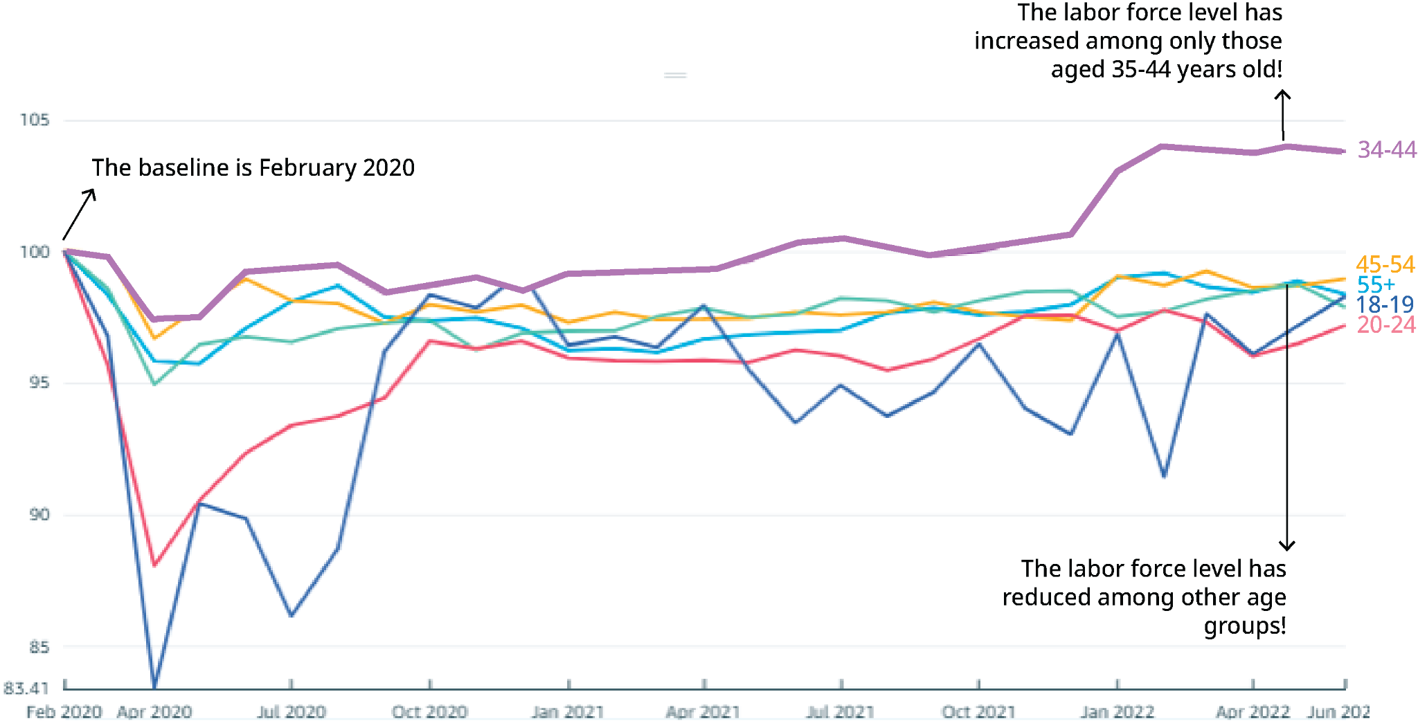
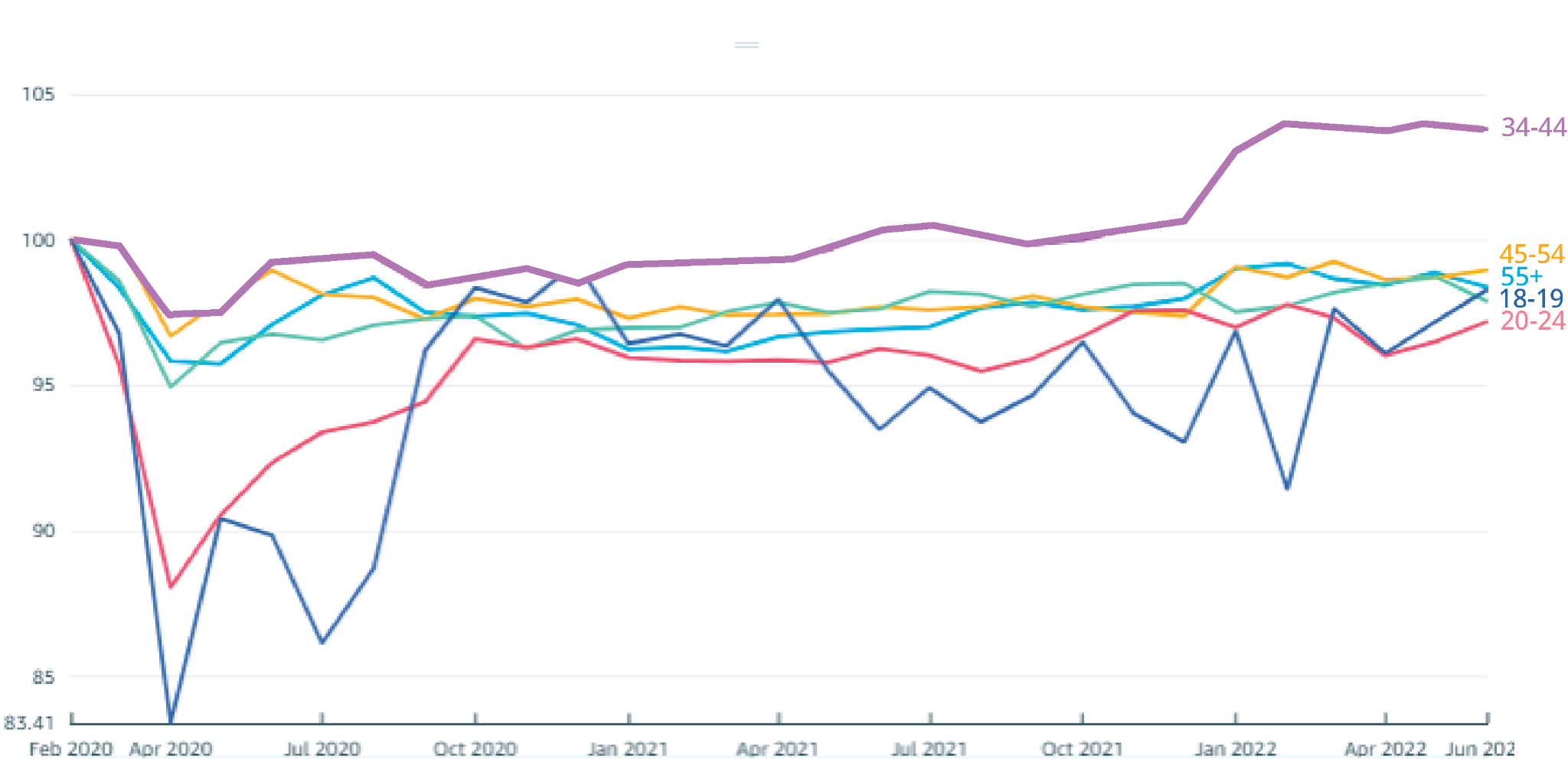
Directly Label Lines

Now we can quickly find the different age categories in the chart.
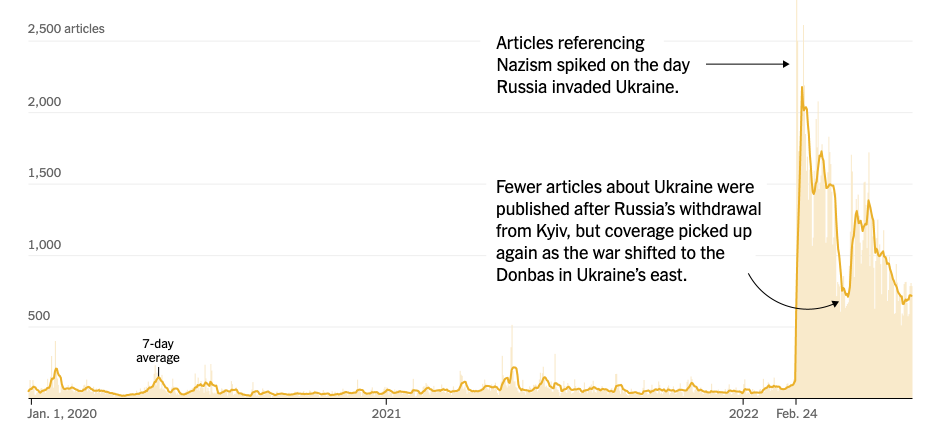
Annotate Charts to Tell a Story

We can use some of the text to directly annotate the chart.

Before and After
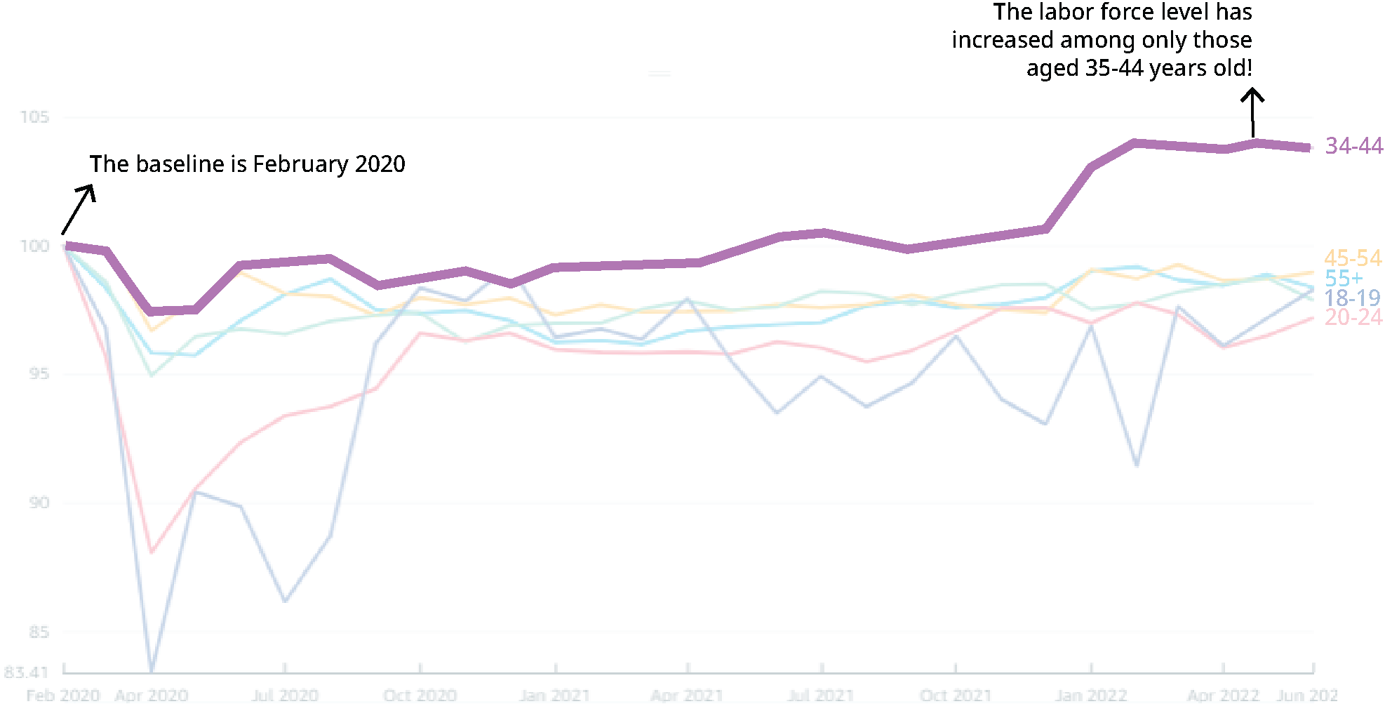
Highlight an Element of the Chart

If an element in the chart is important, we can guide the reader’s eyes with opacity and highlighting.