Week 5 — Feature Engineering

IAT 461 / 882 · Data Science for Human-Centered Systems · Summer 2026 · Alireza Karduni

Feature Engineering

What does a model do?

%%{init: {'theme': 'base', 'themeVariables': {'primaryColor': '#efefef', 'primaryTextColor': '#2d2d2d', 'primaryBorderColor': '#cccccc', 'lineColor': '#999999', 'fontFamily': 'Inter, sans-serif', 'fontSize': '18px', 'edgeLabelBackground': '#ffffff'}, 'flowchart': {'rankDir': 'LR', 'curve': 'linear'}}}%%
flowchart LR
    D["📊 Data"]

    classDef accent fill:#e8925a,color:#fff,stroke:none
    classDef muted fill:#efefef,color:#2d2d2d,stroke:#cccccc

    class D muted

What does a model do?

%%{init: {'theme': 'base', 'themeVariables': {'primaryColor': '#efefef', 'primaryTextColor': '#2d2d2d', 'primaryBorderColor': '#cccccc', 'lineColor': '#999999', 'fontFamily': 'Inter, sans-serif', 'fontSize': '18px', 'edgeLabelBackground': '#ffffff'}, 'flowchart': {'rankDir': 'LR', 'curve': 'linear'}}}%%
flowchart LR
    D["📊 Data"] --> M["🧠 Model"]

    classDef accent fill:#e8925a,color:#fff,stroke:none
    classDef muted fill:#efefef,color:#2d2d2d,stroke:#cccccc

    class D muted
    class M accent

What does a model do?

%%{init: {'theme': 'base', 'themeVariables': {'primaryColor': '#efefef', 'primaryTextColor': '#2d2d2d', 'primaryBorderColor': '#cccccc', 'lineColor': '#999999', 'fontFamily': 'Inter, sans-serif', 'fontSize': '18px', 'edgeLabelBackground': '#ffffff'}, 'flowchart': {'rankDir': 'LR', 'curve': 'linear'}}}%%
flowchart LR
    D["📊 Data"] --> M["🧠 Model"] --> P["🎯 Prediction"]

    classDef accent fill:#e8925a,color:#fff,stroke:none
    classDef muted fill:#efefef,color:#2d2d2d,stroke:#cccccc

    class D muted
    class M accent
    class P muted

What does a model do?

%%{init: {'theme': 'base', 'themeVariables': {'primaryColor': '#efefef', 'primaryTextColor': '#2d2d2d', 'primaryBorderColor': '#cccccc', 'lineColor': '#999999', 'fontFamily': 'Inter, sans-serif', 'fontSize': '18px', 'edgeLabelBackground': '#ffffff'}, 'flowchart': {'rankDir': 'LR', 'curve': 'linear'}}}%%
flowchart LR
    D["📊 Data"] --> M["🧠 Model"] --> P["🎯 Prediction"]
    M --> C["🏷️ Classification"]
    M --> H["📐 Hypothesis Testing"]

    classDef accent fill:#e8925a,color:#fff,stroke:none
    classDef muted fill:#efefef,color:#2d2d2d,stroke:#cccccc

    class D muted
    class M accent
    class P muted

A YouTube video — what we see

video_id title category channel_tier upload_day views
vid_0042 STOP using ChatGPT WRONG Debate & Controversy Mid Saturday 284,991

A YouTube video — what we see

video_id title category channel_tier upload_day views
vid_0042 STOP using ChatGPT WRONG Debate & Controversy Mid Saturday 284,991
  • video_id — just a label, useless to a model
  • title — free text, a model can’t read sentences
  • category — a word, not a number
  • channel_tier — Small / Mid / Large — what does “Mid” mean mathematically?
  • upload_day — “Saturday” is not a number
  • views — ✅ already a number

What a model actually sees

column value
title STOP using ChatGPT WRONG
category Debate & Controversy
channel_tier Mid
upload_day Saturday
duration_seconds 743
subscribers 184,200
  • A model needs one row of numbers
  • Every column must become a number
  • Text, categories, and dates all need to be translated
  • \[\mathbf{x} = [0.51,\ 0,\ 1,\ 0,\ 0,\ 1,\ 0,\ 743,\ 0.23]\]

What a model actually sees

column value
title STOP using ChatGPT WRONG caps_count = 3
category Debate & Controversy [0, 0, 1, 0, 0, 0]
channel_tier Mid 1
upload_day Saturday is_weekend = 1
duration_seconds 743 743
subscribers 184,200 0.23

\[\mathbf{x} = [3,\ 0,\ 0,\ 1,\ 0,\ 0,\ 0,\ 1,\ 1,\ 743,\ 0.23]\]

  • Every row in the dataset becomes a vector like this
  • The model sees only these numbers — nothing else
  • Feature engineering is the process of building this vector

Not all features belong

Suppose we want to predict view count before a video goes live.

column available before upload?
title ✅ yes
category ✅ yes
upload_day ✅ yes
subscribers ✅ yes
likes ❌ only exists after upload
comments ❌ only exists after upload

Including likes or comments would leak the future into the model.
The prediction would look great — and be completely useless in practice.

Feature engineering

Transforming raw data into a vector of numbers a model can learn from —
while choosing the right features for the question being asked.

Feature engineering

%%{init: {'theme': 'base', 'themeVariables': {'primaryColor': '#efefef', 'primaryTextColor': '#2d2d2d', 'primaryBorderColor': '#cccccc', 'lineColor': '#999999', 'fontFamily': 'Inter, sans-serif', 'fontSize': '18px', 'edgeLabelBackground': '#ffffff'}, 'flowchart': {'rankDir': 'LR', 'curve': 'linear'}}}%%
flowchart LR
    R["📋 Raw Data"] --> F["⚙️ Feature Engineering"] 

    classDef accent fill:#e8925a,color:#fff,stroke:none
    classDef muted fill:#efefef,color:#2d2d2d,stroke:#cccccc

    class R muted
    class F accent
    class V muted
    class M muted

Feature engineering

%%{init: {'theme': 'base', 'themeVariables': {'primaryColor': '#efefef', 'primaryTextColor': '#2d2d2d', 'primaryBorderColor': '#cccccc', 'lineColor': '#999999', 'fontFamily': 'Inter, sans-serif', 'fontSize': '18px', 'edgeLabelBackground': '#ffffff'}, 'flowchart': {'rankDir': 'LR', 'curve': 'linear'}}}%%
flowchart LR
    R["📋 Raw Data"] --> F["⚙️ Feature Engineering"] --> V["🔢 Feature Vector"] --> M["🧠 Model"]

    classDef accent fill:#e8925a,color:#fff,stroke:none
    classDef muted fill:#efefef,color:#2d2d2d,stroke:#cccccc

    class R muted
    class F accent
    class V muted
    class M muted

Let’s learn some feature engineering ideas.

Scaling & Normalization

Putting features on a common scale so the model treats them fairly.

Min-Max Scaling — why?

Different features live on completely different scales.

feature min max
duration_seconds 120 14,400
click_through_rate 0.01 0.25
subscribers 5,000 8,000,000

A model seeing these raw will treat subscribers as overwhelmingly important — not because it is, but because its numbers are bigger.

\[x' = \frac{x - x_{min}}{x_{max} - x_{min}} \qquad x' \in [0, 1]\]

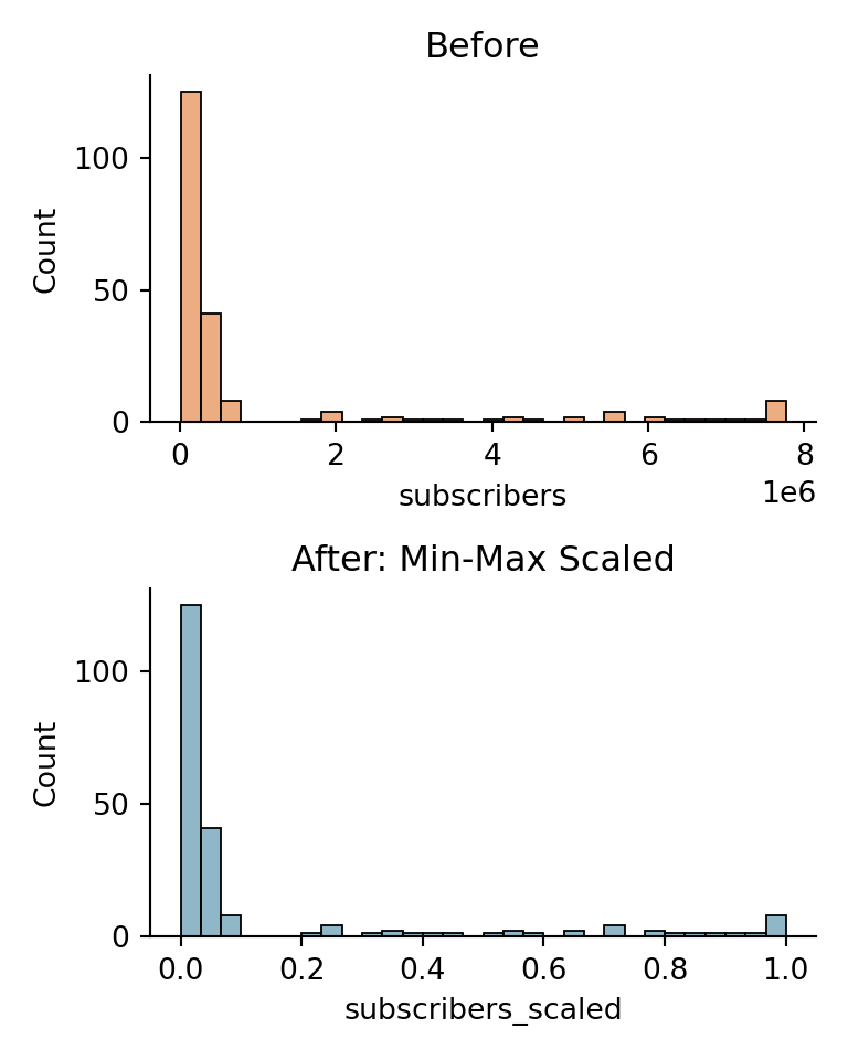
Min-Max Scaling — in our dataset

subscribers ranges from ~5K to ~8M depending on channel tier.
Raw, it dominates any distance-based model.

video_id channel_tier subscribers subscribers_scaled
vid_0012 Small 5,210 0.001
vid_0091 Mid 184,200 0.022
vid_0003 Large 7,803,441 0.975

All three rows now live in [0, 1] — the model can compare them fairly.

Min-Max Scaling — code

import pandas as pd
import seaborn as sns
import matplotlib.pyplot as plt
from sklearn.preprocessing import MinMaxScaler

df = pd.read_csv("data/youtube_videos.csv")

scaler = MinMaxScaler()
df["subscribers_scaled"] = scaler.fit_transform(
    df[["subscribers"]]
)

fig, axes = plt.subplots(2, 1, figsize=(4, 5))

sns.histplot(df["subscribers"], 
             ax=axes[0], 
             color="#e8925a", bins=30)
axes[0].set_title("Before")
axes[0].set_xlabel("subscribers")

sns.histplot(df["subscribers_scaled"], 
             ax=axes[1], 
             color="#6a9fb5", bins=30)
axes[1].set_title("After: Min-Max Scaled")
axes[1].set_xlabel("subscribers_scaled")

sns.despine()
plt.tight_layout()
plt.show()
Standardization (Z-score) — why?

Center things around 0 (mean = 0)

Z-score scaling centers the data around mean = 0 and scales by standard deviation:

\[x' = \frac{x - \mu}{\sigma}\]

Min-Max Z-score
Range always [0, 1] unbounded
Outlier sensitivity ❌ high ✅ lower
Preserves distribution shape

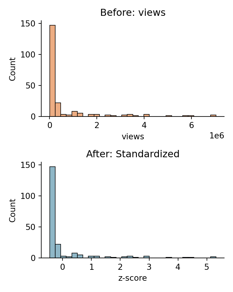
Standardization — in our dataset

views is heavily skewed — a few viral videos pull the max to 25M.
Min-Max would compress 95% of videos into a tiny range near 0.

video_id channel_tier views views_scaled
vid_0012 Small 1,412 -0.61
vid_0091 Mid 284,991 0.12
vid_0003 Large 7,038,551 4.83

Values are now centered around 0 — most videos sit between -1 and 2, outliers clearly visible beyond that.

Standardization — code

import pandas as pd
import seaborn as sns
import matplotlib.pyplot as plt
from sklearn.preprocessing import StandardScaler

df = pd.read_csv("data/youtube_videos.csv")

scaler = StandardScaler()
df["views_scaled"] = scaler.fit_transform(df[["views"]])

fig, axes = plt.subplots(2, 1, figsize=(4, 5))

sns.histplot(df["views"],
             ax=axes[0],
             color="#e8925a", bins=30)
axes[0].set_title("Before: views")
axes[0].set_xlabel("views")

sns.histplot(df["views_scaled"],
             ax=axes[1],
             color="#6a9fb5", bins=30)
axes[1].set_title("After: Standardized")
axes[1].set_xlabel("z-score")

sns.despine()
plt.tight_layout()
plt.show()
Robust Scaling — why?

Z-score still uses the mean — which is pulled by outliers.
Robust scaling uses the median and interquartile range (IQR) instead.

\[x' = \frac{x - \text{median}}{\text{IQR}} \qquad \text{IQR} = Q_3 - Q_1\]

Z-score Robust
Center mean median
Scale std deviation IQR

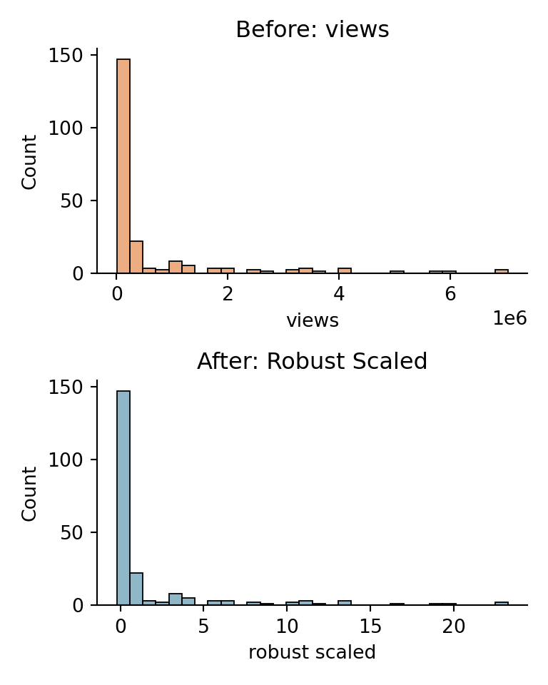
Robust Scaling — in our dataset

views has extreme outliers — viral Large-tier videos reaching 25M.
These pull the mean and std, distorting Z-score scaling for everyone else.

video_id channel_tier views views_robust
vid_0012 Small 1,412 -0.71
vid_0091 Mid 284,991 0.08
vid_0003 Large 7,038,551 2.14
vid_0187 Large 24,100,000 8.91

The outlier is still visible — but it no longer collapses everyone else to near zero.

Robust Scaling — code

import pandas as pd
import seaborn as sns
import matplotlib.pyplot as plt
from sklearn.preprocessing import RobustScaler

df = pd.read_csv("data/youtube_videos.csv")

scaler = RobustScaler()
df["views_robust"] = scaler.fit_transform(df[["views"]])

fig, axes = plt.subplots(2, 1, figsize=(4, 5))

sns.histplot(df["views"],
             ax=axes[0],
             color="#e8925a", bins=30)
axes[0].set_title("Before: views")
axes[0].set_xlabel("views")

sns.histplot(df["views_robust"],
             ax=axes[1],
             color="#6a9fb5", bins=30)
axes[1].set_title("After: Robust Scaled")
axes[1].set_xlabel("robust scaled")

sns.despine()
plt.tight_layout()
plt.show()
Numerical Transformations

Reshaping the values of a feature to better reveal its structure.

Log Transform — why?

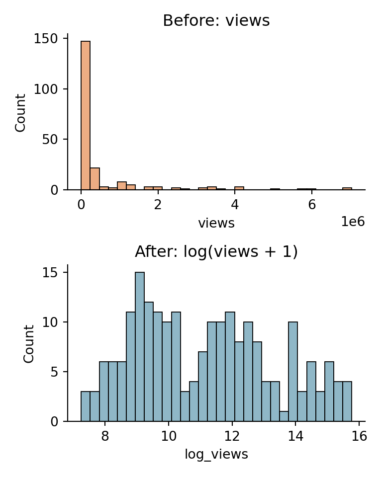
Many real-world variables grow exponentially — a small number of cases dominate the range, compressing everything else to the left.

The log transform pulls the long tail back in:

\[x' = \log(x + 1)\]

The +1 avoids log(0) for zero-valued rows. IF there are no zeros, you can skip the +1.

before after
most values crushed near zero spread evenly across range
a few huge outliers outliers visible but not dominating
hard for models to learn from much easier to fit a line through

Log Transform — in our dataset

views, subscribers, and watch_time_minutes are all heavily right-skewed.
A Small channel with 1K views and a Large channel with 7M views are worlds apart — but models see them on a linear scale.

video_id channel_tier views log_views
vid_0012 Small 1,412 7.25
vid_0091 Mid 284,991 12.56
vid_0003 Large 7,038,551 15.77

The gap between Small and Large compresses from 7 million to just 8 log units — a scale a model can reason about.

Log Transform — code

import pandas as pd
import numpy as np
import seaborn as sns
import matplotlib.pyplot as plt

df = pd.read_csv("data/youtube_videos.csv")

df["log_views"] = np.log1p(df["views"])

fig, axes = plt.subplots(2, 1, figsize=(4, 5))

sns.histplot(df["views"],
             ax=axes[0],
             color="#e8925a", bins=30)
axes[0].set_title("Before: views")
axes[0].set_xlabel("views")

sns.histplot(df["log_views"],
             ax=axes[1],
             color="#6a9fb5", bins=30)
axes[1].set_title("After: log(views + 1)")
axes[1].set_xlabel("log_views")

sns.despine()
plt.tight_layout()
plt.show()
Binning — why?

Sometimes a continuous number is less meaningful than the category it falls into.
A model predicting engagement doesn’t need to know a video is exactly 743 seconds — it needs to know it’s a medium-length video.

Binning converts a continuous feature into ordered groups:

\[x' = \begin{cases} \text{short} & x < 300 \\ \text{medium} & 300 \leq x < 1800 \\ \text{long} & x \geq 1800 \end{cases}\]

when to bin when not to bin
domain knowledge defines meaningful ranges the exact value matters
reduce noise in a messy variable you’ll lose information you need
make a non-linear relationship linear

Binning — in our dataset

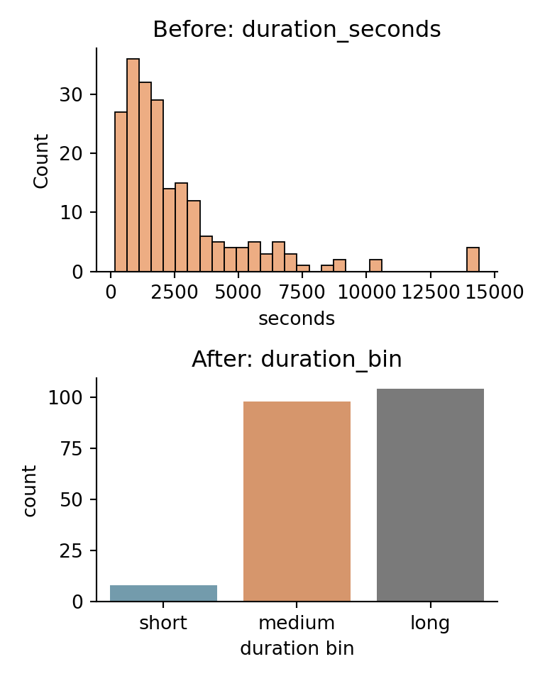
duration_seconds ranges from 2 minutes to 4 hours.
YouTube creators and viewers think in terms of short clips, standard videos, and long-form content — not raw seconds.

video_id duration_seconds duration_bin
vid_0044 187 short
vid_0091 743 medium
vid_0003 1,413 medium
vid_0021 5,820 long

We can now encode duration_bin as a categorical feature — or use it directly as a grouping variable in analysis.

Binning — code

Binning — code

import pandas as pd
import seaborn as sns
import matplotlib.pyplot as plt

df = pd.read_csv("data/youtube_videos.csv")

bins = [0, 300, 1800, float("inf")]
labels = ["short", "medium", "long"]

df["duration_bin"] = pd.cut(
    df["duration_seconds"],
    bins=bins,
    labels=labels
)

order = ["short", "medium", "long"]
colors = ["#6a9fb5", "#e8925a", "#7a7a7a"]

fig, axes = plt.subplots(2, 1, figsize=(4, 5))

sns.histplot(df["duration_seconds"],
             ax=axes[0],
             color="#e8925a", bins=30)
axes[0].set_title("Before: duration_seconds")
axes[0].set_xlabel("seconds")

sns.countplot(data=df,
              x="duration_bin",
              order=order,
              palette=colors,
              ax=axes[1])
axes[1].set_title("After: duration_bin")
axes[1].set_xlabel("duration bin")
axes[1].set_ylabel("count")

sns.despine()
plt.tight_layout()
plt.show()
Encoding Categorical Variables

Converting categories into numbers — in a way that preserves their meaning.

Ordinal Encoding — why?

Some categories have a natural order. Treating them as arbitrary labels throws that information away.

Ordinal encoding maps each category to an integer that reflects its rank:

\[\text{Small} \rightarrow 0 \quad \text{Mid} \rightarrow 1 \quad \text{Large} \rightarrow 2\]

use ordinal encoding when avoid it when
categories have a clear order order is ambiguous or arbitrary
the rank difference matters differences between ranks aren’t equal
e.g. Small < Mid < Large e.g. Gaming, Music, News

Ordinal Encoding — in our dataset

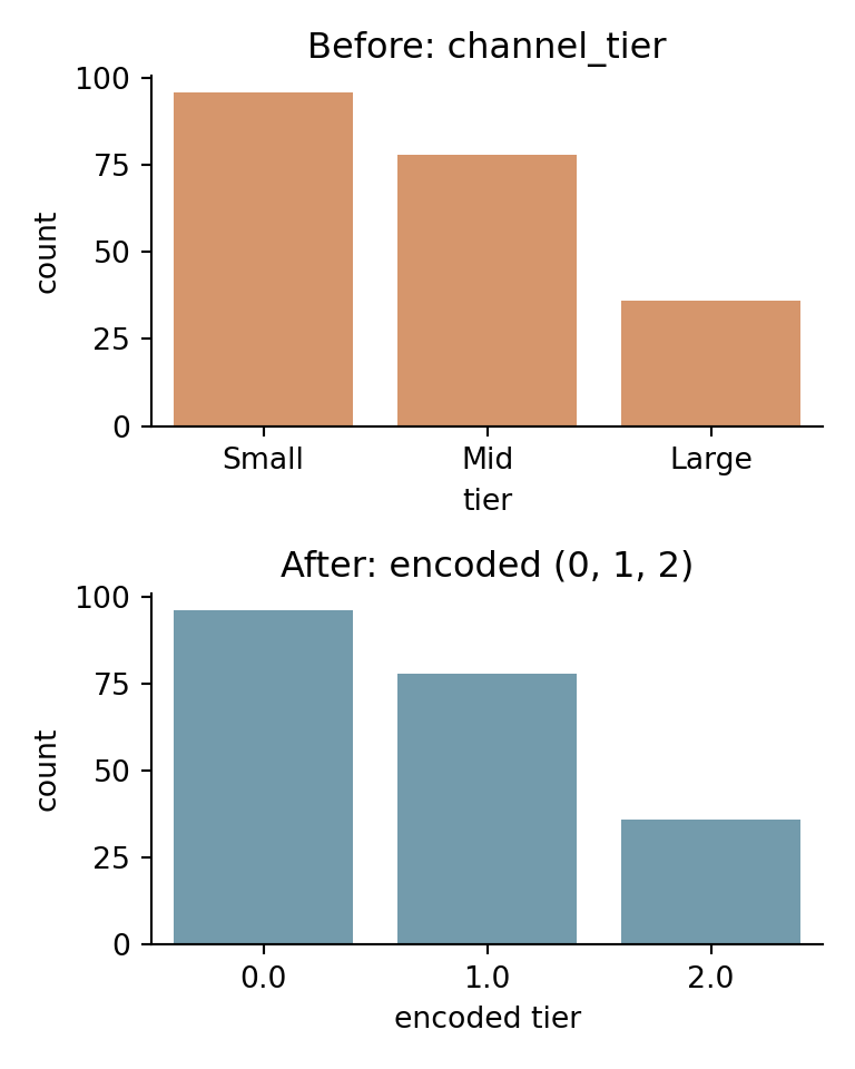
channel_tier has a clear ordering — Small channels have fewer subscribers, less reach, and typically fewer views than Mid or Large.
A model should know that Large > Mid > Small.

video_id channel_tier channel_tier_encoded
vid_0012 Small 0
vid_0091 Mid 1
vid_0003 Large 2

The model can now reason that Large (2) is meaningfully greater than Small (0) — not just different.

Ordinal Encoding — code

import pandas as pd
import seaborn as sns
import matplotlib.pyplot as plt
from sklearn.preprocessing import OrdinalEncoder

df = pd.read_csv("data/youtube_videos.csv")

enc = OrdinalEncoder(categories=[["Small", "Mid", "Large"]])
df["channel_tier_encoded"] = enc.fit_transform(
    df[["channel_tier"]]
)

fig, axes = plt.subplots(2, 1, figsize=(4, 5))

order_str = ["Small", "Mid", "Large"]
sns.countplot(data=df,
              x="channel_tier",
              order=order_str,
              color="#e8925a",
              ax=axes[0])
axes[0].set_title("Before: channel_tier")
axes[0].set_xlabel("tier")

order_num = [0, 1, 2]
sns.countplot(data=df,
              x="channel_tier_encoded",
              color="#6a9fb5",
              ax=axes[1])
axes[1].set_title("After: encoded (0, 1, 2)")
axes[1].set_xlabel("encoded tier")

sns.despine()
plt.tight_layout()
plt.show()
One-Hot Encoding — why?

When categories have no natural order, assigning integers is misleading.
Is “Gaming” = 3 really greater than “Music” = 1? The model might think so.

One-hot encoding creates a separate binary column for each category:

category is_Tutorial is_Review is_News is_Debate is_Project is_Productivity
Tutorial 1 0 0 0 0 0
Review 0 1 0 0 0 0
Debate & Controversy 0 0 0 1 0 0

Each category gets its own dimension — no false ordering imposed.

One-Hot Encoding — in our dataset

category has 6 unordered values: Tutorial, Review, News & Opinion, Project Showcase, Debate & Controversy, Productivity & Tools.
A model treating these as 0–5 would wrongly assume Productivity (5) is “more” than Tutorial (0).

video_id category is_Tutorial is_Review is_Debate
vid_0012 Tutorial 1 0 0
vid_0091 Review 0 1 0
vid_0003 Debate & Controversy 0 0 1

The tradeoff: more columns. With 6 categories we add 6 new binary features — manageable. With 1000 categories it becomes expensive.

One-Hot Encoding — code

import pandas as pd
import seaborn as sns
import matplotlib.pyplot as plt

df = pd.read_csv("data/youtube_videos.csv")

ohe = pd.get_dummies(df["category"], prefix="is")

result = pd.concat([df[["video_id", "category"]], ohe], axis=1)

print(result.head(6).to_string(index=False))
video_id category  is_Comedy  is_Education  is_Gaming  is_Music  is_News  is_Vlog
vid_0000    Music      False         False      False      True    False    False
vid_0001   Gaming      False         False       True     False    False    False
vid_0002   Gaming      False         False       True     False    False    False
vid_0003   Gaming      False         False       True     False    False    False
vid_0004    Music      False         False      False      True    False    False
vid_0005     News      False         False      False     False     True    False

Date & Time Features

Extracting meaningful signals from when something happened.

Date & Time Features — why?

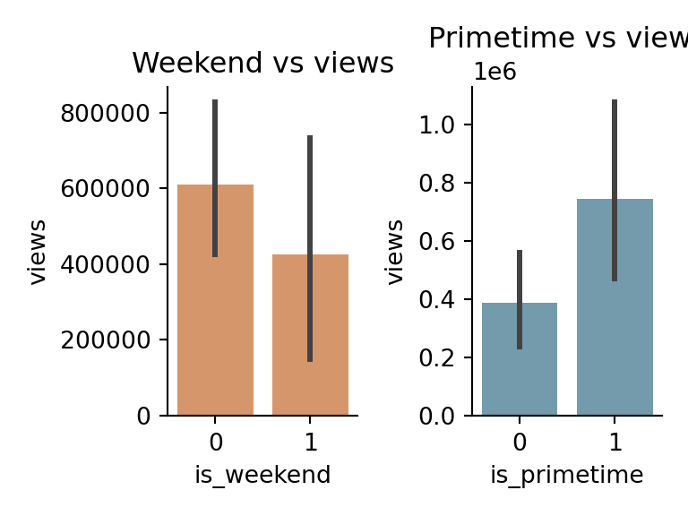
Raw timestamps aren’t useful to a model — but the patterns within them are.
When a video is uploaded matters as much as what it contains.

raw feature engineered feature why it matters
upload_day is_weekend weekend uploads reach more idle viewers
upload_hour is_primetime 18:00–22:00 is peak viewing time

A model can’t learn from “Saturday” — but it can learn from is_weekend = 1.

Date & Time Features — in our dataset

upload_day and upload_hour are already extracted in our dataset.
We can engineer two binary features directly from them.

video_id upload_day upload_hour is_weekend is_primetime
vid_0012 Monday 9 0 0
vid_0091 Saturday 20 1 1
vid_0003 Sunday 14 1 0
vid_0021 Friday 19 0 1

Date & Time Features — code

import pandas as pd
import numpy as np
import seaborn as sns
import matplotlib.pyplot as plt

df = pd.read_csv("data/youtube_videos.csv")

# simulate a full timestamp from existing day/hour columns
day_map = {
    "Monday": 0, "Tuesday": 1, "Wednesday": 2,
    "Thursday": 3, "Friday": 4, "Saturday": 5, "Sunday": 6
}
rng = np.random.default_rng(42)
base = pd.Timestamp("2024-01-01")

df["uploaded_at"] = [
    base
    + pd.offsets.Week(weekday=day_map[d])
    + pd.Timedelta(hours=int(h))
    + pd.Timedelta(minutes=int(rng.integers(0, 60)))
    for d, h in zip(df["upload_day"], df["upload_hour"])
]

# extract features from timestamp
df["is_weekend"] = (df["uploaded_at"].dt.dayofweek >= 5).astype(int)
df["is_primetime"] = (
    (df["uploaded_at"].dt.hour >= 18) &
    (df["uploaded_at"].dt.hour <= 22)
).astype(int)

fig, axes = plt.subplots(1, 2, figsize=(4, 3))

sns.barplot(data=df,
            x="is_weekend",
            y="views",
            color="#e8925a",
            ax=axes[0])
axes[0].set_title("Weekend vs views")
axes[0].set_xlabel("is_weekend")

sns.barplot(data=df,
            x="is_primetime",
            y="views",
            color="#6a9fb5",
            ax=axes[1])
axes[1].set_title("Primetime vs views")
axes[1].set_xlabel("is_primetime")

sns.despine()
plt.tight_layout()
plt.show()
Text Features

Turning words into numbers — without losing what makes them meaningful.

ANALYZING TEXT DATA

title caps_count
I tested ChatGPT for 30 days -
STOP using Claude WRONG -
URGENT: GPT-4 is about to CHANGE EVERYTHING -

ANALYZING TEXT DATA

title caps_count
I tested ChatGPT for 30 days 0
STOP using Claude WRONG 2
URGENT: GPT-4 is about to CHANGE EVERYTHING 3

Raw title text is useless to a model. But patterns within text carry signal.
Sensationalized titles on YouTube deliberately use ALL CAPS words to grab attention.

Counting ALL CAPS words is a simple domain knowledge feature — it encodes something we know about the data before modeling.

ALL CAPS count — in our dataset

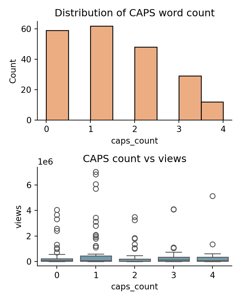
Our dataset has ~38% sensationalized titles — concentrated in Debate & Controversy and Productivity & Tools categories.
Does the number of ALL CAPS words correlate with views?

ALL CAPS count — code

import pandas as pd
import seaborn as sns
import matplotlib.pyplot as plt

df = pd.read_csv("data/youtube_videos.csv")

df["caps_count"] = df["title"].apply(
    lambda t: sum(1 for w in t.split() if w.isupper())
)

fig, axes = plt.subplots(2, 1, figsize=(4, 5))

sns.histplot(df["caps_count"],
             bins=8,
             color="#e8925a",
             ax=axes[0])
axes[0].set_title("Distribution of CAPS word count")
axes[0].set_xlabel("caps_count")

sns.boxplot(data=df,
            x="caps_count",
            y="views",
            color="#6a9fb5",
            ax=axes[1])
axes[1].set_title("CAPS count vs views")
axes[1].set_xlabel("caps_count")
axes[1].set_ylabel("views")

sns.despine()
plt.tight_layout()
plt.show()
From text to numbers — word counts

The simplest approach: count how many times each word appears in each document.
This is called a Bag of Words — order doesn’t matter, only counts.

title
“I tested ChatGPT”
“I tested Gemini”
“ChatGPT is amazing”
I tested ChatGPT Gemini is amazing
doc 1 1 1 1 0 0 0
doc 2 1 1 0 1 0 0
doc 3 0 0 1 0 1 1

Each row is now a vector of numbers — a model can work with this.

The problem with raw counts

In a larger corpus, common words like “I”, “the”, “is” appear everywhere.
They dominate the count matrix — but carry almost no meaning.

I tested ChatGPT Gemini is amazing
doc 1 1 1 1 0 0 0
doc 2 1 1 0 1 0 0
doc 3 0 0 1 0 1 1

“I” appears in 2 out of 3 documents — it tells us nothing about what makes each title distinctive.
We need a way to reward rare, meaningful words and penalize common ones.

TF-IDF — the idea

TF-IDF = Term Frequency × Inverse Document Frequency

  • TF — how often does this word appear in this document?
  • IDF — how rare is this word across all documents?

\[\text{TF-IDF}(t, d) = \text{TF}(t,d) \times \log\left(\frac{N}{df(t)}\right)\]

where \(N\) = total documents, \(df(t)\) = number of documents containing term \(t\)

word TF (doc 1) df IDF = log(3/df) TF-IDF
I 1 2 log(1.5) = 0.41 0.41
tested 1 2 log(1.5) = 0.41 0.41
ChatGPT 1 2 log(1.5) = 0.41 0.41
Gemini 0 1 log(3.0) = 1.10 0.00

A word that appears in every document gets IDF ≈ 0 — it contributes nothing.
A word unique to one document gets a high IDF — it’s distinctive.

TF-IDF — code

import pandas as pd
import seaborn as sns
import matplotlib.pyplot as plt
from sklearn.feature_extraction.text import TfidfVectorizer

df = pd.read_csv("data/youtube_videos.csv")

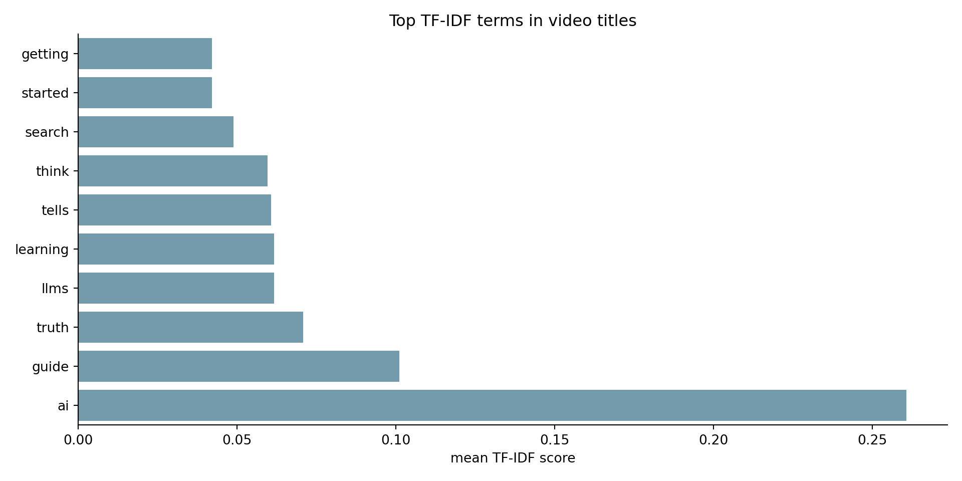
vectorizer = TfidfVectorizer(max_features=10, stop_words="english")
tfidf_matrix = vectorizer.fit_transform(df["title"])

terms = vectorizer.get_feature_names_out()
mean_scores = tfidf_matrix.toarray().mean(axis=0)

tfidf_df = pd.DataFrame({
    "term": terms,
    "mean_tfidf": mean_scores
}).sort_values("mean_tfidf", ascending=True)

sns.barplot(data=tfidf_df,
            x="mean_tfidf",
            y="term",
            color="#6a9fb5")

plt.title("Top TF-IDF terms in video titles")
plt.xlabel("mean TF-IDF score")
plt.ylabel("")
sns.despine()
plt.tight_layout()
plt.show()
Ratios & Interaction Features

Combining existing features to reveal relationships a model can’t see on its own.

Ratios — why?

Raw counts don’t tell the full story.
A video with 10,000 comments means something very different with 100K views vs 10M views.

Dividing one feature by another creates a normalized signal — one that accounts for scale:

\[\text{retention rate} = \frac{\text{watch time minutes}}{\text{duration seconds} / 60}\]

feature what it measures
watch_time_minutes total minutes watched — driven by views
duration_seconds / 60 how long the video actually is
retention_rate did viewers stay? independent of view count

Retention Rate — in our dataset

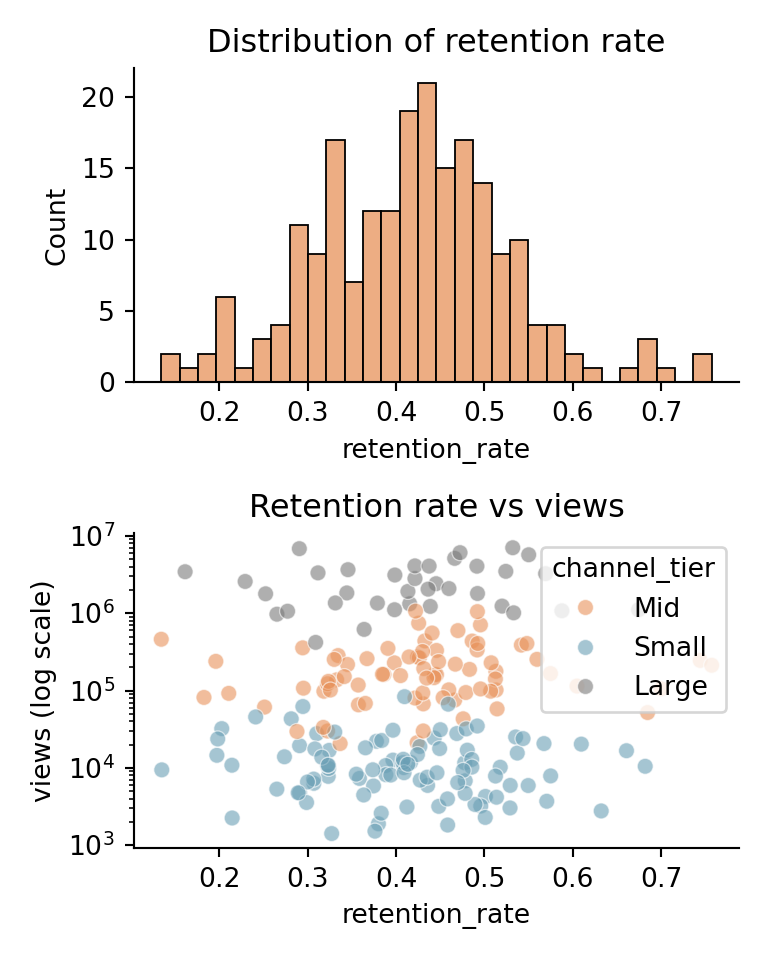
Two videos can have the same watch_time_minutes for very different reasons — one is short and rewatched, one is long and abandoned halfway.
Retention rate separates these cases.

video_id watch_time_minutes duration_seconds retention_rate
vid_0012 8,420 187 0.91
vid_0091 423,818 1,894 0.44
vid_0003 1,091,087 5,820 0.38

vid_0012 is a short video that people watched almost entirely — high retention.
vid_0003 is long-form content where most viewers dropped off — lower retention.

Retention Rate — code

import pandas as pd
import seaborn as sns
import matplotlib.pyplot as plt
import numpy as np

df = pd.read_csv("data/youtube_videos.csv")

df["duration_minutes"] = df["duration_seconds"] / 60

df["retention_rate"] = (
    df["watch_time_minutes"] /
    (df["views"] * df["duration_minutes"])
).clip(0, 1)

fig, axes = plt.subplots(2, 1, figsize=(4, 5))

sns.histplot(df["retention_rate"],
             bins=30,
             color="#e8925a",
             ax=axes[0])
axes[0].set_title("Distribution of retention rate")
axes[0].set_xlabel("retention_rate")

sns.scatterplot(data=df,
                x="retention_rate",
                y="views",
                hue="channel_tier",
                palette={"Small": "#6a9fb5",
                         "Mid": "#e8925a",
                         "Large": "#7a7a7a"},
                alpha=0.6,
                ax=axes[1])
axes[1].set_yscale("log")
axes[1].set_title("Retention rate vs views")
axes[1].set_xlabel("retention_rate")
axes[1].set_ylabel("views (log scale)")

sns.despine()
plt.tight_layout()
plt.show()
Interaction Features — why?

Sometimes two features combine to create a signal neither carries alone.
A large channel with low click-through rate and a small channel with high click-through rate are very different situations.

Multiplying features creates an interaction term that captures this joint effect:

\[\text{reach potential} = \text{subscribers} \times \text{click through rate}\]

feature alone combined
subscribers audience size
click_through_rate thumbnail effectiveness
reach_potential expected viewers from this upload

Interaction Features — in our dataset

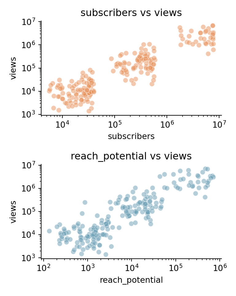
A Mid-tier channel with a compelling thumbnail can outperform a Large channel with a weak one.
reach_potential captures this — raw subscriber count alone would miss it.

video_id subscribers click_through_rate reach_potential
vid_0012 25,339 0.18 4,561
vid_0091 441,016 0.04 17,641
vid_0003 2,398,429 0.10 239,843

Interaction Features — code

import pandas as pd
import seaborn as sns
import matplotlib.pyplot as plt

df = pd.read_csv("data/youtube_videos.csv")

df["reach_potential"] = (
    df["subscribers"] * df["click_through_rate"]
)

fig, axes = plt.subplots(2, 1, figsize=(4, 5))

sns.scatterplot(data=df,
                x="subscribers",
                y="views",
                color="#e8925a",
                alpha=0.5,
                ax=axes[0])
axes[0].set_xscale("log")
axes[0].set_yscale("log")
axes[0].set_title("subscribers vs views")

sns.scatterplot(data=df,
                x="reach_potential",
                y="views",
                color="#6a9fb5",
                alpha=0.5,
                ax=axes[1])
axes[1].set_xscale("log")
axes[1].set_yscale("log")
axes[1].set_title("reach_potential vs views")

sns.despine()
plt.tight_layout()
plt.show()
one last thing

Multi-Label Encoding

When a single cell contains multiple values, each needs its own column.

Multi-Label Encoding — why?

Some features are naturally a list — a video can belong to multiple hashtag communities at once.
A single column can’t capture this. We need one binary column per possible value.

video_id hashtags
vid_0012 [“ai”, “tutorial”, “trending”]
vid_0091 [“review”, “chatgpt”]
vid_0003 [“viral”, “trending”, “tech”]

This is similar to one-hot encoding — but a row can have multiple 1s at once.

Multi-Label Encoding — in our dataset

Each video has between 1 and 5 hashtags.
We expand these into binary columns — one per unique hashtag.

video_id ai tutorial trending review chatgpt viral tech
vid_0012 1 1 1 0 0 0 0
vid_0091 0 0 0 1 1 0 0
vid_0003 0 0 1 0 0 1 1

Each row can now have multiple 1s — unlike one-hot encoding where exactly one column is 1.

Multi-Label Encoding — code

import pandas as pd
import json
import seaborn as sns
import matplotlib.pyplot as plt

df = pd.read_csv("data/youtube_videos.csv")

df["hashtags"] = df["hashtags"].apply(json.loads)

from sklearn.preprocessing import MultiLabelBinarizer

mlb = MultiLabelBinarizer()
hashtag_encoded = pd.DataFrame(
    mlb.fit_transform(df["hashtags"]),
    columns=mlb.classes_,
    index=df.index
)

result = pd.concat([df[["video_id"]], hashtag_encoded], axis=1)
print(result.head(4).to_string(index=False))
video_id  ai  chatgpt  comedy  datascience  deeplearning  explained  gaming  howto  llm  machinelearning  music  news  python  review  shorts  tech  trending  tutorial  viral  vlog
vid_0000   1        0       0            0             0          0       0      0    0                0      0     0       0       0       0     0         1         1      0     0
vid_0001   0        0       0            0             0          0       0      0    0                0      0     0       0       0       0     0         0         1      0     0
vid_0002   0        0       0            0             0          1       0      0    0                0      0     0       0       0       0     0         0         0      0     0
vid_0003   0        0       0            0             0          1       1      0    0                0      0     0       0       0       0     1         1         0      0     0

Thank you :) See you next week

We will start building models, Linear Regression, Logistic Regression, and more :).