Week 6 - Significance and other stories

IAT 461 / 882 · Data Science for Human-Centered Systems · Summer 2026 · Alireza Karduni

Populations & Samples

We want to understand the world

  • How many hours do people spend gaming each day?
  • Does a new feature change how long users stay in an app?
  • Is this effect real — or just noise?

To answer these questions we need data. But we can never measure everyone.

The population

A population is the complete group you care about.

  • Every gamer on the planet
  • All users of an app
  • Every possible run of an experiment

Populations are usually too large to measure directly.
We work with a sample instead.

A sample is a slice

  • A sample is a subset of the population we actually observe
  • We use the sample to estimate what the population looks like
  • The sample mean \(\bar{x}\) estimates the population mean \(\mu\)

The gap between \(\bar{x}\) and \(\mu\) is sampling error — it never fully disappears.

Draw samples. Watch the mean.

200 gamers · each circle = one person · orange = sampled

What you just saw

  • Each draw gives a different \(\bar{x}\) — even from the same population
  • Small \(n\): means jump around widely
  • Large \(n\): means cluster tightly around \(\mu\)
  • The dot plot is the sampling distribution of the mean

This variability is not a mistake — it is the nature of sampling.
How much variability should we expect by chance?

Now imagine two groups

  • Group A: casual gamers · Group B: competitive league players
  • We sample both and find Group B’s mean is higher
  • But we just saw that samples vary even when nothing is different

Maybe Group B genuinely plays more.
Or maybe we just got a lucky draw.

We need a principled way to decide. That is hypothesis testing.

The Null Hypothesis

We observed a difference

  • Recall: we sampled two groups and got different means
  • Group B (competitive league) had a higher average gaming time
  • Our instinct: the league caused them to play more

But before we claim that — we need to ask a harder question.

Could this difference be due to chance?

The null hypothesis

  • The null hypothesis H₀ says: there is no real difference
  • Any gap between the two sample means is just sampling variability
  • In other words: what we observe is due to random variability.

H₀ is not a claim we believe. We ask: how likely is our data if H₀ were true?

What H₀ looks like as a model

But H₀ is just one model

  • A hypothesis is not a model
  • H₁ (“competitive players game more”) is a verbal claim
  • It could be true for many different reasons — each a different process

Testing H₀ only rules out one explanation: pure chance.
It tells us nothing about which alternative is correct.

What else could explain the difference?

%%{init: {"theme": "base", "themeVariables": {"primaryColor": "#f5f5f5", "primaryTextColor": "#555", "primaryBorderColor": "#aaa", "lineColor": "#aaa", "fontSize": "13px"}}}%%
flowchart LR
    OBS["Group B plays more hours"]
    OBS --> C["✓ causes more play"]

What else could explain the difference?

%%{init: {"theme": "base", "themeVariables": {"primaryColor": "#f5f5f5", "primaryTextColor": "#555", "primaryBorderColor": "#aaa", "lineColor": "#aaa", "fontSize": "13px"}}}%%
flowchart LR
    OBS["Group B plays more hours"]
    OBS --> C["✓ causes more play"]
    OBS --> S["Selection bias — heavy players join"]

What else could explain the difference?

%%{init: {"theme": "base", "themeVariables": {"primaryColor": "#f5f5f5", "primaryTextColor": "#555", "primaryBorderColor": "#aaa", "lineColor": "#aaa", "fontSize": "13px"}}}%%
flowchart LR
    OBS["Group B plays more hours"]
    OBS --> C["✓ causes more play"]
    OBS --> S["Selection bias — heavy players join"]
    OBS --> CF["Confound — age / free time"]
    OBS --> M["Measurement error — self-reported hours"]

Rejecting H₀ only means: We find it unreasonable to bellieve that the difference we observe is due to chance.

What we did not test

  • Did competitive players already play more before joining the league?
  • Are competitive players systematically younger or have more free time?
  • Did they over-report gaming hours because the league makes it feel significant?
  • Is our sample representative of all competitive players — or just active forum users?

The p-value

What is the p-value?

  • We have an observed difference between two groups
  • We ask: if H₀ were true, how often would we see a difference this large or larger?
  • That probability is the p-value

The p-value is the probability of obtaining results at least as extreme as the observed result, under the assumption that the null hypothesis is correct.

Visualizing the p-value

What the p-value is NOT

  • ❌ Not the probability that H₀ is true
  • ❌ Not the probability that your result was a fluke
  • ❌ Not the size or importance of the effect
  • ❌ Not the probability that your finding will replicate

The p-value only answers one narrow question:
how surprising is this data, assuming nothing is going on?

The threshold α = 0.05

  • By convention, we call a result significant if p < 0.05
  • This means: less than 5% chance of seeing this if H₀ were true
  • Fisher chose 0.05 in the 1920s — it is a convention, not a law of nature

Some fields use p < 0.01 or p < 0.001.
A result with p = 0.049 is not meaningfully different from p = 0.051.

Significance is binary. The world is not.

Simulating outcomes

How do we test of the outcome is due to chance?

  • We observed a difference between two groups
  • To get a p-value we need to know: what differences would chance alone produce?
  • simulate the null world from our own data

There are two flavours of resampling — each answers a different question.

Two flavours of resampling

%%{init: {"theme": "base", "themeVariables": {"primaryColor": "#f0f0f0", "primaryTextColor": "#444", "primaryBorderColor": "#bbb", "lineColor": "#bbb", "fontSize": "13px"}}}%%
flowchart LR
    A["One dataset"] --> B["Permutation test<br/>Shuffle the labels"]
    A --> C["Bootstrap<br/>Resample with replacement"]
    B --> D["Null distribution<br/>→ p-value"]
    C --> E["Sampling distribution<br/>→ confidence interval"]

Permutation test — the skeptic’s move

If H₀ is true — that there is no real difference — then the group labels are meaningless.
We can shuffle them and recompute the difference over and over.

The p-value = fraction of shuffles where chance matched or beat what we actually saw.

Bootstrap — measuring uncertainty

%%{init: {"theme": "base", "themeVariables": {"primaryColor": "#f0f0f0", "primaryTextColor": "#444", "primaryBorderColor": "#bbb", "lineColor": "#bbb", "fontSize": "13px"}}}%%
flowchart TD
    A["Group A (original)"] --> C["Resample A<br/>with replacement"]
    B["Group B (original)"] --> D["Resample B<br/>with replacement"]
    C --> E["Compute difference<br/>of means"]
    D --> E
    E --> F["Record it"]
    F --> G["Repeat 1000×"]
    G --> H["95% CI:<br/>middle 95% of gaps"]

The CI tells you how uncertain we are about the difference.

Effect Size & Power

p tells you if — not how much

  • A significant p-value only says: this difference is unlikely by chance
  • It says nothing about whether the difference matters
  • With a large enough sample, almost anything becomes significant

%%{init: {"theme": "base", "themeVariables": {"primaryColor": "#f0f0f0", "primaryTextColor": "#444", "primaryBorderColor": "#bbb", "lineColor": "#bbb", "fontSize": "13px"}}}%%
flowchart LR
    A["Same data<br/>n = 10"] --> B["p = 0.31<br/>not significant"]
    C["Same data<br/>n = 100"] --> D["p = 0.0002<br/>significant ✓"]
    E["Same data<br/>n = 1000"] --> F["p = 0.000001<br/>very significant ✓"]

The effect size stayed the same (~0.40) across all three.
The p-value just responded to the sample size.

Effect size: how big is the difference?

  • An effect size measures the magnitude of a difference, independent of sample size
  • For two groups, the most common measure is Cohen’s d
  • d = difference of means ÷ pooled standard deviation
  • It answers: how many standard deviations apart are the two groups?

\[d = \frac{\bar{x}_B - \bar{x}_A}{SD_{pooled}}\]

What Cohen’s d looks like

More overlap = smaller effect. Less overlap = larger effect.

Two questions, two answers

%%{init: {"theme": "base", "themeVariables": {"primaryColor": "#f0f0f0", "primaryTextColor": "#444", "primaryBorderColor": "#bbb", "lineColor": "#bbb", "fontSize": "13px"}}}%%
flowchart LR
    A["Observed<br/>difference"] --> B["p-value<br/>Is it real?"]
    A --> C["Cohen's d<br/>How big is it?"]
    B --> D["Rules out<br/>chance"]
    C --> E["Measures practical<br/>significance"]

Always report both. A result can be statistically significant and practically tiny.

Statistical vs. practical significance

  • A new UI reduced task time by 0.1 seconds, p < 0.001 at n = 10,000
  • Statistically significant — but does it matter to users?
  • A different technique improved time by 15% but p = 0.12 at n = 20
  • Not significant — but potentially important

Significance is a property of your test.
Importance is a property of your finding.
They are not the same thing.

Power

  • Type I error (false positive): H₀ is true but we reject it → p < 0.05 by luck
  • Type II error (false negative): H₁ is true but we miss it → effect is real but p ≥ 0.05
  • Power = probability of detecting a real effect when it exists = 1 − β

%%{init: {"theme": "base", "themeVariables": {"primaryColor": "#f0f0f0", "primaryTextColor": "#444", "primaryBorderColor": "#bbb", "lineColor": "#bbb", "fontSize": "13px"}}}%%
flowchart LR
    A["Reality"] --> B["H₀ true"]
    A --> C["H₁ true"]
    B --> D["Reject H₀ <br/>→ Type I error ❌"]
    B --> E["Fail to reject<br/>→ Correct ✓"]
    C --> F["Reject H₀<br/>→ Correct ✓"]
    C --> G["Fail to reject<br/>→ Type II error ❌"]

What affects power?

  • Sample size ↑ → power ↑ (more data = less noise)
  • Effect size ↑ → power ↑ (bigger signal = easier to detect)
  • α threshold ↑ → power ↑ (but more false positives)

The conventional target is power = 0.80 — accepting a 20% chance of missing a real effect.

Power analysis lets you ask: how many participants do I need to detect an effect of this size?
Run it before your study, not after.

What to report

  • The test statistic and p-value — how likely is it to see this data due to chance?
  • The effect size (Cohen’s d, η², r) — how big is the difference?
  • The confidence interval of the effect size — how certain?
  • The sample size and achieved power — Is the study sensitive enough?

A p-value alone is never the whole story.

Try the explorable

Open Explorable ↗

Linear Regression

Linear Regression

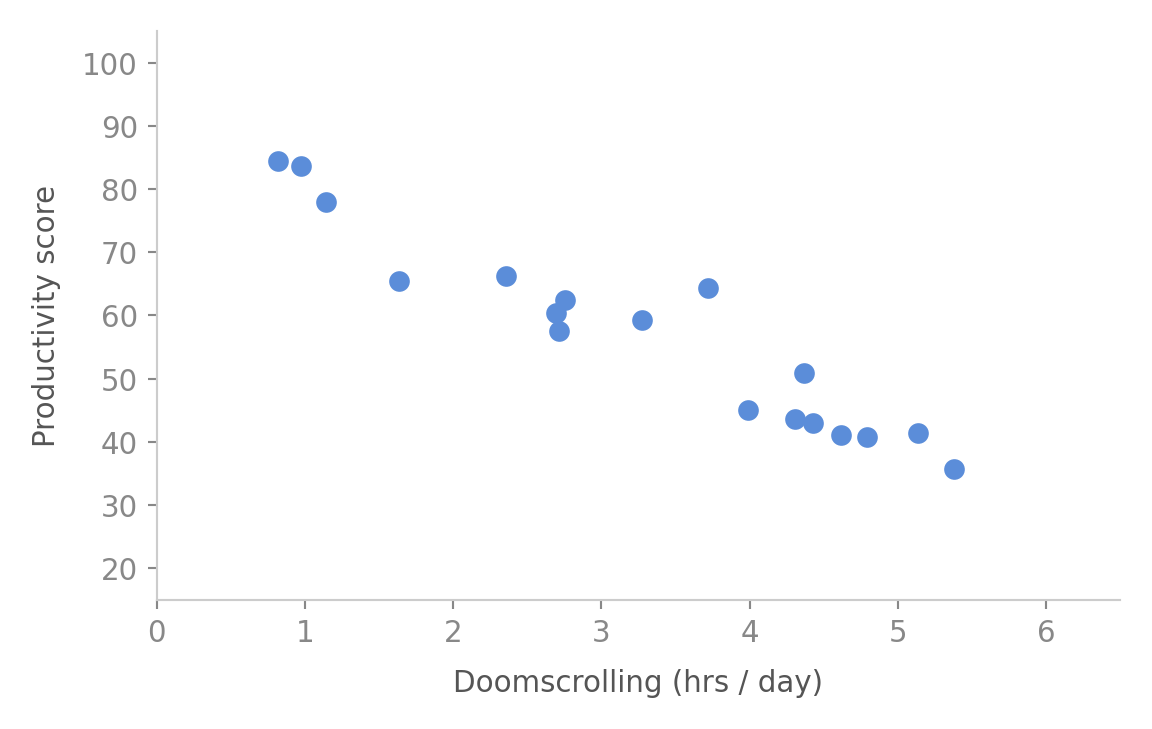
The data

  • Each dot is one person
  • x-axis: hours spent doomscrolling per day
  • y-axis: productivity score
  • There seems to be a trend — but how do we summarise it?

Our simplest model: just use the mean
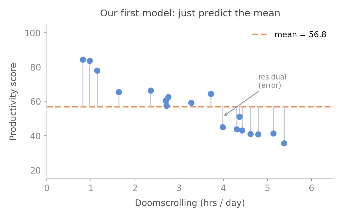
  • If we know nothing, our best guess for anyone is the average
  • The grey lines are residuals — how wrong we are for each person
  • Some are above, some below — they cancel if we just add them
  • So we use the sum of squared residuals — always positive, penalises big errors more

Can we do better? Try tilting the line
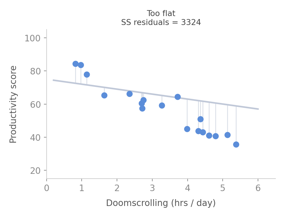
  • A sloped line should follow the trend better than the mean
  • This line is too flat — it barely responds to doomscrolling
  • The residuals are still large
  • Sum of squared residuals is high

Can we do better? Try tilting the line
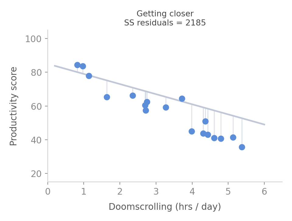
  • A steeper slope fits the trend better
  • Residuals are visibly smaller
  • Sum of squared residuals is lower than before
  • But is this the best we can do?

Can we do better? Try tilting the line
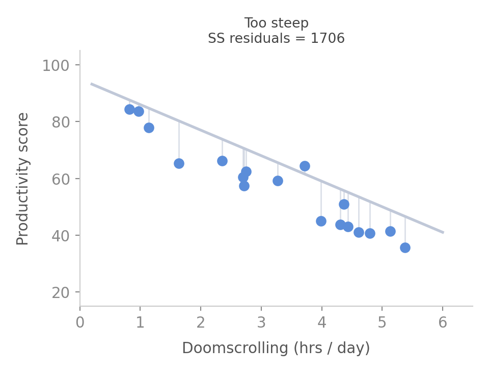
  • Now the line overshoots
  • Residuals are large again — in the opposite direction
  • Sum of squared residuals goes back up
  • There is a sweet spot somewhere in between

The best line — least squares
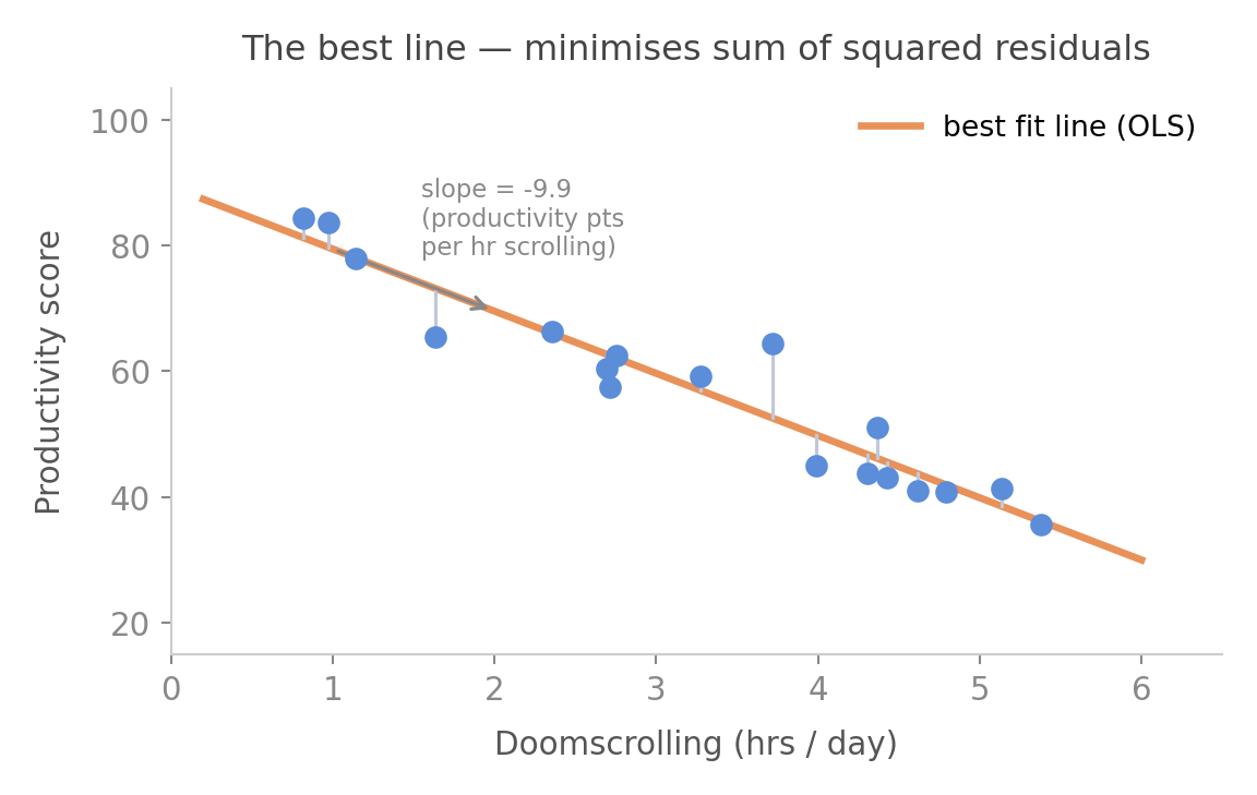
  • OLS finds the line that minimises the sum of squared residuals
  • The slope tells us: for each extra hour of doomscrolling, productivity changes by β₁ points
  • The intercept is the predicted productivity when doomscrolling = 0
  • Residuals remain — no line fits perfectly. That leftover is ε

How much better is the line than the mean?
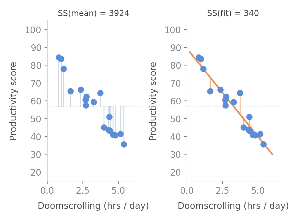
  • SS(mean) = total variation in the data
  • SS(fit) = variation left over after the line
  • The difference is what the line explained
  • R² = 1 − SS(fit) / SS(mean)
  • R² = proportion of variation explained by the model

R² — how well does the model fit?
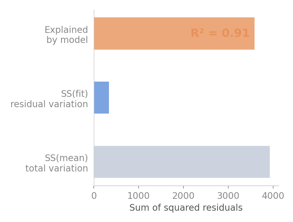
  • R² = 0 → the line is no better than the mean
  • R² = 1 → the line explains everything perfectly
  • Our model: R² = 0.91 → doomscrolling explains 91% of the variation in productivity
  • The rest is due to things we didn’t measure — sleep, mood, deadlines…

But is R² real — or just luck?
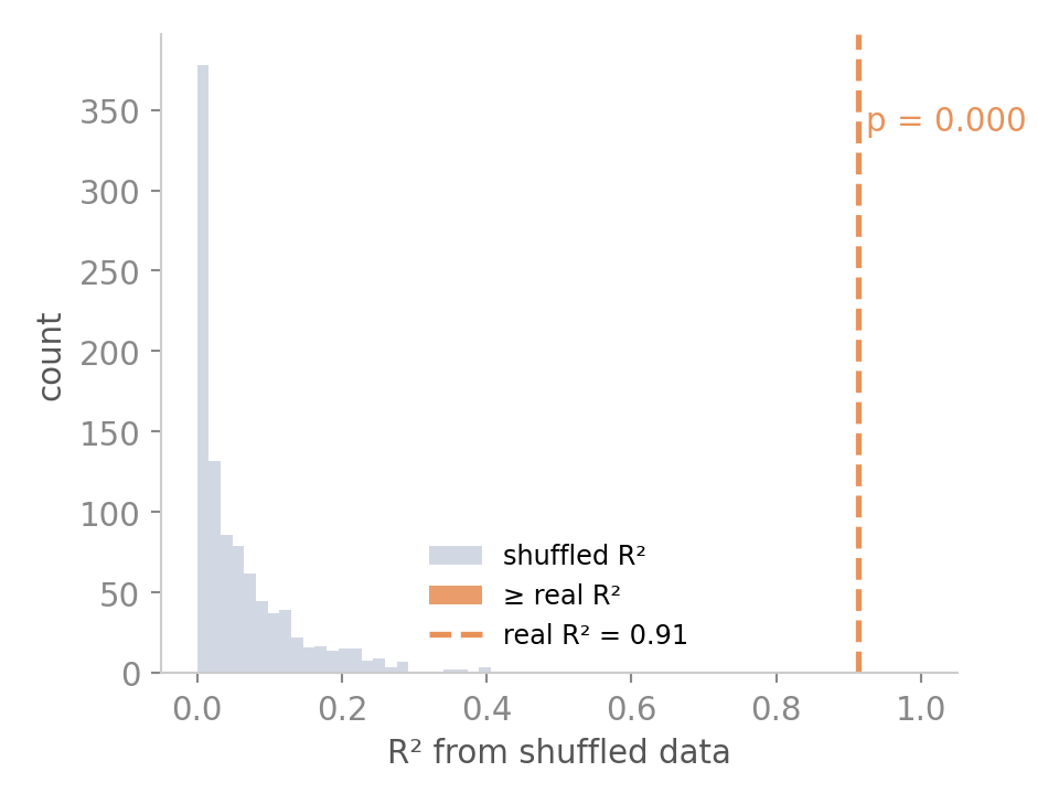
  • If doomscrolling had no real relationship with productivity, we’d still get some R² by chance
  • We test this by randomly shuffling the productivity values 1000×
  • Each shuffle breaks the real relationship — any R² we get is pure luck
  • Where does our real R² land in that distribution?
  • That tail probability is the p-value for the model

What does the slope tell us?
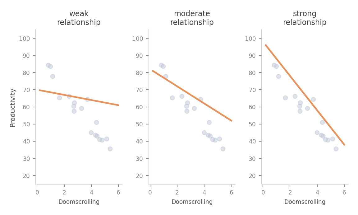
  • A shallow slope means the predictor has little influence
  • A steep slope means a small change in x produces a large change in y
  • The sign tells you the direction — negative = more x, less y
  • The coefficient is the slope — it is our estimate, just like the sample mean

Coefficients in multiple regression
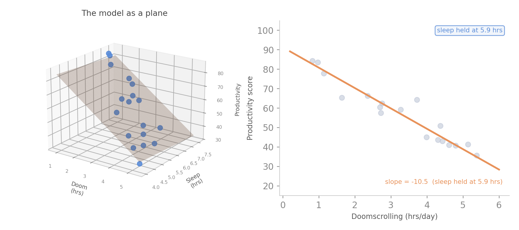
  • Each predictor has its own slope — its own coefficient
  • β₁ is the slope of the doomscrolling slice — holding sleep fixed
  • β₂ is the slope of the sleep slice — holding doomscrolling fixed
  • “Holding constant” means: compare people who differ only on this one variable

Why coefficients change when you add predictors
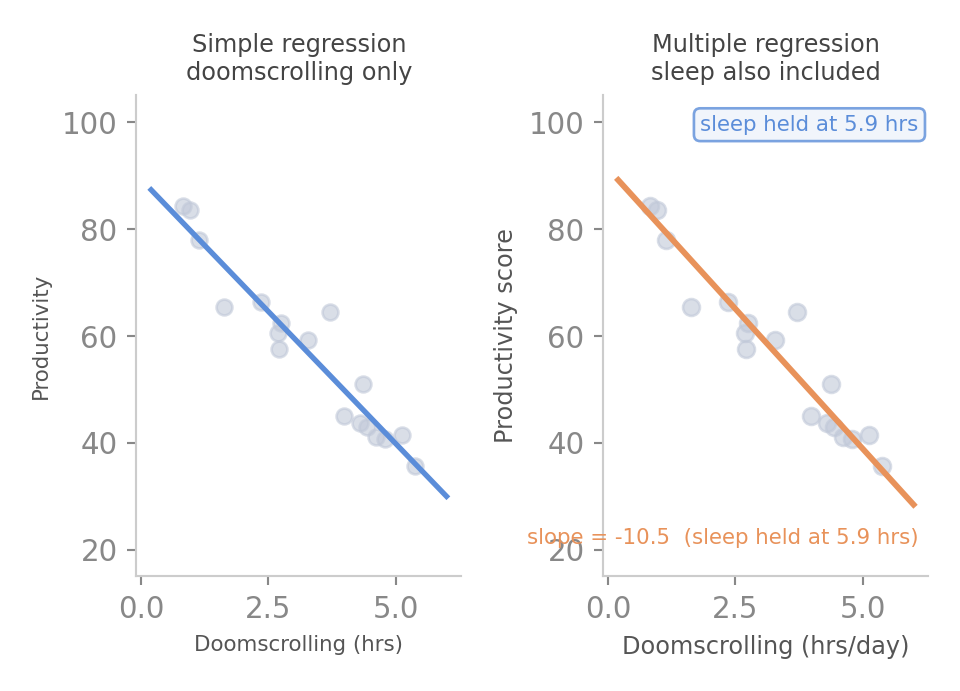
  • The doomscrolling slope changes when we add sleep
  • Why? Because doomscrolling and sleep are correlated — people who doomscroll also sleep less
  • Simple regression conflates both effects into one slope
  • Multiple regression separates them — each coefficient is purified of the others

p-value for a coefficient
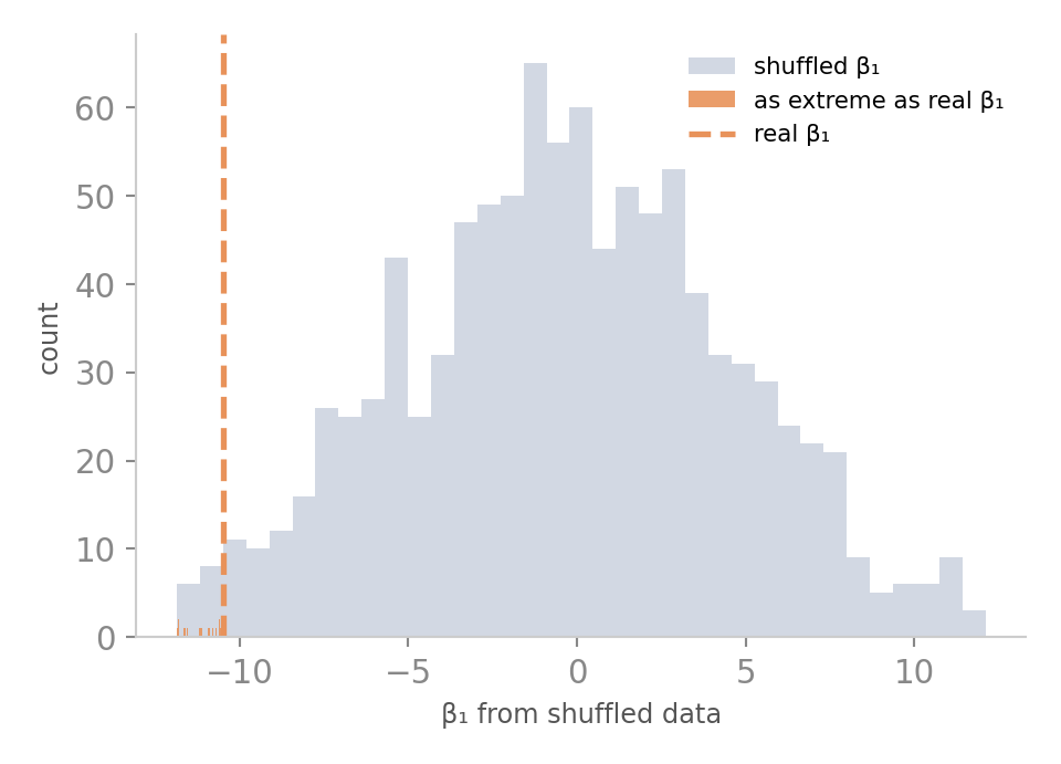
  • H₀ for each coefficient: this slope is zero
  • Shuffle productivity, refit the full model, record β₁
  • Do this 1000× — this is what β₁ looks like when there is no real relationship
  • Where does our real β₁ land?
  • That tail probability is the p-value for this coefficient

Reading the regression table
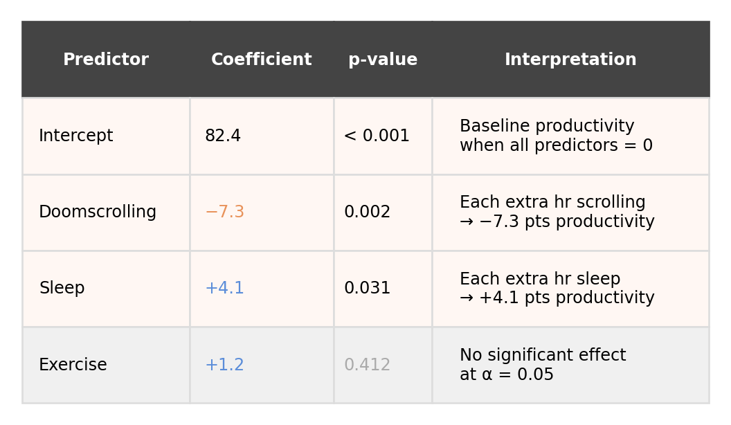
  • Each row is one predictor
  • The coefficient is the slope — how much y changes per unit of x, holding others constant
  • The p-value asks: could this slope be zero by chance?
  • Doomscrolling and sleep are significant, we don’t think that these are due to chance.
  • Exercise has p = 0.41 — we cannot rule out that its slope is zero

The ML Lens

Same line, different question

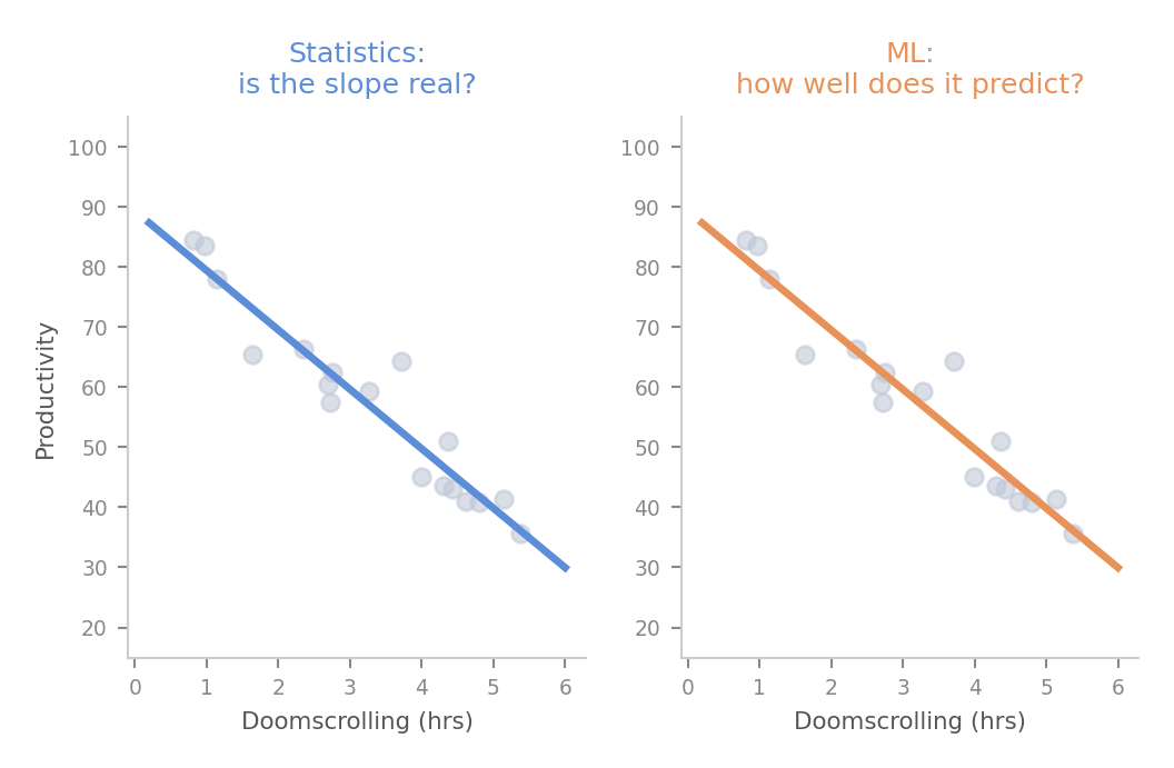
  • The model is identical — same line, same coefficients
  • The question is different
  • Statistics asks: is β₁ significantly different from zero?
  • ML asks: how accurately does this model predict new data it has never seen?
  • This shift changes everything about how we evaluate the model

The train / test split
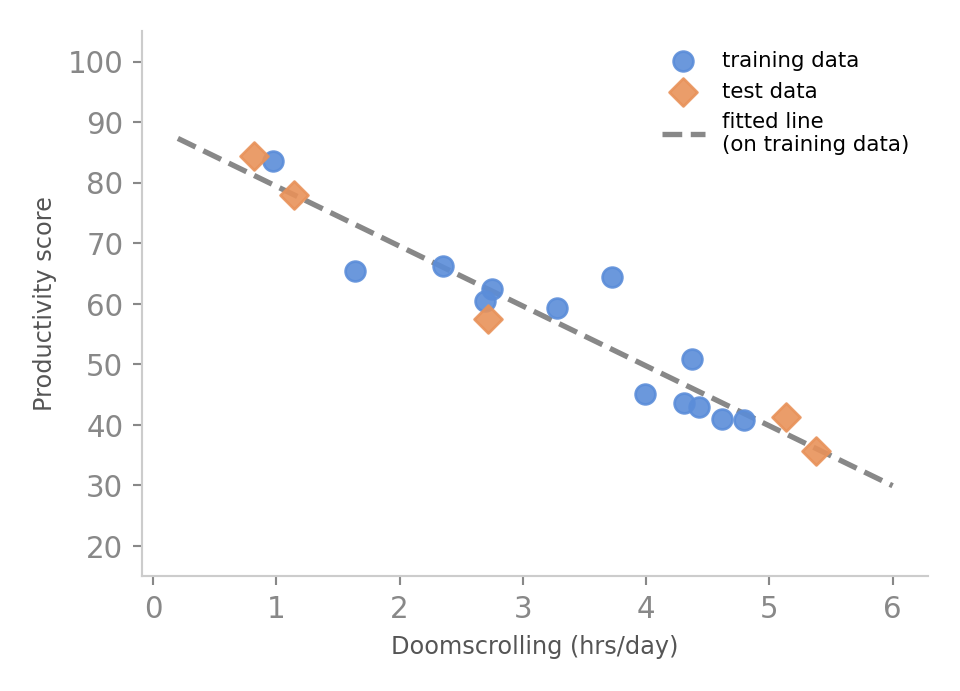
  • We split the data before fitting anything
  • Training set — the model sees this data and learns from it
  • Test set — the model never sees this during training
  • We fit the line on training data only
  • Then we ask: how well does it predict the test points?
  • This simulates what happens when the model meets new real-world data

Loss — how we measure prediction error
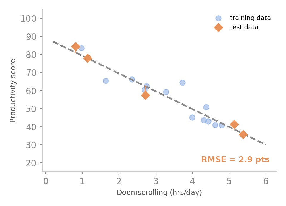
  • We measure error on the test set — data the model never saw
  • Each orange line is a prediction error on a test point
  • RMSE (root mean squared error) summarises these into one number
  • RMSE is in the same units as y — here, productivity points
  • Lower RMSE = better predictions on unseen data

Fitting vs. predicting
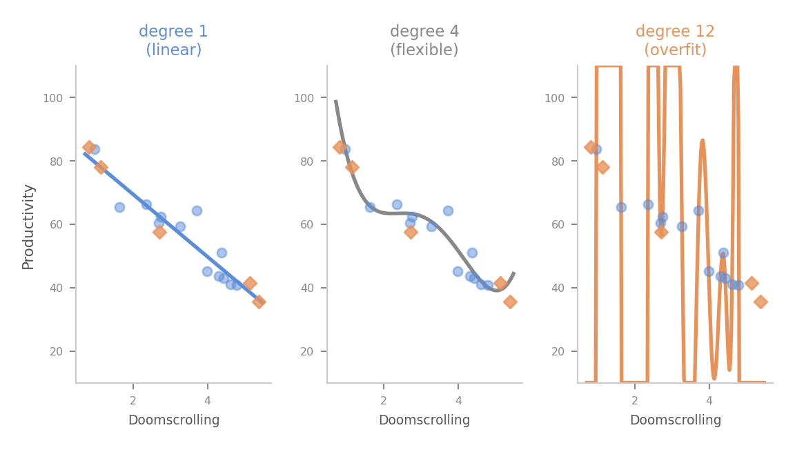
  • A more complex model always fits the training data better
  • But it can fail badly on new data — it learned the noise, not the signal
  • This is overfitting
  • The test set is our defence — it tells us when we have gone too far
  • In ML, a model that fits perfectly on training data is a warning sign