Week 7 - The simple ideas behind classification

IAT 461 / 882 · Data Science for Human-Centered Systems · Summer 2026 · Alireza Karduni

to BE or NOT to BE. That is classification 😂

Regression: a number

  • We predicted productivity score from doomscrolling — a number
  • Linear regression: the best-fit line through the data

This week: Classification

  • Did this trial user convert to a paid plan?
  • converted_to_paid is 1 or 0, or True / False

The scenario

  • Phigma gives every new signup a 14-day free trial
  • We log how they use it
  • At the end: did they upgrade, or not?

Fourteen days of usage

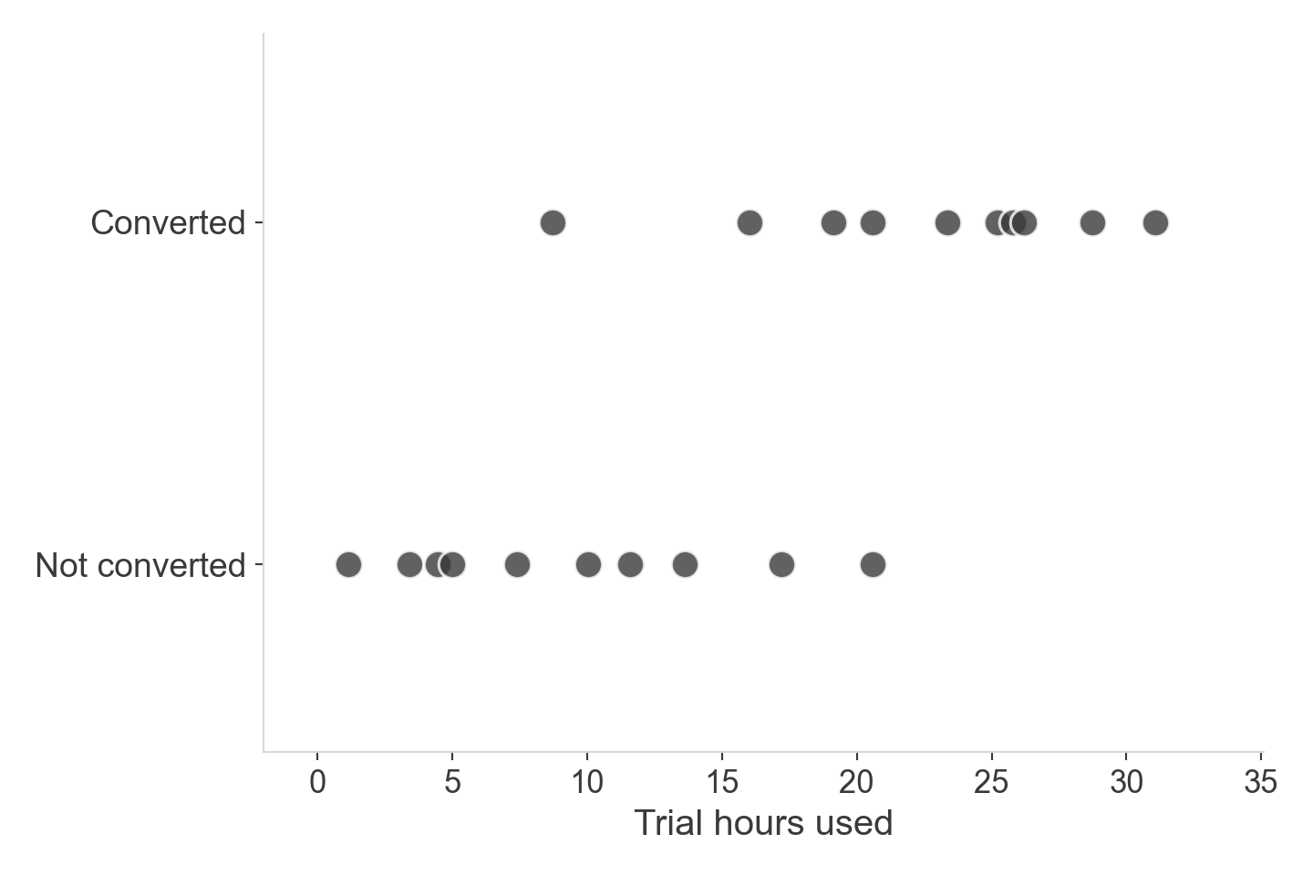
  • Each dot is one trial user
  • trial_hours_used on the x-axis
  • converted_to_paid on the y-axis — only two possible heights

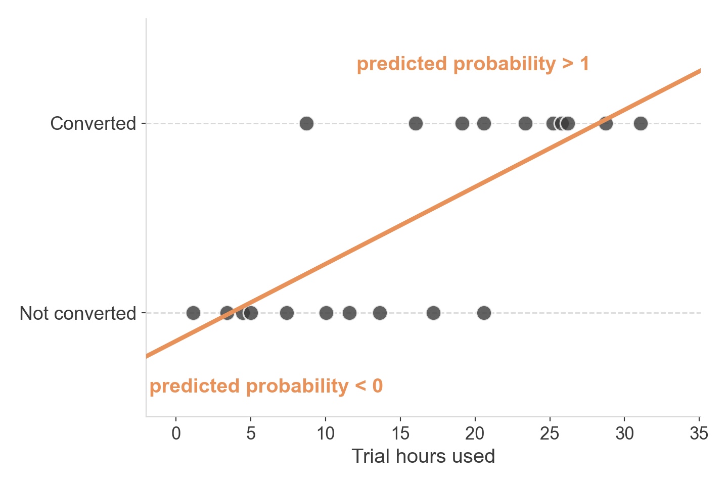
What if we just… fit a line?

  • Linear regression doesn’t know the outcome is bounded
  • It happily predicts negative probabilities and probabilities above 1
  • Neither one means anything

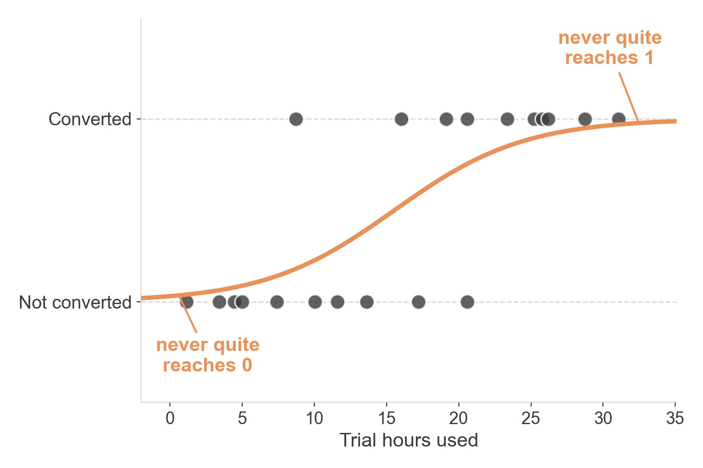
We need a different shape

  • Whatever curve we use, it has to stay between 0 and 1 — always
  • Flat near the edges, steep in the middle, smooth everywhere

The sigmoid

  • Squeezes any input into the range (0, 1)
  • Output reads directly as P(converted)
  • Gets steepest where the model is least sure

The logistic function

\[ P(\text{converted}) = \frac{1}{1 + e^{-(\beta_0 + \beta_1 \cdot \text{trial\_hours\_used})}} \]

  • Same linear combination as before — \(\beta_0 + \beta_1 x\) — just passed through a squeezing function
  • \(\beta_0, \beta_1\) are what we still have to fit

From probability to decision

  • The sigmoid gives us a probability — not a yes/no
  • To act on it, we need a cutoff: above this, predict “converted”; below it, predict “not”
  • The default cutoff is 0.5 — but it doesn’t have to be

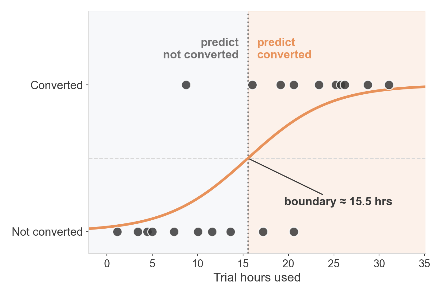
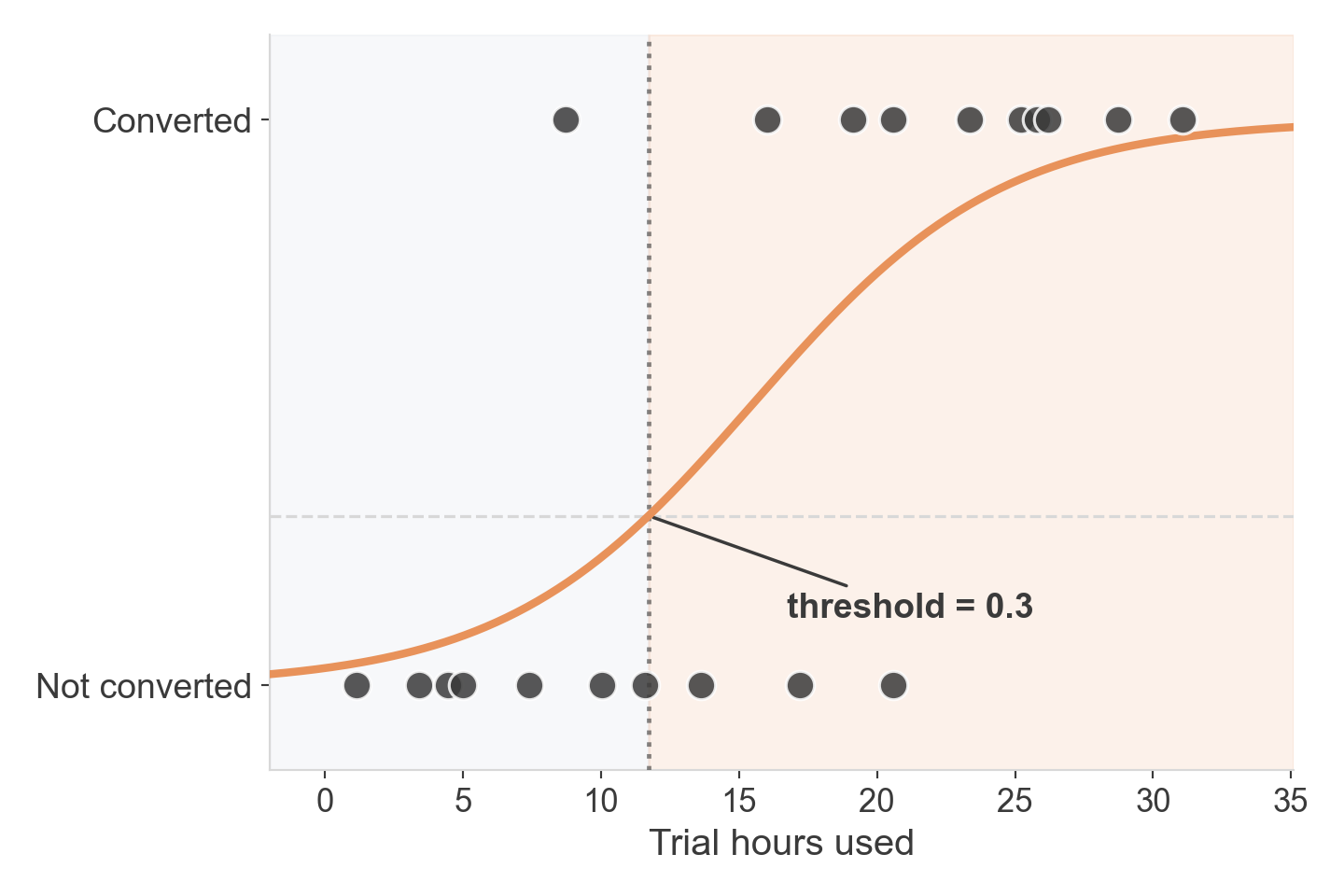
The decision boundary

  • Where the curve crosses p = 0.5
  • One number on the x-axis splits the whole space into two predictions
  • Everything to the right: predict converted

Not every curve is equally good

  • Lots of sigmoid-shaped curves are possible for this data
  • They don’t all put the boundary in the same place
  • Some are clearly better than others

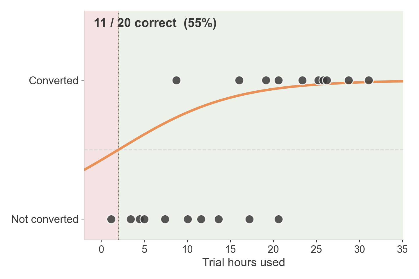
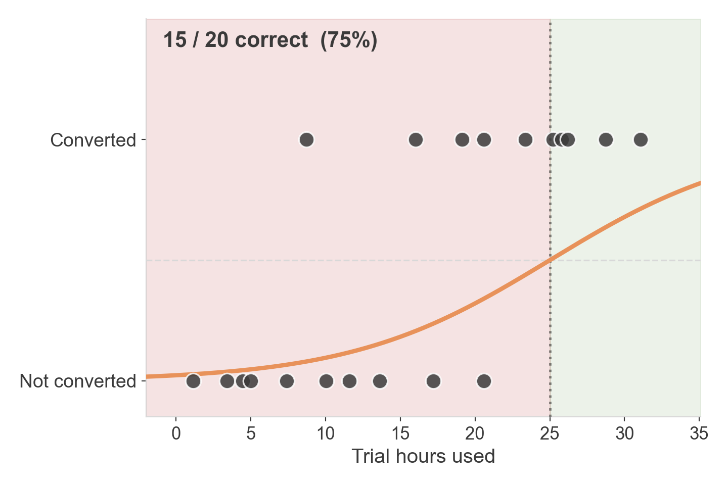
Is this a good fit?

  • Boundary too early
  • Most “not converted” users end up on the wrong side

Is this a good fit?
  • Better — boundary moved right
  • Still misses several converters along the way

Is this a good fit?
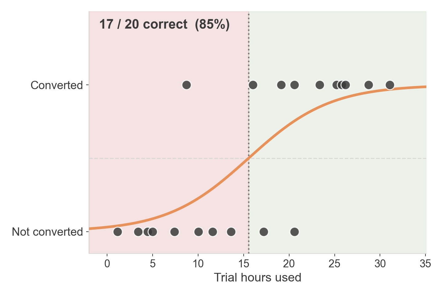
  • Best of the three
  • Only 3 points end up on the wrong side

So which curve is best?

  • We just compared three by eye
  • We need a principled way to find the best one — not guess-and-check
  • That’s exactly what fitting the model means

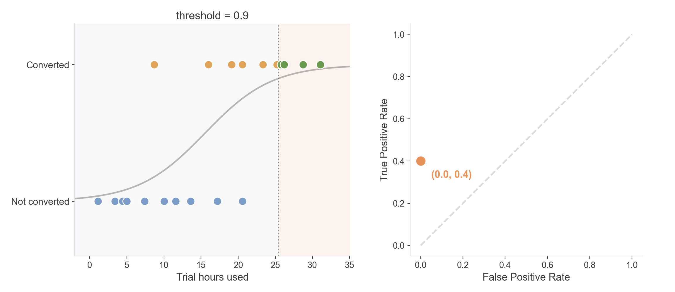
We don’t have to use 0.5

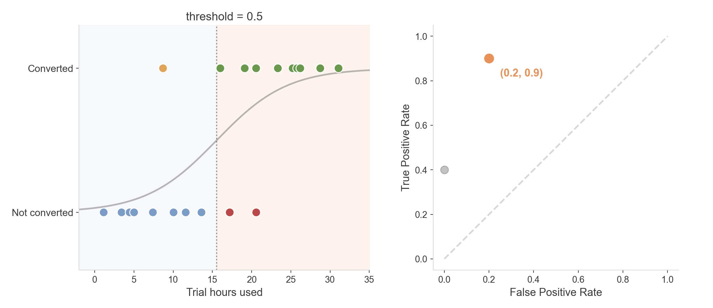
  • Lowering the threshold moves the boundary left
  • More users get predicted “converted” — more false alarms, fewer missed conversions
  • We’ll come back to this when we evaluate models

Maximum Likelihood

The idea

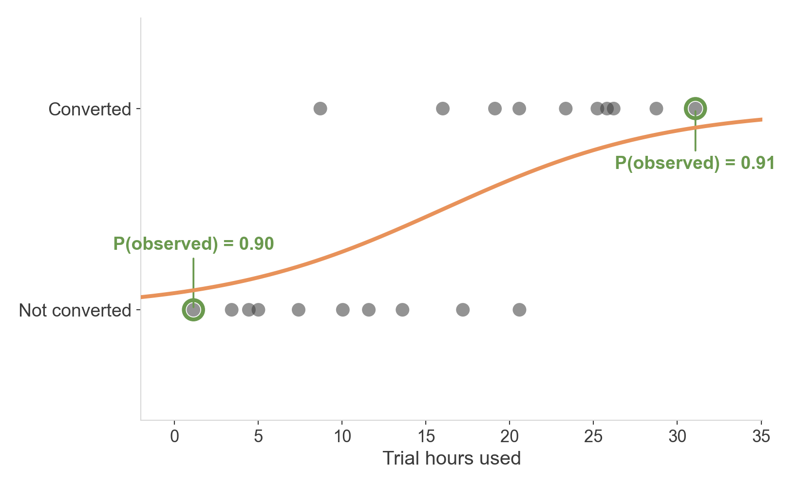
  • For each user, the curve assigns a probability to what actually happened
  • A good curve assigns high probability to what we observed
  • A bad curve is “surprised” by its own data
  • We want the curve that makes the data look as unsurprising as possible

Two confident points

  • This user used the app a lot and converted — the curve gives that 0.91
  • This user barely used it and didn’t convert — the curve gives that 0.90
  • High probability assigned to what really happened

A surprising point
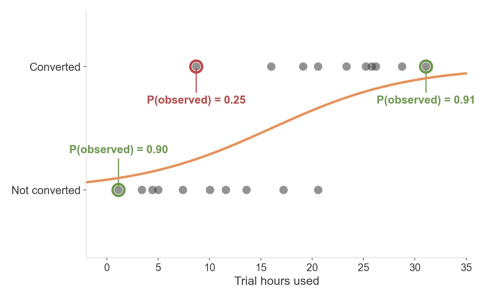
  • This user barely used the app — but converted anyway
  • The curve only gave that outcome a 0.25
  • This point drags the curve’s overall score down

Multiply across every point

  • Do this for all 20 users, then multiply every probability together
  • That product is the likelihood of the data, given this curve
  • Multiplying 20 small numbers gives an extremely small number — so in practice we use the log-likelihood instead
  • Same idea, easier numbers: bigger (less negative) is still better

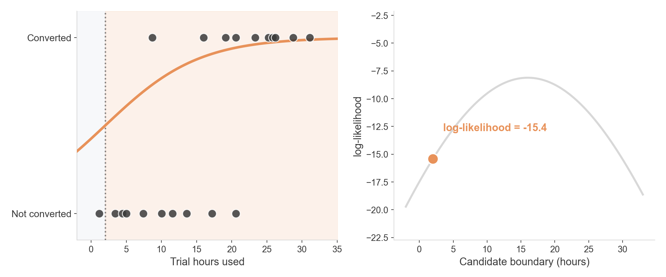
Is this curve likely?

Low log-likelihood — this curve is frequently surprised

Is this curve likely?
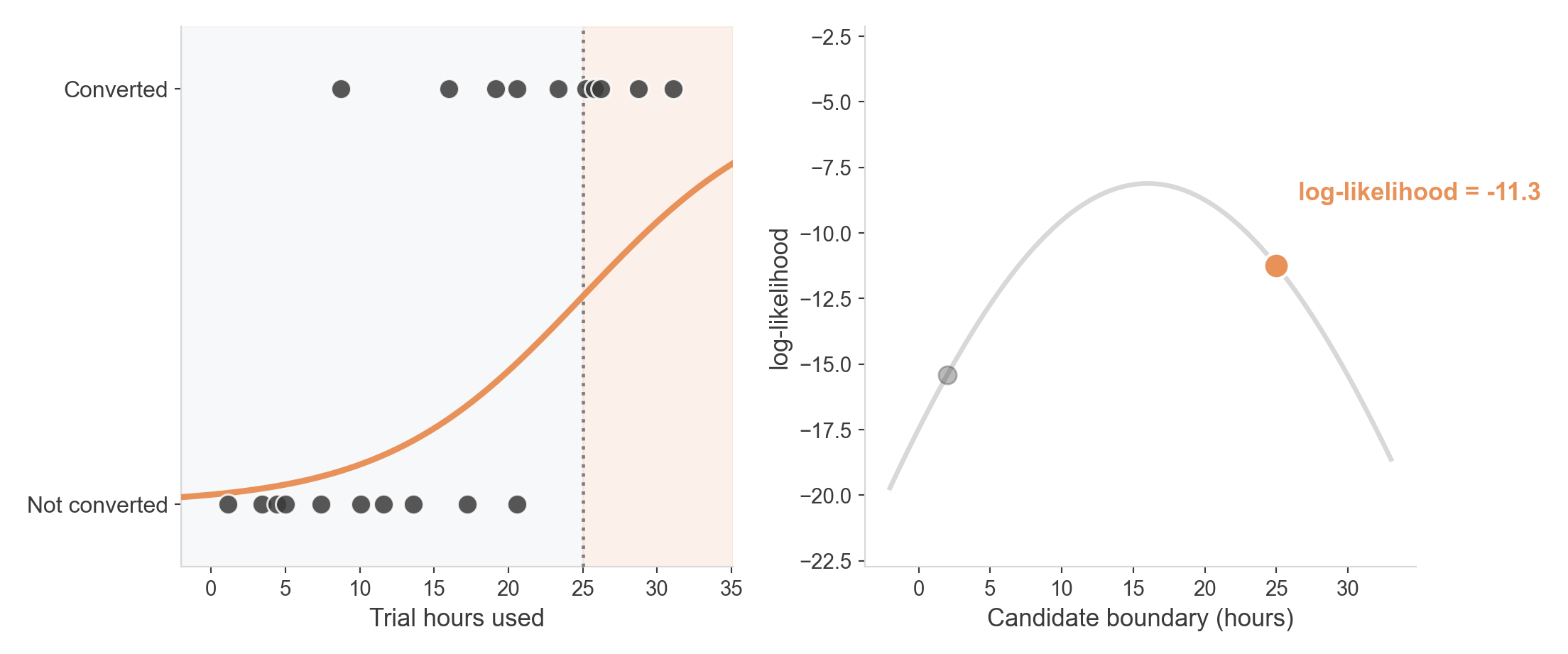
Better — but still leaves several users unexplained

Is this curve likely?
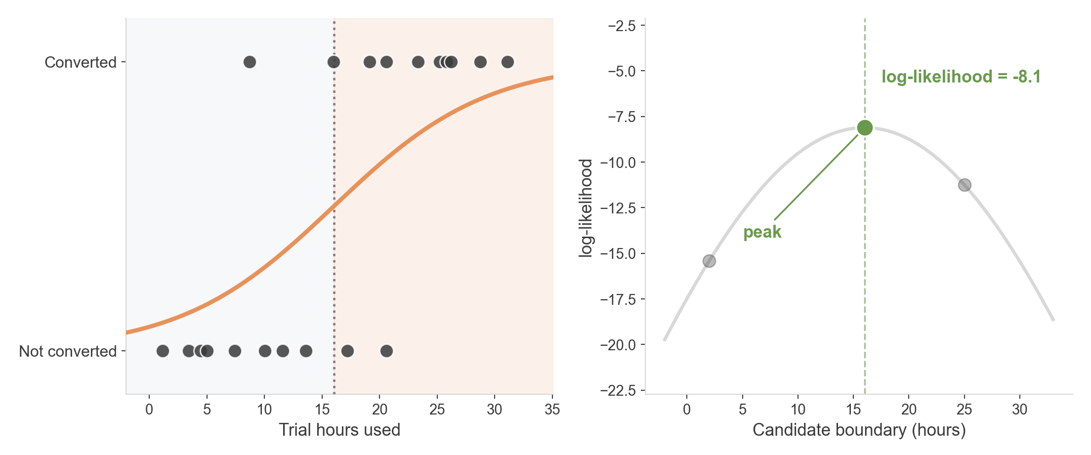
  • This is the peak — the maximum likelihood curve
  • Fitting a logistic regression is finding this peak
  • The algorithm keeps checking lines until it finds the best one.

Odds, Log-Odds, and Coefficients

What does β₁ actually mean?

  • We’ve been fitting \(\beta_0 + \beta_1 x\) this whole time
  • But what does a coefficient like 0.22 actually say about the world?
  • To answer that, we need a short detour through odds

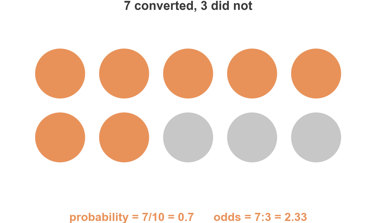
From probability to odds

  • Probability: out of everyone, what fraction converted?
  • Odds: for every person who didn’t, how many did?
  • Same information, different framing

Comparing two groups: the odds ratio
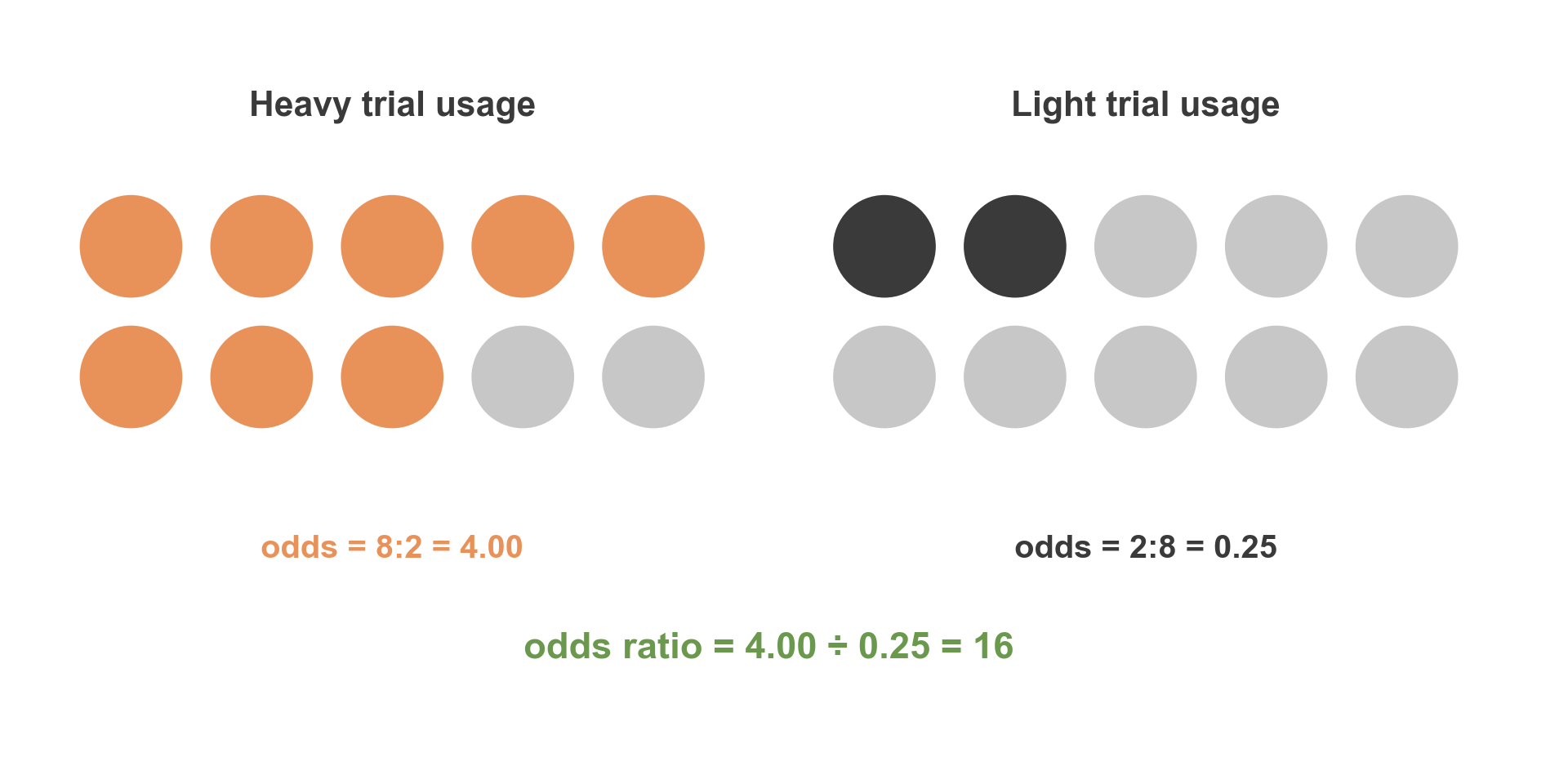
The odds ratio is just one odds divided by another — here, heavy users have 16× the odds of converting that light users do.

Why use odds ratios?

  • One number, comparing two groups or two values of a predictor
  • It doesn’t matter which outcome we call “success” — flip the labels and the OR just becomes its reciprocal (\(1/16\) here)
  • Most importantly: this is exactly what you get by exponentiating a logistic regression coefficient, \(e^\beta\) — it’s the bridge from the model’s output to a real comparison

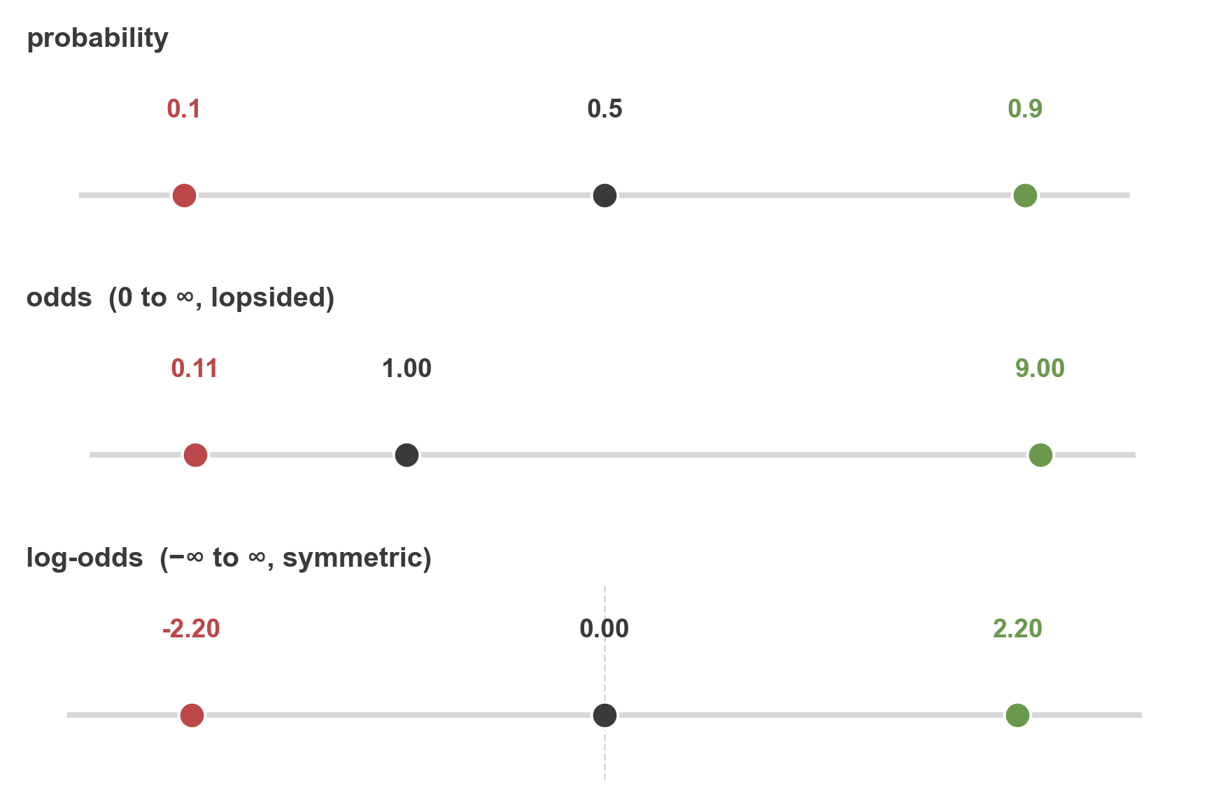
The full scale

  • Same three points, three different ways of expressing them
  • \(\beta_0 + \beta_1 x\) computes the log-odds directly
  • The sigmoid is just the trip back from log-odds to probability

What one more hour does to the odds
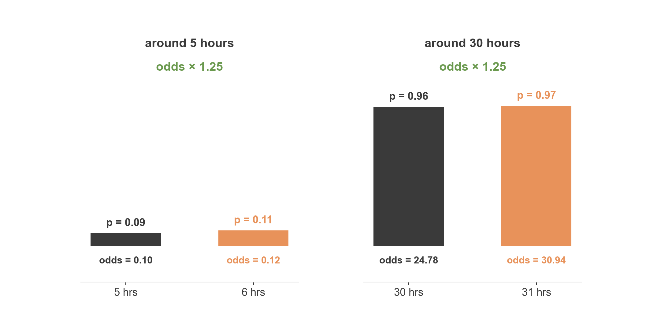
  • At low usage, probability barely moves — but odds still ×1.25
  • At high usage, probability also barely moves — odds still ×1.25
  • The coefficient acts on odds, multiplicatively, everywhere — not on probability

The real fit

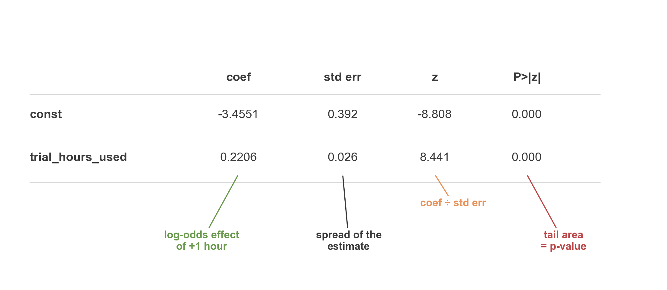
model_large.summary()

Reading the output

  • Same four columns you’ll see for any logistic regression
  • coef and P>|z| are the two to look at first
  • Everything else explains where those two come from

But could this slope just be noise?

  • The question: if hours truly had no effect, how big a slope could chance alone produce?
  • The trick: shuffle converted_to_paid across the 300 users — same outcomes, randomly reassigned
  • This keeps everything else identical but completely destroys the real relationship
  • Refit on the shuffled data, record the slope, repeat

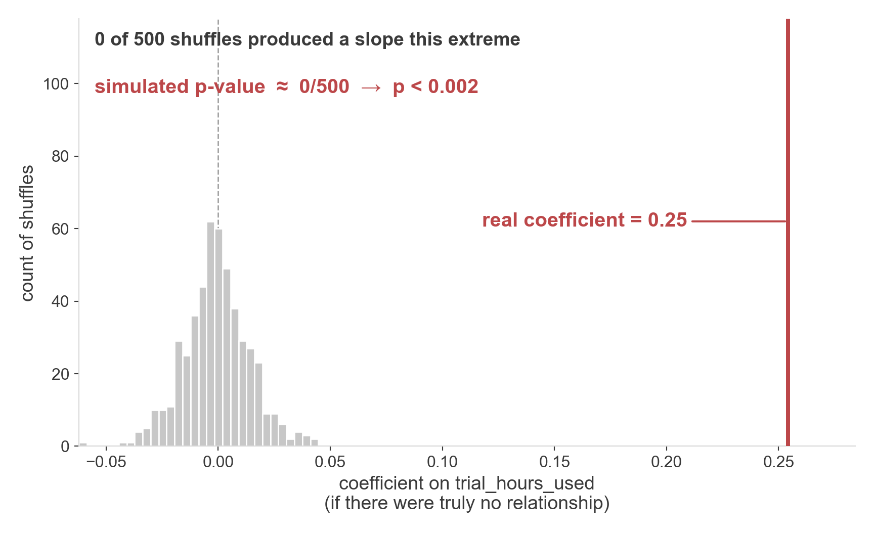
Simulating a p-value

  • This histogram is what “no relationship” looks like, 500 times over, by chance alone
  • p-value = fraction of shuffles at least this extreme
  • Here: 0 of 500 → p < 0.002
  • The real coefficient isn’t just bigger than the others — it’s off the chart entirely

What the software actually does
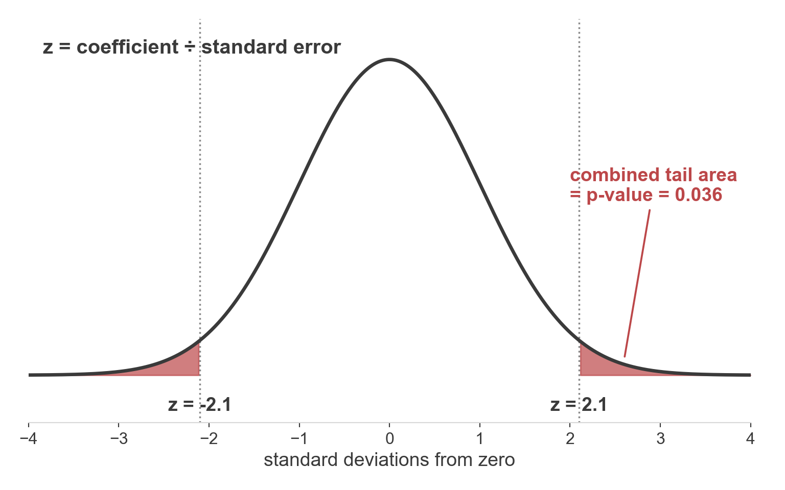
  • In pracitce, there are different methods for calculating the p-value.
  • Instead: \(z = \text{coefficient} \div \text{standard error}\), compared to a normal curve
  • Same logic as the shuffle test, computed analytically instead

Two Predictors

One predictor becomes two

  • trial_hours_used alone got us pretty far
  • Phigma also tracks promo_emails_opened — does it add anything?
  • Same scenario, same users, one more column

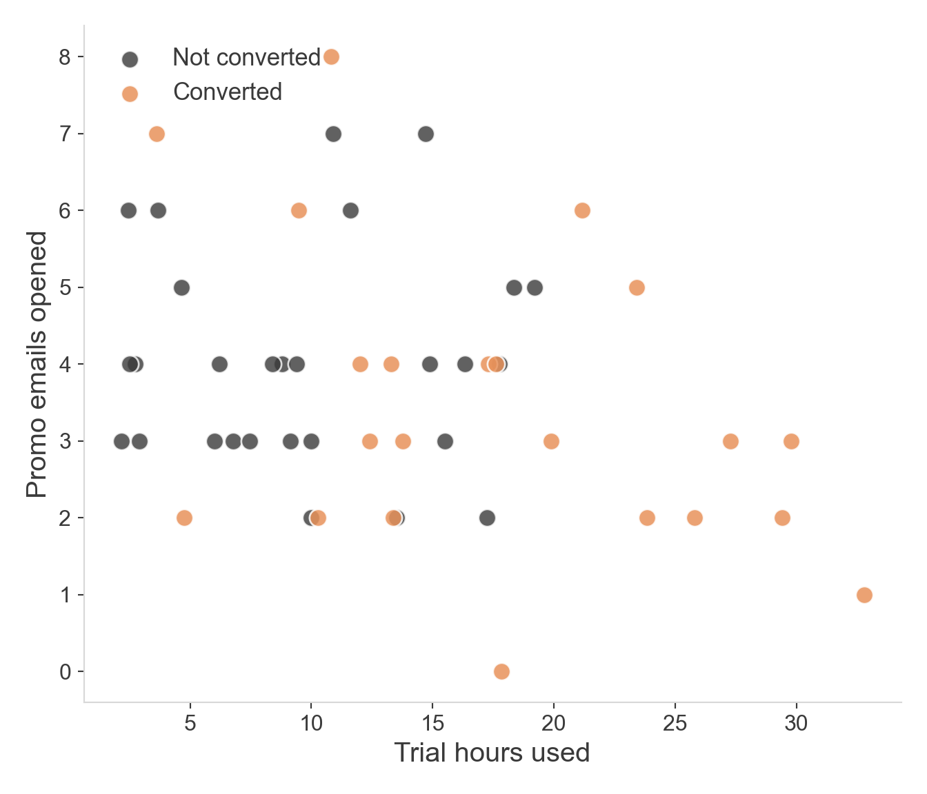
The 2D cloud

  • Trial hours (x-axis): converted users skew clearly to the right
  • Promo emails (y-axis): the two colors are mixed all the way up and down
  • One axis looks informative; the other doesn’t

The boundary becomes a line
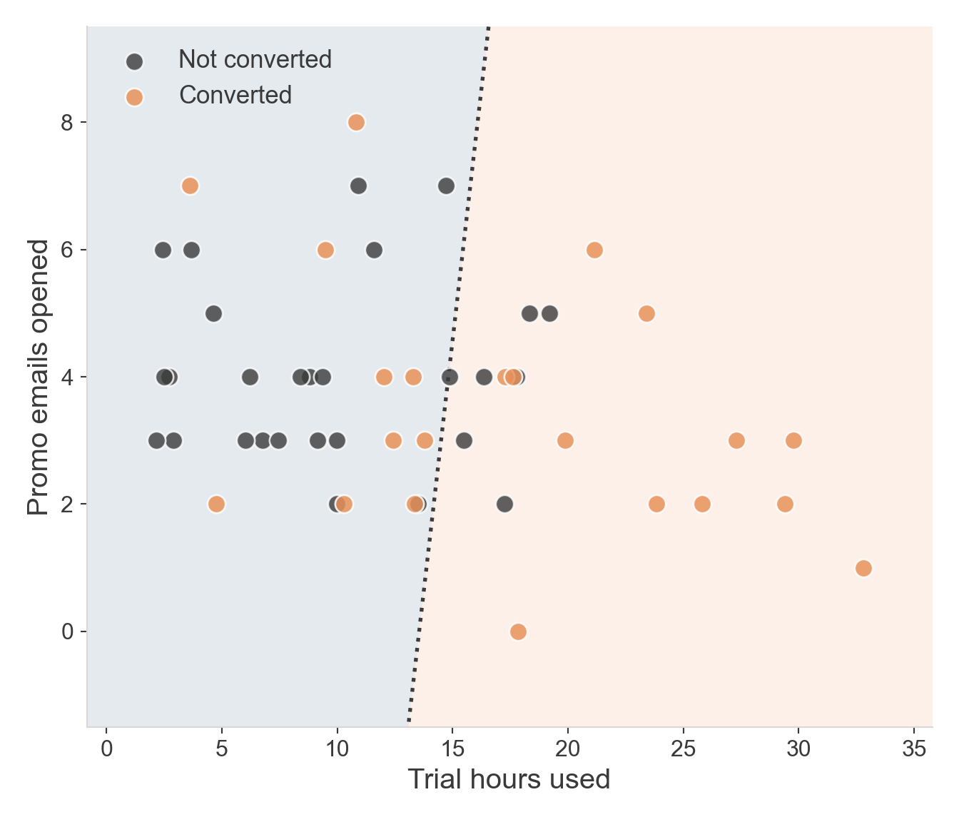
  • With two predictors, the boundary is no longer a point — it’s a line across the whole plane
  • Its tilt depends on both coefficients
  • This line is nearly vertical — promo emails barely tilts it at all

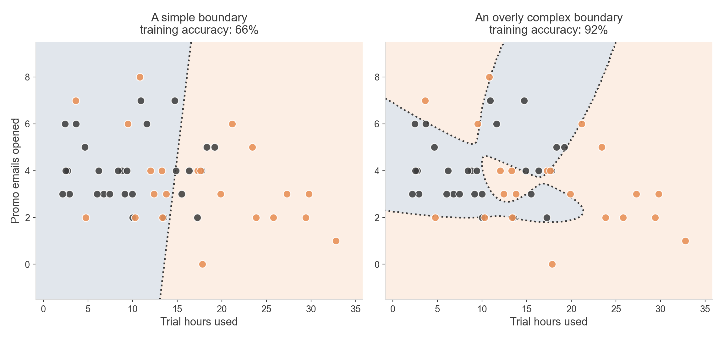
More flexible models can overfit

  • Logistic regression can only ever draw a straight line (or a flat plane, with more predictors)
  • Other model families can bend, loop, and carve much more complicated shapes
  • More flexible isn’t automatically better — it can mean memorizing this dataset’s noise instead of the real pattern

Clean vs. overfit

Same 50 users, two different boundaries. The complicated one scores higher on this data — for the wrong reasons.

Coefficients with two predictors
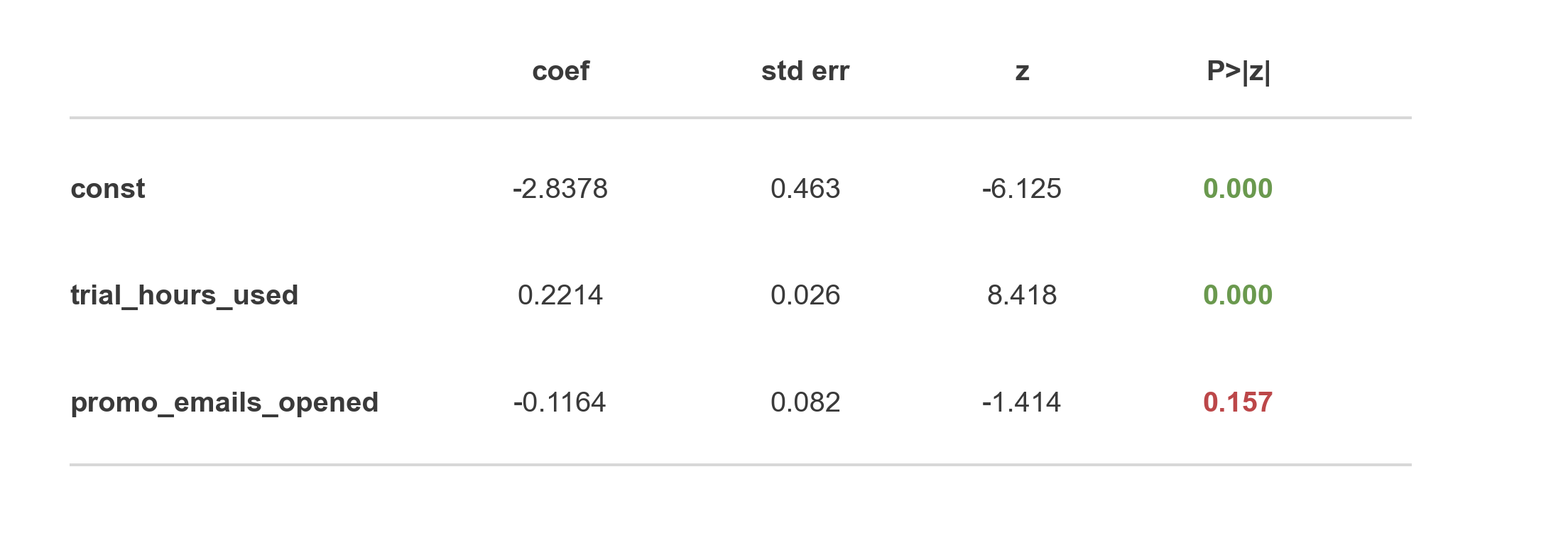
  • trial_hours_used barely moved from the single-predictor fit
  • promo_emails_opened is not significant — p = 0.157
  • A coefficient is now interpreted holding the other predictor constant

In plain language

  • An extra hour of trial usage still multiplies the odds of converting by about the same amount, whether or not we also know promo email activity
  • promo_emails_opened isn’t adding real predictive information once usage is already in the model

What if predictors don’t act independently?

  • So far, each predictor’s effect is the same no matter what the other one is doing — that’s an assumption, not a law
  • An interaction term lets one predictor’s effect change depending on the value of another
  • Add one more feature: \(x_1 \times x_2\), with its own coefficient \(\beta_3\)

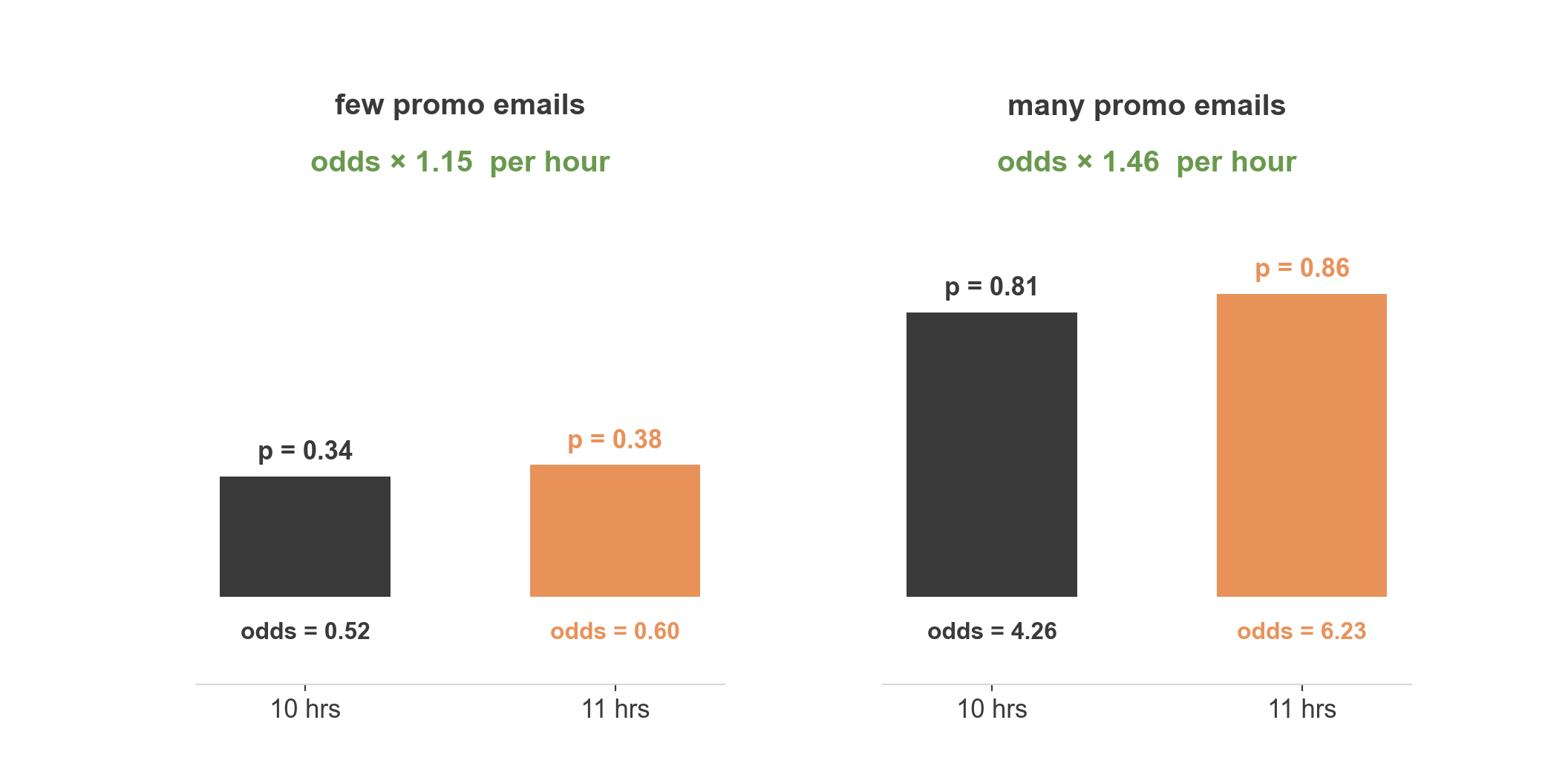
Does the jump change?

One more hour of usage is worth a bigger jump in odds for heavy promo-email users than for light ones. That difference is the interaction.

The interaction term, formally

  • \(z = \beta_0 + \beta_1 x_1 + \beta_2 x_2 + \beta_3 (x_1 \times x_2)\)
  • \(\beta_3 = 0\) → the additive model we’ve been fitting all along
  • \(\beta_3 \neq 0\)\(x_1\)’s effect depends on \(x_2\) — and symmetrically, \(x_2\)’s effect depends on \(x_1\)

Interpreting the interaction coefficient

  • \(\beta_3\) is not an odds ratio by itself — it’s how much the odds-ratio-per-hour changes per extra promo email
  • Easiest to communicate by example, not formula: “odds × 1.15 for light users, odds × 1.46 for heavy users”
  • Catch: once an interaction is in the model, \(\beta_1\) and \(\beta_2\) stop meaning “this predictor’s effect” — they now mean “this predictor’s effect when the other one is zero

The interaction term, formally

  • \(z = \beta_0 + \beta_1 x_1 + \beta_2 x_2 + \beta_3 (x_1 \times x_2)\)
  • \(\beta_3 = 0\) → the additive model we’ve been fitting all along
  • \(\beta_3 \neq 0\)\(x_1\)’s effect depends on \(x_2\) — and symmetrically, \(x_2\)’s effect depends on \(x_1\)
  • Sign of \(\beta_3\): positive means the two predictors reinforce each other; negative means one dampens the other

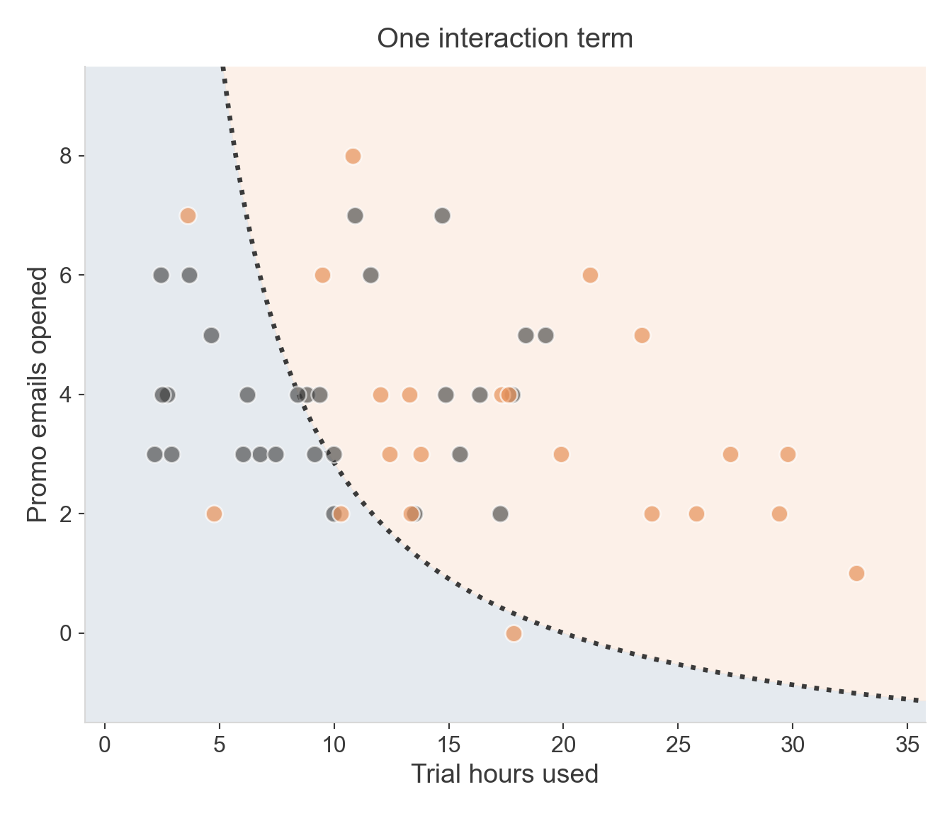
A bent boundary, from one term

  • Compare this to the wiggly polynomial boundary from a few slides ago
  • Both bend — but this one has a name, a sign, and a p-value
  • Interpretable complexity, not memorized noise

Evaluating the Classifier

Beyond accuracy

  • 85% accuracy on our 20 users — sounds good, but it hides something
  • Not every mistake is the same kind of mistake
  • A missed converter and a false alarm have very different costs in practice

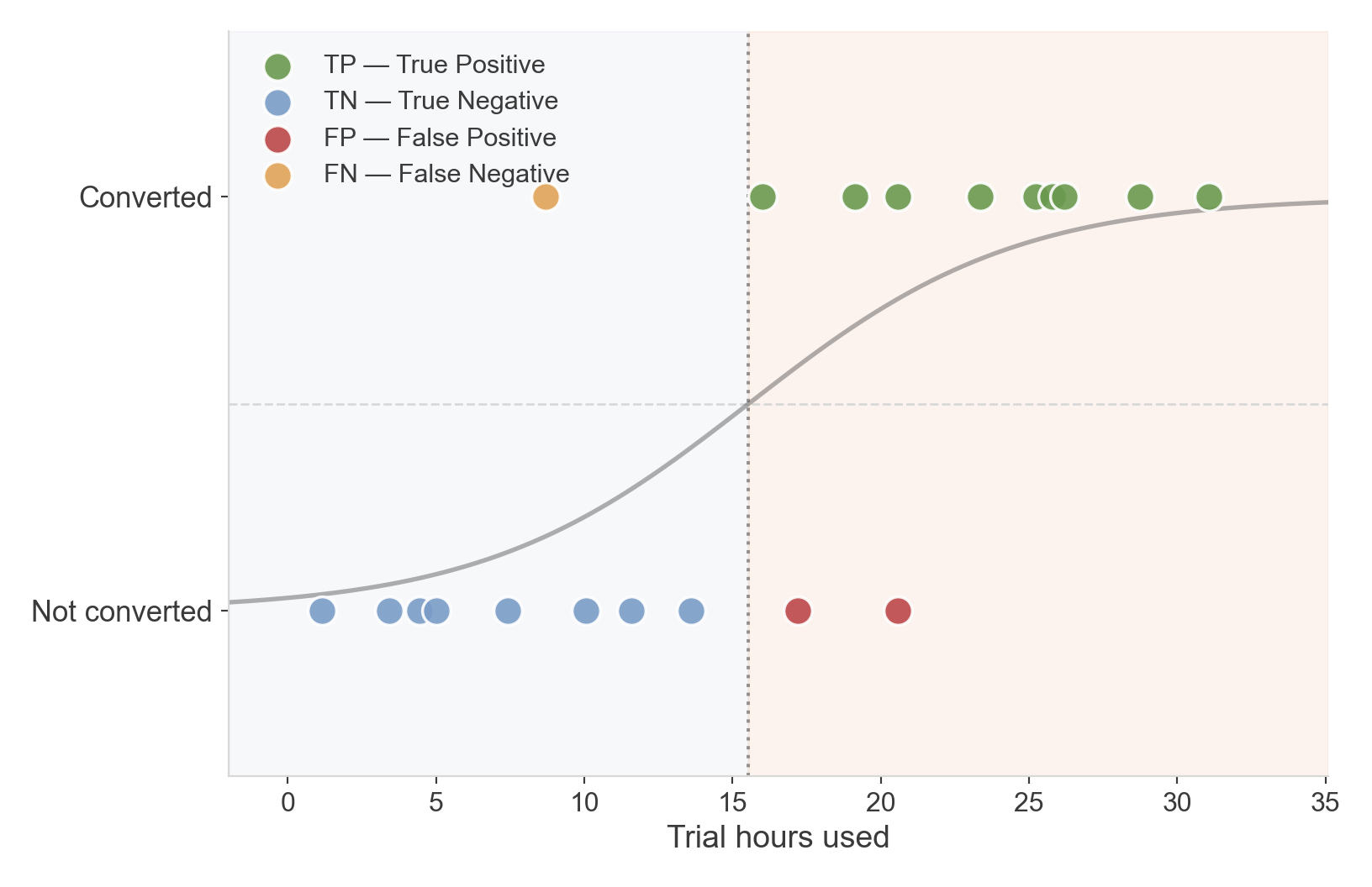
Four ways to be right or wrong

  • TP / TN — model agrees with reality
  • FP — predicted converted, didn’t (“false alarm”)
  • FN — predicted not converted, did (“missed opportunity”)

The confusion matrix
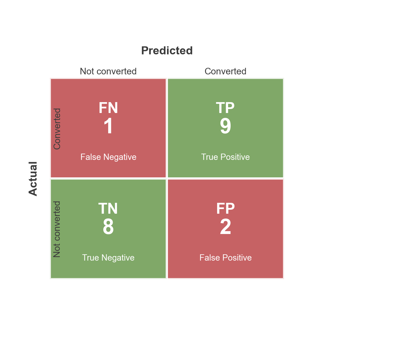
  • Same four categories, laid out as a grid
  • Rows: what actually happened. Columns: what we predicted
  • Every classification metric is just some combination of these four numbers

Accuracy
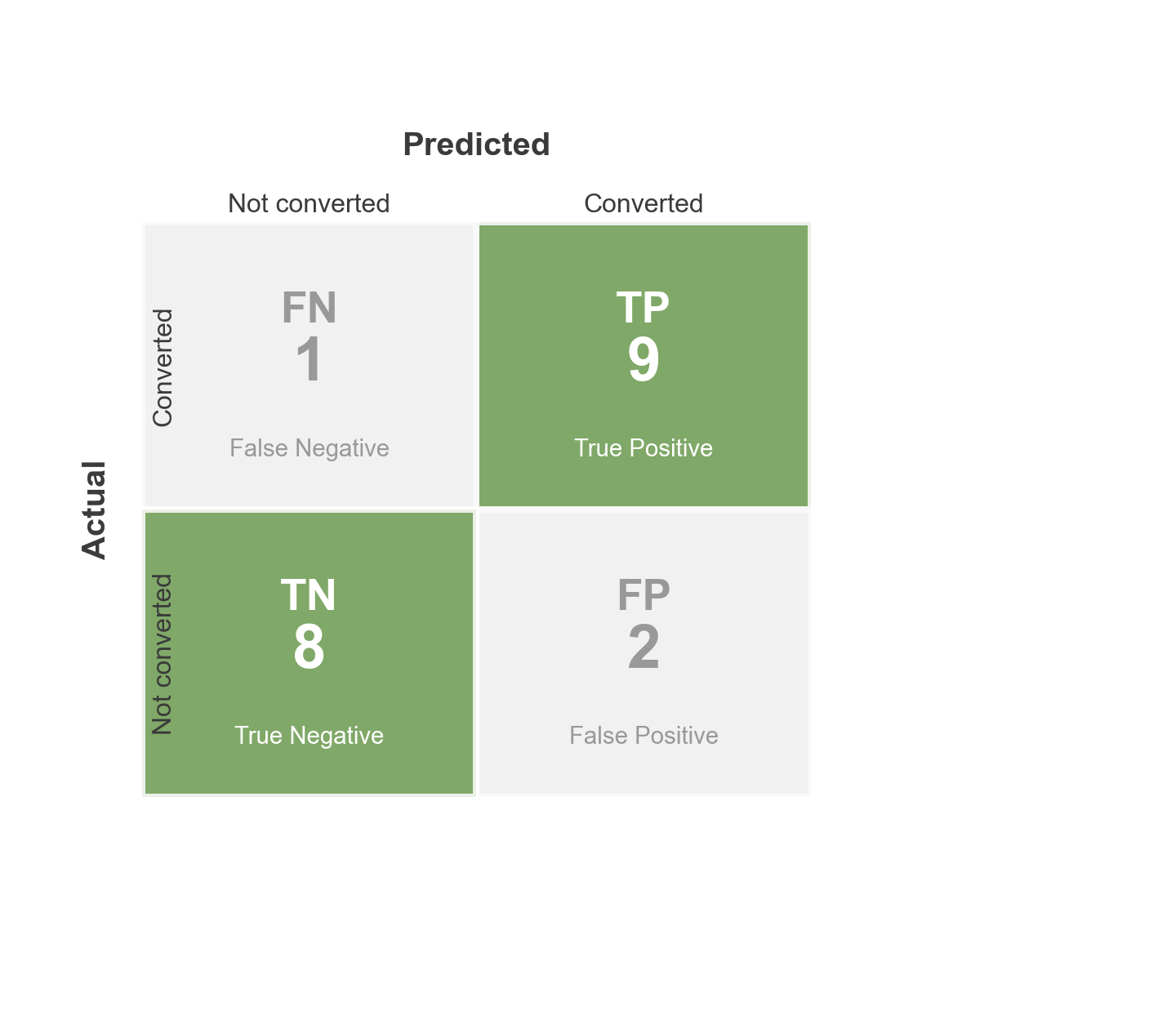
  • \(\text{accuracy} = \dfrac{TP + TN}{\text{everyone}}\)
  • \((9 + 8) / 20 = 85\%\)
  • The diagonal — everything we got right

Precision
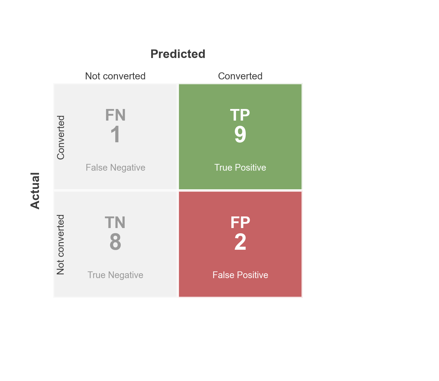
  • \(\text{precision} = \dfrac{TP}{TP + FP}\)
  • \(9 / 11 = 82\%\)
  • Of everyone we predicted would convert, how many actually did?

Recall
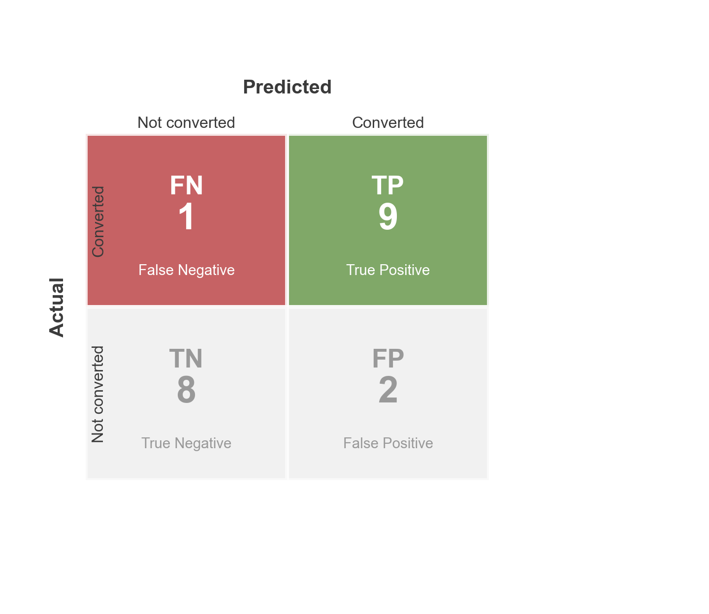
  • \(\text{recall} = \dfrac{TP}{TP + FN}\)
  • \(9 / 10 = 90\%\)
  • Of everyone who actually converted, how many did we catch?

Precision and recall trade off

  • Lowering the threshold → catch more converters (higher recall), but more false alarms (lower precision)
  • Raising it → fewer false alarms, but you miss more real converters
  • There’s no single “right” threshold — it depends on which mistake costs more

A strict threshold

A looser threshold
Looser still
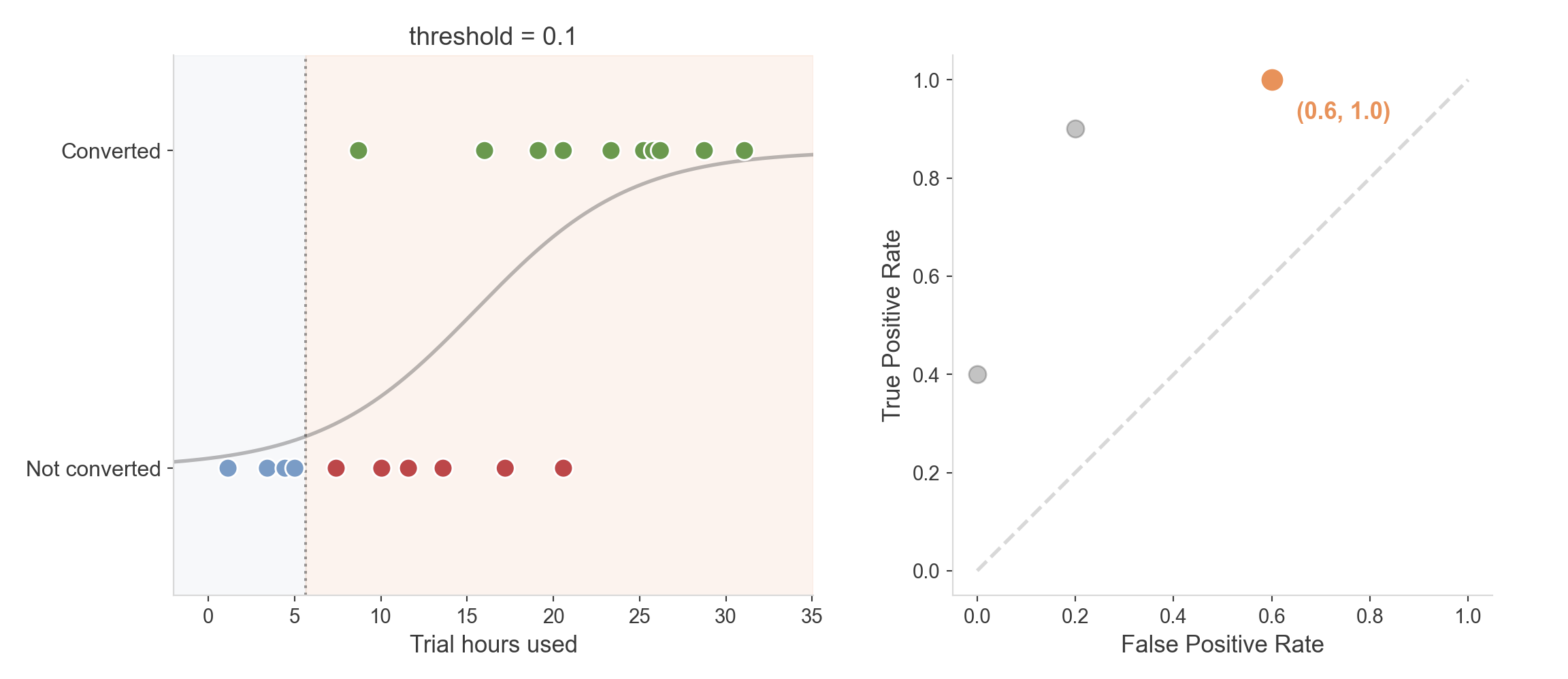
Every possible threshold is a point in this space. Trace through all of them, and you get a curve.

The ROC curve and AUC
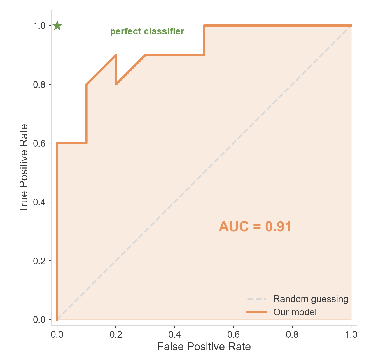
  • ROC curve: True Positive Rate vs. False Positive Rate, across every threshold at once
    • AUC: the area underneath — here, 0.91
    • AUC has a clean meaning: the probability a random converter scores higher than a random non-converter
    • AUC = 0.5 → no better than coin-flipping. AUC = 1.0 → perfect separation

Why bother with ROC/AUC?

  • A single accuracy number depends on a threshold you picked somewhat arbitrarily
  • ROC/AUC describe the model independent of any one threshold — useful for comparing models before deciding where to draw the line
  • Especially valuable when classes are imbalanced, where accuracy alone can be badly misleading

Regularization

Reining in complexity

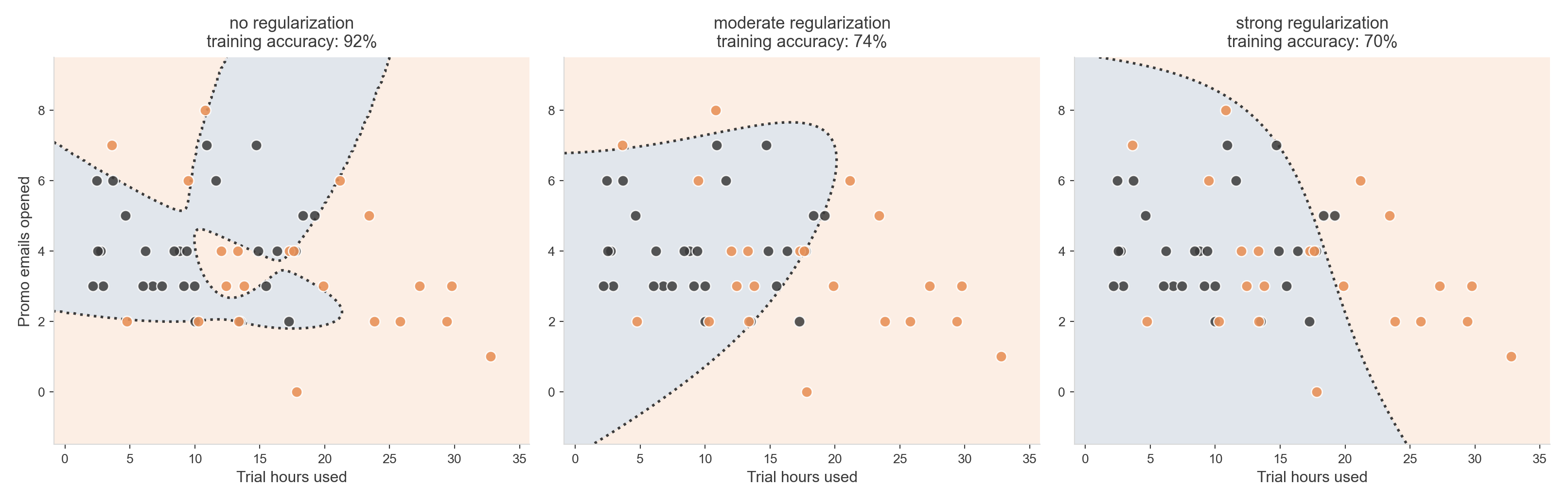
  • Remember the wiggly boundary from a few sections back — 92% training accuracy, for the wrong reasons
  • Regularization: penalize the model for using large coefficients
  • The model can still try to get complicated — it just has to “pay” for it

The same flexible model, dialed down

  • Same degree-6 polynomial features in all three panels — only the penalty changes
  • More regularization → simpler boundary, lower training accuracy, but far less nonsense

Two flavors

  • L2 (ridge): penalizes the sum of squared coefficients — shrinks everything toward zero, rarely to exactly zero
  • L1 (lasso): penalizes the sum of absolute coefficients — can push some coefficients to exactly zero, dropping features entirely
  • C in sklearn’s LogisticRegression is the inverse of regularization strength — smaller C means more regularization

Multi-Class

What if there are more than two outcomes?

  • So far: converted or not — one cutoff, two outcomes
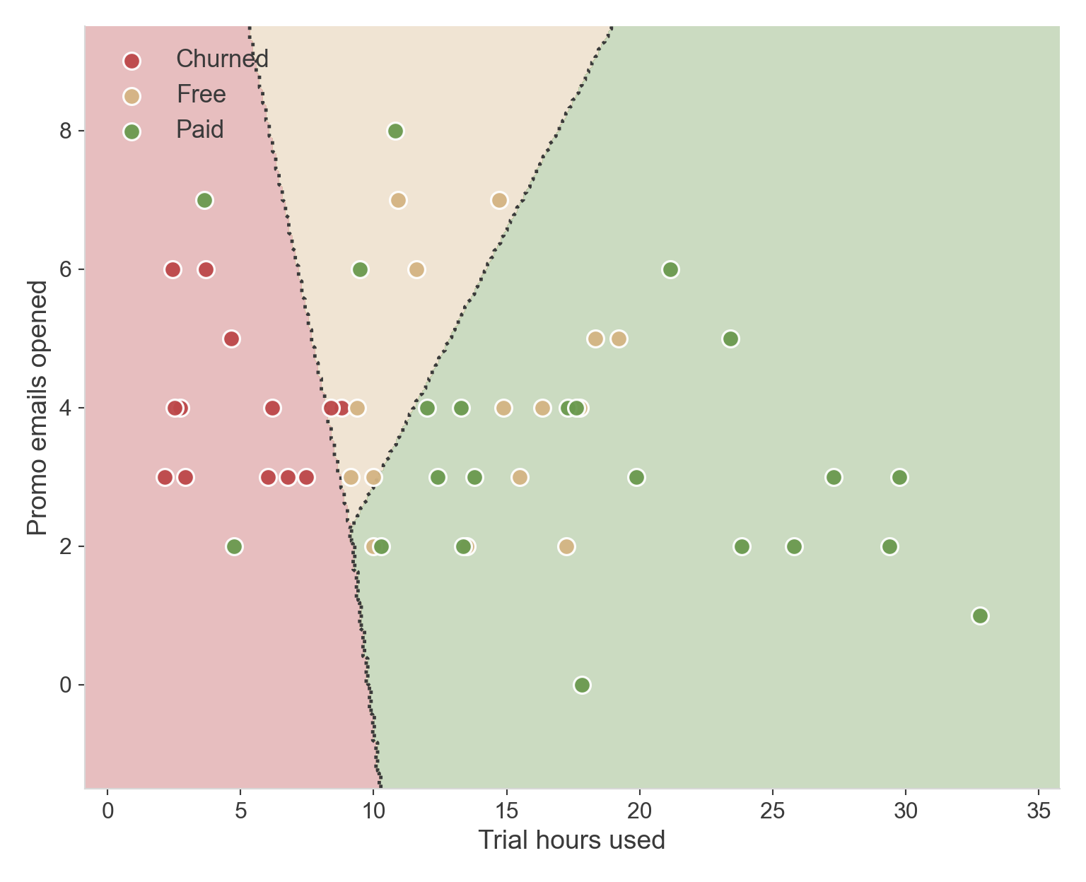
  • Real picture: a trial user could end up Churned, Free, or Paid
  • We need probabilities for three things that all sum to 1

Softmax

  • Each class gets its own score: \(z_k = \beta_{0k} + \beta_{1k}x_1 + \beta_{2k}x_2\)
  • Softmax turns scores into probabilities: \(P(\text{class } k) = \dfrac{e^{z_k}}{\sum_j e^{z_j}}\)
  • This is the sigmoid’s generalization — with two classes, softmax is the sigmoid

Three regions instead of two

  • Same two predictors, now carving the plane into three zones
  • Regions meet cleanly — every point belongs to exactly one class
  • Free sits in the middle, where usage is moderate

Reading coefficients with 3+ classes

  • The model picks one class as a reference (say, “Free”)
  • Every other class gets its own coefficients, interpreted relative to that reference
  • \(e^\beta\) here is a relative risk ratio: how much more likely that class is than the reference, per unit increase — not quite the same as a binary odds ratio, but the same spirit

One-vs-Rest vs. softmax

  • One-vs-Rest: fit separate binary models (“Paid vs. not”, “Churned vs. not”, …) and let them vote — can leave gaps or overlaps, since each model decides independently
  • Softmax: fits all classes jointly — the regions always exhaustively partition the space, no gaps
  • sklearn defaults to softmax (multinomial) for LogisticRegression when there are more than two classes

Looking Ahead

What carries over

  • Probability output, decision boundary, confusion matrix, ROC/AUC — all of this still applies to any classifier, not just logistic regression
  • What changes between model families is how the boundary gets drawn and what’s being fit

New vocabulary, by family

  • Decision trees: splits, depth, purity (Gini / entropy) — no coefficients, just “which question to ask next”
  • k-Nearest Neighbors: distance, \(k\) — no fitting at all, just memorize and compare
  • Ensembles (bagging, boosting): combine many simple models — hyperparameters like number of trees, learning rate
  • Support Vector Machines: margin, support vectors, kernel trick

A few general terms worth knowing

  • Hyperparameter vs. parameter: parameters are learned (like \(\beta\)); hyperparameters are chosen by you (\(k\), tree depth, \(C\))
  • Most of these models have no closed-form solution — fitting means iterative search, same spirit as the likelihood hill we climbed earlier
  • Cross-validation becomes essential once there are hyperparameters to choose, not just parameters to fit